


Data Handling And Presentation - Exercise-wise Questions and Answers For Class 6 Maths - Free PDF Download
Chapter 4 Class 6 Maths Data Handling and Presentation, introduces students to organising and interpreting data. Chapter 6 covers the basics of data collection, representing data in tables, bar graphs, and pictographs, and understanding the importance of data in real life. With NCERT Solutions, students can easily grasp these concepts and solve related problems step by step, enhancing their analytical and problem-solving skills.
 Table of Content
Our Class 6 Maths NCERT Solutions PDF breaks the lesson into easy-to-understand explanations, making learning fun and interactive. Students will develop essential language skills with engaging activities and exercises. Check out the revised CBSE Class 6 Maths Syllabus and start practising the Maths Class 6 Chapter 4.
Glance on Class 6 Chapter 4 Maths Data Handling and Presentation
It is understanding what data is and how it is collected.
We are arranging data systematically using tables.
Representing data using pictures or symbols.
Learning to represent data using bars of different heights.
Analysing data from pictographs and bar graphs.
Application of data handling in daily life.
Class 6 Maths Chapter 4: Data Handling and Presentation
4.1 Collecting and Organising Data
Figure it Out (Page No. 75 – 76)
Question 1. What would you do to find the most popular game among Naresh’s and Navya’s classmates?
Solution: By organizing the data collected, using tally marks.
Question 2. What is the most popular game in their class?
Solution: Hockey
Question 3. Try to find out the most popular game among your classmates.
Solution: Its an activity for students.
Question 4. Pari wants to respond to the questions given below. Put a tick (✓) for the questions where she needs to carry out data collection and put a cross (✗) for the questions where she doesn’t need to collect data. Discuss your answers in the classroom.
(a) What is the most popular TV show among her classmates? ⬜
(b) When did India get independence? ⬜
(c) How much water is getting wasted in her locality? ⬜
(d) What is the capital of India? ⬜
Solution:
(a) What is the most popular TV show among her classmates? ✅
(b) When did India get independence? ❌
(c) How much water is getting wasted in her locality? ✅
(d) What is the capital of India? ❌
4.1 Collecting and Organising Data Figure it Out (Page No. 76 – 77)
Question 1. Complete the table to help Shri Nilesh to purchase the correct number of sweets:
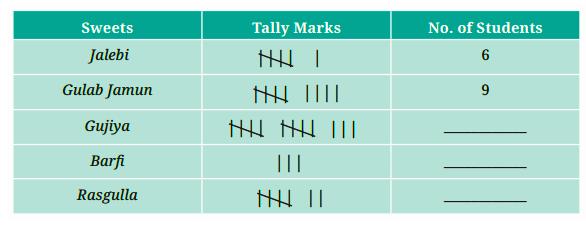
(a) How many students chose Jalebi? ___
(b) Barfi was chosen by _____ students?
(c) How many students chose gujiya? _____
(d) Rasgulla was chosen by _____ students?
(e) How many students chose Gulab Jamun? _____
Solution:
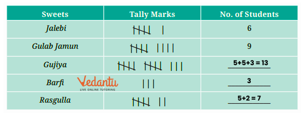
(a) How many students chose Jalebi? 6
(b) Barfi was chosen by 3 students.
(c) How many students chose gujiya? 13
(d) Rasgulla was chosen by 7 students.
(e) How many students chose Gulab Jamun? 9
Question 2. Is the above table sufficient to distribute each type of sweet to the correct student? Explain. If it is not sufficient, what is the alternative?
Solution: No, it is not sufficient.
Shri Nilesh should have also written children’s names against each sweet item. Only then he could have given the right sweet to the right child.
4.1 Collecting and Organising Data Figure it Out (Page No. 77 – 79)
Question 1. Help her to figure out the following-
The largest shoe size in the class is ____________
The smallest shoe size in the class is ____________
There are ____________ students who wear shoe size 5.
There are ____________ students who wear shoe sizes larger than 4.
Solution: Here let’s make the frequency table.
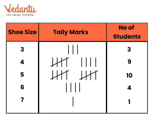
The largest shoe size in the class is 7.
The smallest shoe size in the class is 3.
There are 10 students who wear shoe size 5.
There are 15 students who wear shoe sizes larger than 4.
Question 2. How did arranging the data in ascending order help to answer these questions?
Solution: Let’s arrange the data in ascending order:
3, 3, 3, 4, 4, 4, 4, 4, 4, 4, 4, 4, 5, 5, 5, 5, 5, 5, 5, 5, 5, 5, 6, 6, 6, 6, 7
It takes a bit more time to answer as compared to the frequency table.
Question 3. Are there other ways to arrange the data?
Solution: Yes. The data can also be arranged in descending order.
Question 4. Write the names of a few trees you see around you. When you observe a tree on the way from your home to school (or while walking from one place to another place), record the data and fill in the following table-
(a) Which tree was bund in the greatest number?
(b) Which tree was found in the smallest number?
(c) Were there any two trees found in the same numbers?
Solution: Do it yourself.
Question 5. Take a blank piece of paper and paste any small news item from a newspaper. Each student may use a different article. Now, prepare a table on the piece of paper as given below. Count the number of each of the letters ‘c’, ‘e’, ‘i’, ‘r’, and ‘x’ in the words of the news article, and fill in the table.
(a) The letter found the most number of times is ____________
(b) The letter found the least number of times is ____________
(c) List the five letters ‘c’, ‘e’, ‘i’, ‘r’, ‘x’ in ascending order of frequency. Now, compare the order of your list with that of your classmates. Is your order the same or nearly the same as theirs? (Almost everyone is likely to get the order ‘x, c, r, i, e’). Why do you think this is the case?
(d) Write the process you followed to complete this task.
(e) Discuss with your friends the processes they followed.
(f) If you do this task with another news item, what process would you follow?
Solution:It is activity for students.
4.2 Pictographs Figure it Out (Page No. 83 – 84)
Question 1. The following pictograph shows the number of books borrowed by students, in a week, from the library of Middle School, Ginnori-
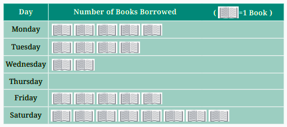
(a) On which day was the minimum number of books borrowed?
(b) What was the total number of books borrowed during the week?
(c) On which day were the maximum number of books borrowed? What may be the possible reason?
Solution:
(a) Thursday
(b) Total number of books borrowed = 5 + 4 + 2 + 0 + 5 + 8 = 24 books.
(c) Saturday
As the next day is the school holiday, they would have enough time to read the books.
Question 2. Magan Bhai sells kites at Jamnagar. Six shopkeepers from nearby villages come to purchase kites from him. The number of kites he sold to these six shopkeepers is given below-
Prepare a pictograph using the symbol 🪁 to represent 100 kites.
Answer the following questions:
(a) How many symbols represent the kites that Rani purchased?
(b) Who purchased the maximum number of kites?
(c) Who purchased more kites, Jasmeet or Chaman?
(d) Rukhsana says Poonam Ben purchased more than double the number of kites that Rani purchased. Is she correct? Why?
Solution: Let’s draw the pictograph 🪁 = 100 kites
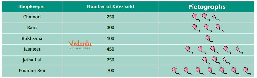
(a) Three symbols
(b) Poonam Ben
(c) Jasmeet
(d) Yes.
Kites purchased by Rani = 300
Kites purchased by Poonam Ben = 700
Hence Poonam Ben purchased more than double.
4.3 Bar Graphs Figure it Out (Page No. 88)
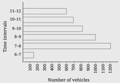
Question 1. How many total cars passed through the crossing between 6 am and noon?
Solution: Total cars passed = 600 + 700 + 800 + 1000 + 1200 + 150 = 4450 cars
Question 2. Why do you think so little traffic occurred during the hours of 6-7 am, as compared to the other hours from 7 am to noon?
Solution: The traffic that occurs during the hours 6-7 am is very little, as it is early morning time and there are very few office goers. Also, there are very few.
Question 3. Why do you think the traffic was the heaviest between 7 am and 8 am?
Solution: 7-8 am is the hour when the maximum number of factory officers and workers use their cars and parents use their cars to drop their children at school.
Question 4. Why do you think the traffic was lesser and lesser each hour after 8 am until noon?
Solution: Because, most of the schools start at 8 am – and many factories also start at 8 am and hence less traffic between 8 am-9 am. Most offices start at 9 am and shops start at 10 am and hence less traffic between 9 am-10 am.
4.4 Drawing a Bar Graph Figure it Out (Page No. 93-99)
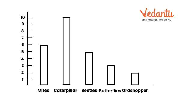
Question 1. Samantha visited a tea garden and collected data on the insects and critters she saw there. Here is the data she collected-
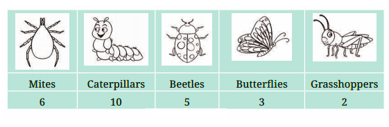
Help her prepare a bar graph representing this data.
Solution:
Question 2. Pooja collected data on the number of tickets sold at the Bhopal railway station for a few different cities of Madhya Pradesh over 2 hours.
She used this data and prepared a bar graph on the board to discuss the data with her students, but someone erased a portion of the graph.
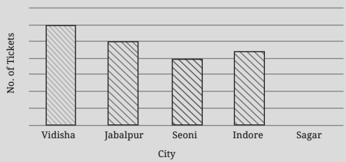
(a) Write the number of tickets sold for Vidisha above the bar.
(b) Write the number of tickets sold for Jabalpur above the bar.
(c) The bar for Vidisha is 6 unit lengths and the bar for Jabalpur is 5 unit lengths. What is the scale for this graph?
(d) Draw the correct bar for Sagar.
(e) Add the scale of the bar graph placing the correct numbers on the vertical axis.
(f) Are the bars for Seoni and Indore correct in this graph? If not, draw the correct bar(s).
Solution:
(a) 24 tickets
(b) 20 tickets
(c) 1 unit length = 4 tickets
(d)
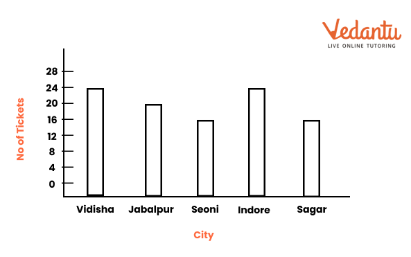
(e)

(f) No. The current graph is shown in (d) and (e) above.
Question 3. China listed the various means of transport that passed across the road in front of his house from 9 am to 10 am:

(a) Prepare a frequency distribution table for the data.
(b) Which means of transport was used the most?
(c) If you were there to collect this data, how could you do it? Write the steps or process.
Solution:
(a)
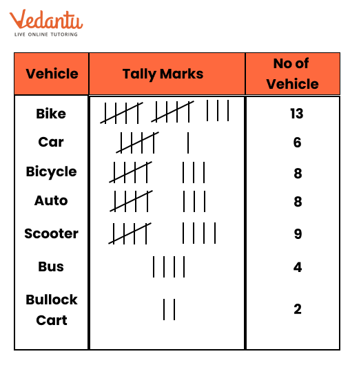
(b) Bike
(c) Only like this
Question 4. Roll a die 30 times and record the number you obtain each time. Prepare a frequency distribution table using tally marks. Find the number that appeared:
(a) The minimum number of times.
(b) The maximum number of times.
(c) Find numbers that appeared an equal number of times.
Solution: Let the outcomes of 30 times roll of a die be
6, 2, 3, 5, 6, 4, 1, 1, 2, 5
3, 4, 1, 1, 3, 5, 2, 2, 1, 1
6, 2, 3, 5, 1, 2, 2, 3, 4, 2
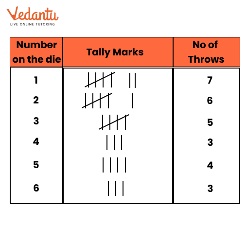
(a) 4 and 6
(b) 2
(c) 4 and 6
Question 5. Faiz prepared a frequency distribution table of data on the number of wickets taken by Jaspreet Bumrah in his last 30 matches:
(a) What information is this table giving?
(b) What may be the title of this table?
(c) What caught your attention in this table?
(d) In how many matches has Burnrah taken 4 wickets?
(e) Mayank says “If we want to know the total number of wickets he has taken in his last 30 matches, we have to add the numbers 0, 1, 2, 3,……..up to 7.” Can Mayank get the total number of wickets taken in this way? Why?
(f) How would you correctly figure out the total number of wickets taken by Bumrah in his last 30 matches, using this table?
Solution:
(a) The information in the table gives an overview of the number of matches in which he took wickets from 0 to 7.
(b) Frequency distribution table indicating the bowling performance of Jaspreet Bumrah.
(c) Bumrah has taken 3 or more wickets in most of the matches.
(d) Three matches
(e) No
(f) He can get the correct total, by adding the following points.
(2 × 0) + (4 × 1) + (6 × 2) + (8 × 3) + (3 × 4) + (5 × 5) + (1 × 6) + (1 × 7)
= 0 + 4 + 12 + 24 + 12 + 25 + 6 + 7
= 90
Question 6. The following pictograph shows the number of tractors in five different villages.
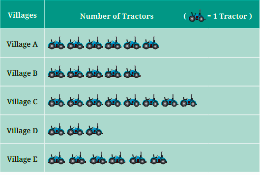
Observe the pictograph and answer the following questions-
(a) Which village has the smallest number of tractors?
(b) Which village has the most tractors?
(c) How many more tractors does Village C have than Village B?
(d) Komal says, “Village D has half the number of tractors as Village E.” Is she right?
Solution:
(a) Village D
(b) Village C
(c) 3 more tractors
(d) Yes.
Question 7. The number of female students in each class of a school is depicted by a pictograph:
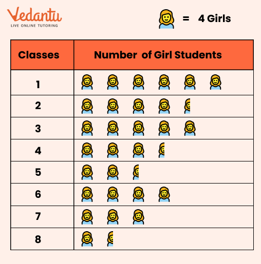
Observe this pictograph and answer the following questions:
(a) Which class has the least number of girl students?
(b) What is the difference between the number of girls in Classes 5 and 6?
(c) If 2 more girls were admitted in Class 2, how would the graph change?
(d) How many girls are there in Class 7?
Solution:
(a) Class 8
(b) Number of Girls in class 6 = 4 × 4 = 16
Number of Girls in class 5 = 4 × 3.5 = 14
Hence difference = 16 – 14 = 2
(c) Five full symbols of a girl
(d) 3 × 4 = 12 girls.
Question 8. Mudhol Hounds (a type of breed of Indian dogs) are largely found in North Karnataka’s Bagalkote and Vijaypura districts. The government took the initiative to protect this breed by providing support to those who adopted these dogs. Due to this initiative, the number of these dogs increased. The number of Mudhol dogs in six villages of Karnataka is as follows-
Village A: 18, Village B: 36, Village C: 12, Village D: 48, Village E: 18, Village F: 24
Prepare a pictograph and answer the following questions:
(a) What will be a useful scale or key to draw this pictograph?
(b) How many symbols will you use to represent the dogs in Village B?
(c) Kamini said that the number of dogs in Village B and Village D together will be more than the number of dogs in the other 4 villages. Is she right? Give reasons for your response.
Solution:
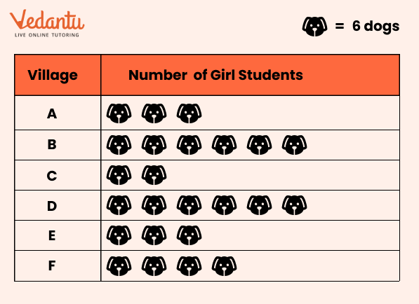
(a) 1 * = 6 dogs will be a useful scale or key to draw this pictograph.
(b) 6 symbols.
(c) Yes, because Total no. of dogs in villages B and D = 6 + 8 = 14 dogs = 14 × 6 = 84 dogs
Total no. of dogs in remaining 4 villages = 3 + 2 + 3 + 4 = 12 dogs = 12 × 6 = 72 dogs
Question 9. A survey of 120 school students was conducted to find out which activity they preferred to do in their free time.
Draw a bar graph to illustrate the above data taking the scale of 1 unit length = 5 students. Which activity is preferred by most students other than playing?
Solution:

Question 10. Students and teachers of a primary school decided to plant tree saplings in the school campus and in the surrounding village during the first week of July. Details of the saplings they planted are as follows-
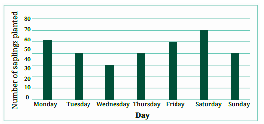
(a) The total number of saplings planted on Wednesday and Thursday is ____________
(b) The total number of saplings planted during the whole week is ____________
(c) The greatest number of saplings were planted on ____________, and the least number of saplings were planted on ____________.
Why do you think that is the case? Why were more saplings planted on certain days of the week and less on others? Can you think of possible explanations or reasons? How could you try and figure out whether your explanations are correct?
Solution:
(a) 30 + 40 = 70 saplings
(b) 52 + 40 + 30 + 40 + 50 + 60 + 40 = 312 saplings
(c) Saturday, Wednesday.
Question 11. The number of tigers in India went down drastically between 1900 and 1970. Project Tiger was launched in 1973 to track and protect tigers in India. Starting in 2006, the exact number of tigers in India was tracked. Shagufta and Divya looked up information about the number of tigers in India between 2006 and 2022 in 4-year intervals. They prepared a frequency table for this data and a bar graph to present this data, but there are a few mistakes in the graph. Can you find those mistakes and fix them?
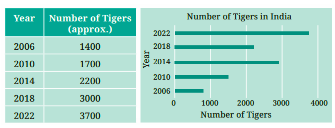
Solution:
Yes, there are a few mistakes in the graph.
No. of tigers in 2006 was 1400 but shown less in the graph.
No. of tigers in 2014 was 2200 but shown more in the graph.
No. of tigers in 2018 was 3000 but shown less in the graph.
4.5 Artistic and Aesthetic Considerations
Figure it Out (Page 103)
Question 1. If you wanted to visually represent the data of the heights of the tallest persons in each class in your school, would you use a graph with vertical bars or horizontal bars? Why?
Solution:Graph with vertical bars. Vertical graphs are like pillars and show a much better presentation of the person’s height.
Question 2. If you were making a table of the longest rivers on each continent and their lengths, would you prefer to use a bar graph with vertical bars or horizontal bars? Why? Try finding out this information, and then make the corresponding table and bar graph! Which continents have the, longest rivers?
Solution: Graph with horizontal bars, because rivers flow on land horizontally.
Benefits of NCERT Solutions for Class 6 Maths Chapter 4 Data Handling and Presentation
Focus on understanding the difference between raw data and organised data.
Draw pictographs and bar graphs to get a clear idea of data representation.
Try collecting data from your surroundings, such as the number of different fruits at home, and practice presenting it in graphs.
Learn how to interpret graphs and data by asking questions like 'What does the graph tell?' and 'What conclusions can be drawn?'
Review the solved examples in NCERT Solutions to understand the correct way of solving data handling problems.
Important Study Material Links for Maths Chapter 4 Class 6
Conclusion
NCERT Solutions for Class 6 Maths Chapter 4 Data Handling and Presentation provides a thorough understanding of how to organise, represent, and interpret data. These concepts not only enhance mathematical skills but also improve critical thinking by enabling students to draw conclusions based on real-life data. Practising these solutions ensures that students master data handling effectively.
Chapter-wise NCERT Solutions Class 6 Science
After familiarising yourself with the Class 6 Maths Chapters Question Answers, you can access comprehensive NCERT Solutions from all Class 6 Maths textbook chapters.
Related Important Links for Class 6 Maths
Along with this, students can also download additional study materials provided by Vedantu for Maths Class 6-
FAQs on NCERT Solutions For Class 6 Maths Chapter 4 Data Handling And Presentation - 2026-27
1. How do you use tally marks to count data?
Represent each data point with a single vertical line (|). For every fifth data point, draw a diagonal line across the previous four (||||) to create a group of five. This method makes it easy and fast to count the total frequency for each category in your dataset.
2. How can you organize raw data in a frequency distribution table?
To organize raw data in a frequency distribution table, create a table with three columns to structure your raw data: one for the categories, one for tally marks, and one for the frequency (the numerical count). This is a key skill in data handling and presentation for class 6.
Steps to Follow:
- Make three columns labelled 'Category', 'Tally Marks', and 'Frequency'.
- List all unique items from your data in the first column.
- Go through the raw data one by one, placing a tally mark next to the correct item.
- Count the tally marks for each item and write the total in the frequency column.
3. What is the easiest way to download the Data Handling Class 6 Solutions PDF?
Click the “Download PDF” link available on this page to get the complete NCERT Solutions for Class 6 Maths Chapter 4. You can save this Free PDF file on your phone or computer to study offline, revise formulas, and check answers without needing an internet connection.
4. What is the process for drawing a pictograph?
To draw a pictograph, you must represent numerical data using relevant symbols or pictures, where each symbol corresponds to a specific quantity.
Pictographs are visually engaging and make data easy to understand at a glance, especially when comparing different categories.
Steps to Follow:
- Give your pictograph a clear and descriptive title.
- Choose a simple symbol that relates to the data (e.g., a book symbol for library data).
- Define your scale in a key (e.g., 1 symbol = 10 books). This is the most important step.
- Draw the correct number of symbols for each category based on your key.
To draw a pictograph, you must represent numerical data using relevant symbols or pictures, where each symbol corresponds to a specific quantity.
Pictographs are visually engaging and make data easy to understand at a glance, especially when comparing different categories.
Steps to Follow:
Give your pictograph a clear and descriptive title.
Choose a simple symbol that relates to the data (e.g., a book symbol for library data).
Define your scale in a key (e.g., 1 symbol = 10 books). This is the most important step.
Draw the correct number of symbols for each category based on your key.
A good pictograph always includes a title, a symbol, and a key to explain the scale.
5. How should you start analysing a new set of data?
First, arrange the raw data in a systematic way. You can do this by listing the numbers or items in ascending or descending order. This initial step of organising the data makes it much simpler to create tables and graphs later on.
6. How can you interpret information from a bar graph?
Interpret a bar graph by first reading its title and the labels on both the horizontal (x-axis) and vertical (y-axis) axes to understand what is being measured.
This skill helps you quickly compare information across different groups and identify the highest or lowest values without needing to read all the exact numbers.
7. How can you find extra questions for Data Handling Class 6?
Find extra questions by working through the solved examples and in-text questions provided in Vedantu's NCERT solutions. These questions offer more practice on key concepts from class 6 chapter 4 data handling and presentation beyond what is in the main textbook exercises.
8. How can you use NCERT Solutions to revise for an exam?
Use the NCERT Solutions for Data Handling and Presentation Class 6 to revise actively by first solving problems yourself and then using the solutions to analyse your method.
This two-step process helps you identify specific weaknesses in your understanding, rather than just memorising answers. It builds confidence and problem-solving skills for your exam.
9. How do you find the answer to a specific question using the solutions page?
Scroll to the specific exercise number you are working on (e.g., Exercise 4.1, 4.2). Click on the question number to navigate directly to its detailed, step-by-step solution. This allows you to quickly check your work for a single problem without searching the entire document.
10. What is the best way to self-check your homework answers?
Self-check your work by using the data handling and presentation class 6 solutions to verify both your final answer and the accuracy of your method, including tables and graphs.
In data handling, correctly drawing a graph or creating a frequency table is just as important as the final interpretation. A thorough check ensures you have mastered the entire process.