


NCERT Solutions For Class 6 Maths Chapter 4 Data Handling And Presentation Exercise 4.4 - 2026-27
Vedantu provides NCERT Solutions for Class 6 Maths Chapter 4 Exercise 4.4 - Drawing a Bar Graph, guiding students through the process of creating bar graphs from given data. This exercise focuses on the practical aspect of drawing bar graphs, helping students learn how to represent data visually using bars. By mastering this skill, students can effectively organize and present information clearly and concisely.
 Table of Content
You can download the FREE PDF of these solutions to Chapter 4 Exercise 4.4 of the Class 6 Math Syllabus to practice step-by-step methods for drawing accurate bar graphs, ensuring a thorough understanding of this important concept. These solutions are designed to strengthen students' data-handling skills and boost their exam preparation.
Glance on NCERT Solutions for Class 6 English Ch 4 Exercise 4.4 - Drawing a Bar Graph
Students learn how to visually represent data using bars, with each bar representing a specific value or category.
The exercise guides students in creating bar graphs from given data, focusing on accurately plotting the bars on a graph.
This exercise helps students understand how to organize raw data into a structured format before drawing a bar graph.
By practising this exercise, students gain confidence in drawing bar graphs, a skill that is useful for both exams and real-life data presentation scenarios.
Exercise 4.4
Figure it Out (Page No. 93-99)
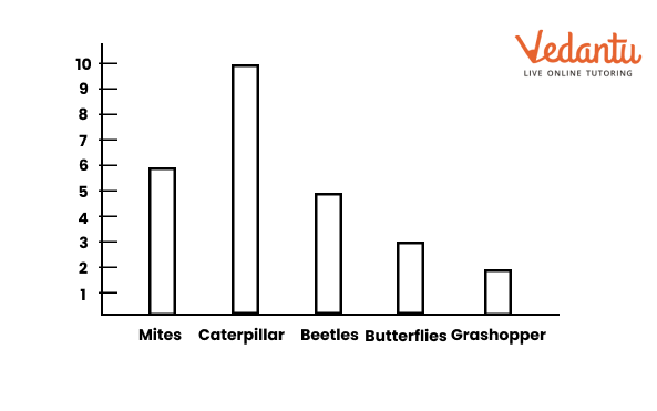
Question 1. Samantha visited a tea garden and collected data on the insects and critters she saw there. Here is the data she collected-
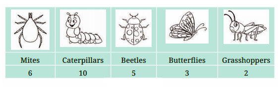
Help her prepare a bar graph representing this data.
Solution:
Question 2. Pooja collected data on the number of tickets sold at the Bhopal railway station for a few different cities of Madhya Pradesh over 2 hours.
She used this data and prepared a bar graph on the board to discuss the data with her students, but someone erased a portion of the graph.
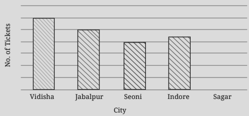
(a) Write the number of tickets sold for Vidisha above the bar.
(b) Write the number of tickets sold for Jabalpur above the bar.
(c) The bar for Vidisha is 6 unit lengths and the bar for Jabalpur is 5 unit lengths. What is the scale for this graph?
(d) Draw the correct bar for Sagar.
(e) Add the scale of the bar graph placing the correct numbers on the vertical axis.
(f) Are the bars for Seoni and Indore correct in this graph? If not, draw the correct bar(s).
Solution:
(a) 24 tickets
(b) 20 tickets
(c) 1 unit length = 4 tickets
(d)
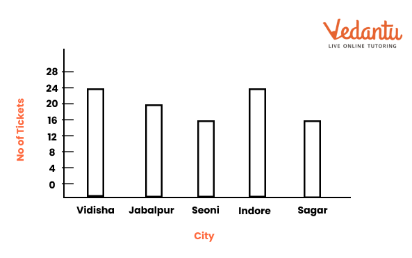
(e)

(f) No. The current graph is shown in (d) and (e) above.
Question 3. China listed the various means of transport that passed across the road in front of his house from 9 am to 10 am:
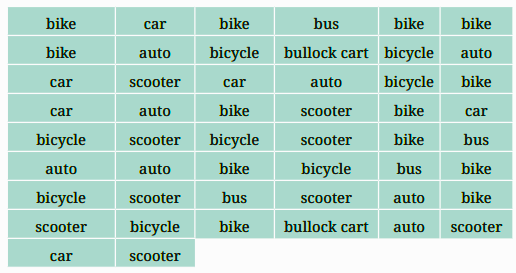
(a) Prepare a frequency distribution table for the data.
(b) Which means of transport was used the most?
(c) If you were there to collect this data, how could you do it? Write the steps or process.
Solution:
(a)
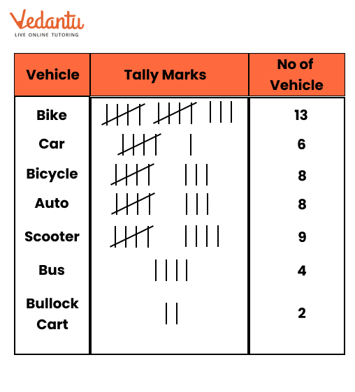
(b) Bike
(c) Only like this
Question 4. Roll a die 30 times and record the number you obtain each time. Prepare a frequency distribution table using tally marks. Find the number that appeared:
(a) The minimum number of times.
(b) The maximum number of times.
(c) Find numbers that appeared an equal number of times.
Solution:
Let the outcomes of 30 times roll of a die be
6, 2, 3, 5, 6, 4, 1, 1, 2, 5
3, 4, 1, 1, 3, 5, 2, 2, 1, 1
6, 2, 3, 5, 1, 2, 2, 3, 4, 2

(a) 4 and 6
(b) 2
(c) 4 and 6
Question 5. Faiz prepared a frequency distribution table of data on the number of wickets taken by Jaspreet Bumrah in his last 30 matches:
(a) What information is this table giving?
(b) What may be the title of this table?
(c) What caught your attention in this table?
(d) In how many matches has Burnrah taken 4 wickets?
(e) Mayank says “If we want to know the total number of wickets he has taken in his last 30 matches, we have to add the numbers 0, 1, 2, 3,……..up to 7.” Can Mayank get the total number of wickets taken in this way? Why?
(f) How would you correctly figure out the total number of wickets taken by Bumrah in his last 30 matches, using this table?
Solution:
(a) The information in the table gives an overview of the number of matches in which he took wickets from 0 to 7.
(b) Frequency distribution table indicating the bowling performance of Jaspreet Bumrah.
(c) Bumrah has taken 3 or more wickets in most of the matches.
(d) Three matches
(e) No
(f) He can get the correct total, by adding the following points.
(2 × 0) + (4 × 1) + (6 × 2) + (8 × 3) + (3 × 4) + (5 × 5) + (1 × 6) + (1 × 7)
= 0 + 4 + 12 + 24 + 12 + 25 + 6 + 7
= 90
Question 6. The following pictograph shows the number of tractors in five different villages.
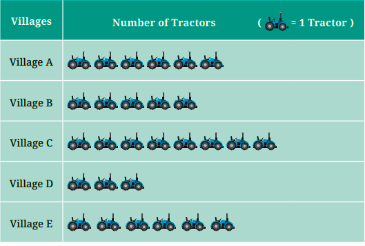
Observe the pictograph and answer the following questions-
(a) Which village has the smallest number of tractors?
(b) Which village has the most tractors?
(c) How many more tractors does Village C have than Village B?
(d) Komal says, “Village D has half the number of tractors as Village E.” Is she right?
Solution:
(a) Village D
(b) Village C
(c) 3 more tractors
(d) Yes.
Question 7. The number of female students in each class of a school is depicted by a pictograph:
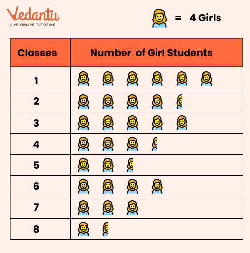
Observe this pictograph and answer the following questions:
(a) Which class has the least number of girl students?
(b) What is the difference between the number of girls in Classes 5 and 6?
(c) If 2 more girls were admitted in Class 2, how would the graph change?
(d) How many girls are there in Class 7?
Solution:
(a) Class 8
(b) Number of Girls in class 6 = 4 × 4 = 16
Number of Girls in class 5 = 4 × 3.5 = 14
Hence difference = 16 – 14 = 2
(c) Five full symbols of a girl
(d) 3 × 4 = 12 girls.
Question 8. Mudhol Hounds (a type of breed of Indian dogs) are largely found in North Karnataka’s Bagalkote and Vijaypura districts. The government took the initiative to protect this breed by providing support to those who adopted these dogs. Due to this initiative, the number of these dogs increased. The number of Mudhol dogs in six villages of Karnataka is as follows-
Village A: 18, Village B: 36, Village C: 12, Village D: 48, Village E: 18, Village F: 24
Prepare a pictograph and answer the following questions:
(a) What will be a useful scale or key to draw this pictograph?
(b) How many symbols will you use to represent the dogs in Village B?
(c) Kamini said that the number of dogs in Village B and Village D together will be more than the number of dogs in the other 4 villages. Is she right? Give reasons for your response.
Solution:
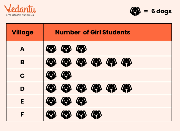
(a) 1 * = 6 dogs will be a useful scale or key to draw this pictograph.
(b) 6 symbols.
(c) Yes, because Total no. of dogs in villages B and D = 6 + 8 = 14 dogs = 14 × 6 = 84 dogs
Total no. of dogs in remaining 4 villages = 3 + 2 + 3 + 4 = 12 dogs = 12 × 6 = 72 dogs
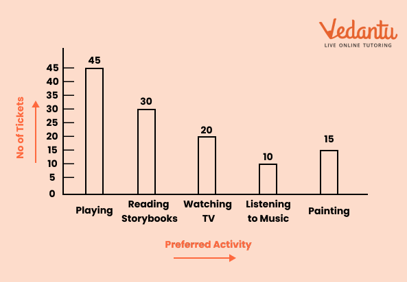
Question 9. A survey of 120 school students was conducted to find out which activity they preferred to do in their free time.
Draw a bar graph to illustrate the above data taking the scale of 1 unit length = 5 students. Which activity is preferred by most students other than playing?
Solution:
Question 10. Students and teachers of a primary school decided to plant tree saplings in the school campus and in the surrounding village during the first week of July. Details of the saplings they planted are as follows-
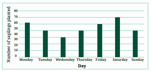
(a) The total number of saplings planted on Wednesday and Thursday is ____________
(b) The total number of saplings planted during the whole week is ____________
(c) The greatest number of saplings were planted on ____________, and the least number of saplings were planted on ____________.
Why do you think that is the case? Why were more saplings planted on certain days of the week and less on others? Can you think of possible explanations or reasons? How could you try and figure out whether your explanations are correct?
Solution:
(a) 30 + 40 = 70 saplings
(b) 52 + 40 + 30 + 40 + 50 + 60 + 40 = 312 saplings
(c) Saturday, Wednesday.
Question 11. The number of tigers in India went down drastically between 1900 and 1970. Project Tiger was launched in 1973 to track and protect tigers in India. Starting in 2006, the exact number of tigers in India was tracked. Shagufta and Divya looked up information about the number of tigers in India between 2006 and 2022 in 4-year intervals. They prepared a frequency table for this data and a bar graph to present this data, but there are a few mistakes in the graph. Can you find those mistakes and fix them?

Solution:
Yes, there are a few mistakes in the graph.
No. of tigers in 2006 was 1400 but shown less in the graph.
No. of tigers in 2014 was 2200 but shown more in the graph.
No. of tigers in 2018 was 3000 but shown less in the graph.
Benefits of NCERT Solutions for Class 6 Maths Chapter 4 Exercise 4.4 Data Handling and Presentation
This exercise helps students learn the step-by-step process of drawing accurate bar graphs, enhancing their ability to visually represent data.
By practicing this exercise, students develop the skills to organize raw data systematically, which is a crucial part of data handling.
Drawing bar graphs is a practical skill used in various subjects and real-life scenarios, making this exercise important for everyday applications.
Vedantu’s NCERT Solutions provide detailed instructions for drawing bar graphs, making it easier for students to understand and apply these concepts, leading to better exam preparation.
Class 6 Maths Chapter 4: Exercises Breakdown
Important Study Material Links for Class 6 Maths Chapter 4 - Data Handling and Presentation
Conclusion:
Class 6 Maths Chapter 4 Exercise 4.4 - Drawing a Bar Graph teaches students how to effectively represent data using bar graphs, an essential skill in data handling. This exercise focuses on the practical aspect of creating bar graphs, helping students organize and present data visually in a clear and accurate manner. Vedantu’s Revision Notes for this exercise offer easy-to-follow explanations and step-by-step instructions, ensuring students master the process of drawing bar graphs. By utilizing these notes, students can strengthen their understanding of data representation, which is crucial for both exams and real-life applications.
Chapterwise NCERT Solutions for Class 6 Maths
Related Important Links for Class 6 Maths
Along with this, students can also download additional study materials provided by Vedantu for Maths Class 6-

FAQs on NCERT Solutions For Class 6 Maths Chapter 4 Data Handling And Presentation Exercise 4.4 - 2026-27
1. Where can I find the correct and detailed NCERT Solutions for Class 6 Maths Chapter 4 (Data Handling) for the 2026-27 session?
You can find comprehensive, step-by-step NCERT Solutions for Class 6 Maths Chapter 4, Data Handling And Presentation, on Vedantu. These solutions are prepared by subject experts and strictly follow the 2026-27 CBSE curriculum guidelines, ensuring you understand the correct method for every problem.
2. How do you correctly use tally marks to organise raw data as per the method in Chapter 4?
To correctly organise data using tally marks, follow these steps:
- Create a table with three columns: Category, Tally Marks, and Frequency (or Number).
- For each data point, draw one vertical line (|) in the Tally Marks column next to its corresponding category.
- For every fifth data point in a category, draw a diagonal line across the previous four vertical lines to form a group of 5.
- Finally, count the tally marks for each category and write the total number in the Frequency column.
3. What is the step-by-step process for interpreting a pictograph in the NCERT solutions?
The NCERT solutions guide you to interpret a pictograph with this method:
- First, carefully read the title of the pictograph to understand what data it represents.
- Next, look for the key, which tells you what each symbol or picture stands for (e.g., 1 symbol = 10 students).
- Count the number of symbols for each category.
- Multiply the number of symbols by the value given in the key to find the actual value for each category.
4. What is the first step when asked to draw a bar graph for a given set of data in Chapter 4?
The first and most crucial step is to draw and label the two axes. Draw a horizontal axis (x-axis) and a vertical axis (y-axis). The x-axis is used to represent the different categories (like subjects, days, or items), while the y-axis represents the numerical values or frequencies.
5. How do you decide on a suitable scale for a bar graph, as explained in the NCERT solutions?
To decide on a suitable scale for a bar graph, first look at the highest value in your data. Choose a scale that allows this highest value to fit comfortably on the graph paper. For example, if your highest value is 85, a scale of 1 unit = 10 marks would be appropriate. The scale must be consistent along the entire axis.
6. What are the common mistakes to avoid when solving questions from Chapter 4, Data Handling And Presentation?
When solving problems from this chapter, students often make these mistakes:
- Forgetting to write the title of the graph or a key for a pictograph.
- Choosing an inappropriate scale for a bar graph, making it too small or too large.
- Drawing bars of unequal width or with uneven spacing between them.
- Miscounting tally marks, especially when dealing with large sets of data.
7. Why is it important to create a frequency table before drawing a bar graph?
Creating a frequency distribution table (often using tally marks) before drawing a bar graph is a critical step because it organises raw, unsorted data into a structured format. This table clearly shows each category and its corresponding numerical value (frequency), which directly translates to the height of each bar, ensuring accuracy and making the graph-drawing process much simpler and less prone to errors.
8. How do the NCERT solutions for Chapter 4 explain the difference in solving methods for a pictograph and a bar graph?
The solutions demonstrate that while both are graphical representations, the method differs. For a pictograph, the solution involves using symbols based on a key to represent data. For a bar graph, the solution requires drawing rectangular bars of uniform width where the height corresponds to the exact value, demanding the use of a proper scale on an axis.
9. What topics are covered in the NCERT Solutions for Class 6 Maths Chapter 4?
The NCERT Solutions for Class 6 Maths Chapter 4, Data Handling And Presentation, cover all key concepts from the CBSE 2026-27 syllabus. This includes step-by-step methods for:
- Collecting and organising data.
- Representing data using tally marks and frequency tables.
- Interpreting and creating pictographs.
- Understanding, interpreting, and drawing bar graphs with appropriate scales.