


NCERT Solutions For Class 6 Maths Chapter 4 Data Handling And Presentation Exercise 4.3 - 2026-27
Vedantu provides NCERT Solutions for Class 6 Maths Chapter 4 Exercise 4.3 - Bar Graphs, guiding students through the key concepts related to reading, organizing, and interpreting bar graphs. This exercise focuses on helping students understand how bar graphs visually represent data, making it easier to compare quantities. While the emphasis is on reading and analyzing bar graphs, there is a brief introduction to drawing them as well. These solutions offer step-by-step guidance to simplify the process of understanding and interpreting bar graphs.
 Table of Content
Vedantu provides the FREE PDF of NCERT solutions for Chapter 4, Exercise 4.3 of the Class 6 Maths Syllabus to practice and build a strong foundation in working with bar graphs for better exam preparation.
Glance on NCERT Solutions for Class 6 Maths Chapter 4 Exercise 4.3
This exercise focuses on teaching students how to read bar graphs by analyzing the heights or lengths of bars to interpret data.
Students learn how data is organized into categories and represented visually using bar graphs, making comparison easier.
The exercise emphasizes interpreting the information presented in bar graphs, such as identifying trends and comparing values.
Although not the main focus, the exercise briefly introduces the concept of drawing bar graphs using given data.
Students understand how bar graphs are used in real-life scenarios, such as surveys or statistical reports, to present data clearly and efficiently.
Exercise 4.3
4.3 - Bar Graphs
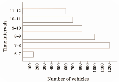
Figure it Out (Page No. 88)
Question 1. How many total cars passed through the crossing between 6 am and noon?
Solution: Total cars passed = 600 + 700 + 800 + 1000 + 1200 + 150 = 4450 cars
Question 2. Why do you think so little traffic occurred during the hours of 6-7 am, as compared to the other hours from 7 am to noon?
Solution: The traffic that occurs during the hours 6-7 am is very little, as it is early morning time and there are very few office goers. Also, there are very few.
Question 3. Why do you think the traffic was the heaviest between 7 am and 8 am?
Solution: 7-8 am is the hour when the maximum number of factory officers and workers use their cars and parents use their cars to drop their children at school.
Question 4. Why do you think the traffic was lesser and lesser each hour after 8 am until noon?
Solution: Because, most of the schools start at 8 am – and many factories also start at 8 am and hence less traffic between 8 am-9 am. Most offices start at 9 am and shops start at 10 am and hence less traffic between 9 am-10 am.
Benefits of NCERT Solutions for Class 6 Maths Chapter 4 Exercise 4.3 Data Handling and Presentation
The solutions help students grasp the key concepts of reading and interpreting bar graphs, simplifying complex data visually.
Vedantu’s solutions provide step-by-step explanations, making it easier for students to understand how bar graphs are organized and how to extract information from them.
The solutions include practical examples to show how bar graphs are used in real-life situations, enhancing students' understanding of data presentation.
These solutions help students practice questions related to bar graphs, improving their analytical skills and preparing them effectively for exams.
Class 6 Maths Chapter 4: Exercises Breakdown
Important Study Material Links for Class 6 Maths Chapter 4 - Data Handling and Presentation
Conclusion:
Class 6 Maths Chapter 4 Exercise 4.3 - Bar Graphs helps students master the skills of reading, organizing, and interpreting data through bar graphs. While it mainly focuses on understanding how to analyze bar graphs, it also introduces the basics of drawing them. Vedantu’s Revision Notes for this exercise provide easy-to-follow explanations, ensuring students grasp these concepts effectively. The notes offer a structured approach to learning bar graphs, making it easier for students to revise and prepare for exams. With Vedantu’s revision notes, students can confidently work with bar graphs and improve their data interpretation skills for academic success.
Chapter-wise NCERT Solutions Class 6 Maths
After familiarising yourself with the Class 6 Maths Chapters Question Answers, you can access comprehensive NCERT Solutions from all Class 6 Maths textbook chapters.
Related Important Links for Class 6 Maths
Along with this, students can also download additional study materials provided by Vedantu for Maths Class 6-

FAQs on NCERT Solutions For Class 6 Maths Chapter 4 Data Handling And Presentation Exercise 4.3 - 2026-27
1. Where can I find the correct and detailed NCERT Solutions for Class 6 Maths Chapter 4, Data Handling and Presentation?
You can find reliable and easy-to-understand NCERT Solutions for Class 6 Maths Chapter 4 on Vedantu. These solutions are prepared by expert teachers and provide step-by-step methods for solving all the problems as per the CBSE 2026-27 syllabus, covering topics like tally marks, pictographs, and bar graphs.
2. What is the correct method for organising data using tally marks as required in Chapter 4 exercises?
To correctly organise data using tally marks, follow these steps:
Create a table with three columns: the category of data, tally marks, and frequency (count).
For each data point, draw a vertical line (|) in the tally marks column next to the corresponding category.
For every fifth data point in a category, draw a diagonal line across the previous four vertical lines (
||||).Finally, count the tally marks for each category and write the total number in the frequency column. This systematic approach is essential for solving NCERT problems accurately.
3. How do you solve problems involving a pictograph in the NCERT Class 6 Maths textbook?
To solve problems with a pictograph, first, look for the key or scale. The key tells you what quantity each symbol represents (e.g., 1 symbol = 10 books). To find the value for a category, count the number of symbols and multiply it by the key's value. For partial symbols, calculate their value proportionally. This method ensures you interpret the data correctly for all questions in the exercise.
4. What are the key steps to correctly draw a bar graph for a given dataset as per the NCERT guidelines?
To draw a bar graph accurately for NCERT solutions, follow these steps:
Draw two perpendicular lines: the horizontal axis (X-axis) and the vertical axis (Y-axis).
Label the X-axis with the data categories (e.g., subjects, months) and the Y-axis with the numerical values.
Choose a suitable scale for the Y-axis (e.g., 1 unit = 5 marks). The scale should cover the highest data value.
Draw rectangular bars of uniform width on the X-axis, with equal spacing between them.
The height of each bar should correspond to the numerical value of its category, according to the chosen scale.
5. Why is choosing the right scale so important when solving problems that require drawing a bar graph in Chapter 4?
Choosing the right scale is crucial because it determines the clarity and accuracy of the bar graph. An inappropriate scale can make the graph misleading. For instance, a scale that is too large will make all the bars look very short and similar, hiding the actual differences in data. A scale that is too small might make the graph too large to fit on the page. A well-chosen scale ensures the graph is easy to read and correctly represents the data comparisons, which is a key requirement for scoring full marks.
6. When solving NCERT problems, how do I decide whether to use a pictograph or a bar graph to represent data?
The choice depends on the nature of the data and the question's objective. Use a pictograph when the data can be easily represented by symbols and the numbers are simple multiples of a key value. It is visually appealing for smaller datasets. Use a bar graph when you need to show precise comparisons between different categories, especially with larger or more complex numbers. Bar graphs are generally more accurate and versatile for data analysis in exams.
7. Why are tally marks grouped in fives (||||)? How does this method help in solving data handling problems?
Tally marks are grouped in fives because it makes counting large amounts of data much faster and less prone to errors. Instead of counting individual strokes (1, 2, 3, 4, 5...), you can quickly count in blocks of five (5, 10, 15...). This bundling technique simplifies the process of finding the total frequency for each category, which is a fundamental step in organising data to create tables, pictographs, or bar graphs as required in Chapter 4.
8. How do I interpret a bar graph to find the category with the maximum or minimum value in the exercises?
To find the category with the maximum value, simply look for the longest or tallest bar on the graph. The category corresponding to this bar has the highest value. Conversely, to find the category with the minimum value, look for the shortest bar. This visual method of comparison is the main advantage of a bar graph and the correct approach to answer such questions in your NCERT exercises.
9. How does mastering the solutions for Data Handling in Chapter 4 help in understanding more advanced concepts later?
Mastering the solutions in this chapter builds a strong foundation in statistics. The skills you learn here, such as organising data, choosing scales, and interpreting graphs, are fundamental for more advanced topics in higher classes. Concepts like frequency distribution, mean, median, mode, and probability all rely on a solid understanding of how to handle and represent data, which begins right here in Class 6 Maths Chapter 4.