Courses
Courses for Kids
Free study material
Offline Centres
More
Store Icon
Store

Statistics Class 9 Notes CBSE Maths Chapter 12 (Free PDF Download)

ffImage
Last updated date: 13th Sep 2024
Total views: 606.3k
Views today: 13.06k

Class 9 Maths Revision Notes for Statistics of Chapter 12 - Free PDF Download

Statistics is a  topic that requires a lot of practice, dedication, and adequate revision. We at Vedantu provide the revision notes for Class 9 Maths Chapter 12 Statistics to help students remember and strengthen their understanding of the chapter's important concepts. These revision notes cover all the major topics of the chapter and are prepared considering the latest CBSE Syllabus. The Class 9 Maths Chapter 12 Statistics revision notes help in revision and benefit students during last-minute exam preparation. Students can download Statistics Class 9 Maths Chapter 12 revision notes through a pdf link provided below.

Topics Covered in Class 9 Maths Chapter 12

  • Introduction to Statistics

  • Collection of Data

  • Presentation of Data

  • Graphical Representation of Data - Bar Graph, Histogram, and Frequency Polygon

Download CBSE Class 9 Maths Revision Notes 2024-25 PDF

Also, check CBSE Class 9 Maths revision notes for all chapters:


Access CBSE Class 9 Maths Chapter 12 – Statistics Notes

Statistics

1. Introduction 

It is a branch in Mathematics related with collection, organisation, analysis and interpretation of data or information is called statistics. 


Statistics is mainly about the communication and analysis of facts and figures using statistical methods. Collection, classification, tabulation, representation, reasoning, testing and drawing inferences are all things done in the statistical method. Graphs, tables, reasoning, estimation and prediction are the means of statistical methods. 


DR. P.K. Bose and Prof. C.R. Rao are eminent Indian statisticians. 


Statistics helps in making predictions and estimates. With the help of figures (data) collected over a period of time, rainfall patterns of a specific city over a given period of time can be analyzed and a fair estimate about next season can be made. 


The word statistics can be used with two meanings. 

  • Collecting data in systematic form and presenting numerical data 

  • Processing the numerical data and finding conclusions 


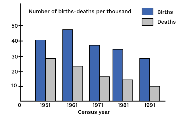
The following figure shows some information about population. See the figure and try to answer the questions below it.


Figure shows some information about population


What information about population does the figure represent? 

  • Find the time interval in which the information has been collected. 

  • The time interval is divided into how many parts? How many years does each part contain? 

  • From the figure can you say that the birth rate is constantly declining? 

  • From the figure can you say that the death-rate is constant declining? 

  • Write the census year which shows the maximum birth rate. How much is it? 

  • Find the time interval in which the death-rate has fallen suddenly. 


We realize that the figure contains a variety of useful information that is easy to understand and analyze and this is what statistics helps us in. 


Today, statistics has become a part of all branches of knowledge that we study or know. It is used to study problems in Biology, Psychology, Economics, Education, Sociology, Trade, Industry etc. 


The statistical method of studying a problem mainly consists of the following steps: 

  • To collect numerical data about the situation or problem 

  • To present the collected data systematically 

  • To analyze the data 

  • To interpret the data and conclude conclusions from it 


The numerical expressions that represent the characteristic of a group (a large number of numerical data) are called measures of central tendency (or averages). 


An average which is used to represent a whole series should not have either the lowest value or the highest value in the group but a value which is somewhere between the two extremities, preferably in the centre, where most of the items of the group cluster. 


There are many types of statistical averages, for example mean, median and mode.


2. Numerical Data and Its Representation 

A class consists of $64$ students. The teacher gives a test in English. The scores each student obtained out of $100$ are as follows:


Table 1

58

38

52

47

16

50

61

37

44

55

38

49

44

52

67

51

33

48

23

51

56

61

46

41

65

43

71

29

50

56

68

25

55

49

44

73

23

63

41

42

66

59

52

28

50

56

60

38

40

73

45

30

47

40


These marks are the numerical data called raw data collected with the purpose of knowing attainment of the class in English.


The way in which the scores are presented hardly gives any idea about attainment of the class in English. It is necessary to present any such numerical data in a systematic manner so as to know some meaning of it. 


There are different methods of presenting numerical data in systematic form.


a. Arranged Data 

Arranged Numerical Data 

In Table $2$ the same data is arranged in ascending order. Observe the table. 


Table 2

14

16

23

23

25

28

29

30

33

37

37

38

38

38

40

40

40

40

40

41

41

42

43

44

44

44

45

46

46

47

47

48

49

49

50

50

50

51

51

52

52

52

55

55

56

56

56

58

58

59

60

61

61

62

63

65

66

67

68

68

71

72

73

73


Information Gathered from the Table: 

The minimum and maximum marks are $14$ and $73$ respectively. Some students have scored equal marks. The score $40$ has occurred five times, which is the maximum repetition. 


Drawbacks of this Method: 

  • The method is very tedious. 

  • Often the numerical data is large and arranging them in the ascending order would take a lot of time. 

  • Even after doing it, we do not get any prominent information from it. 


Therefore to get more information, it becomes necessary to put it in a concentrated form.


b. Ungrouped Frequency Distribution Table 

The table $3$ given below is the ungrouped frequency distribution of the data of table $1$. The table is prepared as follows: 


Start from the smallest number in the data and then write the numbers one below the other till the last. Now to track the repeated occurrence of numbers make a tally mark like this '|' next to that number. The fifth mark is drawn diagonally crossing the first four marks (||||in this way). This makes counting of tally marks easy. Make the sixth tally mark at a small distance from the first five. The total number of tallies or count corresponding to a number in the data is called the frequency of the number. 


Table 3

Tally 

Marks

Frequency

Marks

14

|

1

15


16

|

1

17


18


19


20


21


22


23

||

2

24


25

|

1

26


27


28

|

1


Tally 

Marks

Frequency

Marks

29

|

1

30

|

1

31


32


33

|

1

34


35


36


37

||

2

38

|||

3

39


40

||||

5

41

||

2

42

|

1

43

|

1


Tally 

Marks

Frequency

Marks

44

|||

3

45

|

1

46

||

2

47

||

2

48

|

1

49

||

2

50

|||

3

51

||

2

52

|||

3

53


54


55

||

2

56

|||

3

57


58

|

1


Tally 

Marks

Frequency

Marks

59

|

1

60

|

1

61

||

2

62

|

1

63

|

1

64


65

|

1

66

|

1

67

|

1

68

||

2

69


70


71

|

1

72

||

2

73

||

2


Such a frequency distribution table makes it very easy to observe and also the numerical data is more informative. Just by looking at the table it can be concluded that the number of students scoring marks between $44$ and $58$ is very large. 


Drawback 

The table has a large span. 


This drawback can be removed by creating a grouped frequency distribution table. 


c. Grouped Frequency Distribution Table 

In this method, the numerical data is distributed into convenient groups or classes using tally marks. 


In the table given below, the data is classified into groups $11$ to $20$, $21$ to $30$,….,$71$ to $80$.


Table 4

Class

Tally Marks

Frequency

11-20

||

2

21-30

||||

6

31-40

||||   ||||  |

11

41-50

||||  ||||    ||||  |||

18

51-60

||||  ||||  ||||

14

61-70

||||  ||||

9

71-80

||||

4


Total

64


The Important Points of this Table are: 

  • The method of preparing this type of table is easy. 

  • The numerical data is in a concise form. 

  • The individual nature of the data has disappeared and now the table represents the nature of the group. 

  • With the help of this table, the data can be analysed to some extent. 


3. Some Terms Used in Statistics 

a. Raw Numerical Data 

Table $1$ shows marks of each student in a class. In terms of statistics, they are the scores of individuals of a group. This is the primary information collected. Such information is called Raw numerical data. 


b. Range of the Data 

In table $2$, the numbers are written in order which can be called as the data presented in order. Range of the data is defined as the difference between the largest and the smallest number of the data. The range of data in table $2$ is $73 - 14 = 59$. 


c. Class Limit 

In table $4$, the numerical data are presented dividing into groups. Each of them is called a class. The end values of a class are the limits of the class or the class-limits. The smaller of the two values is called the lower class-limit and the larger is called the upper class-limit. 


d. Class Interval 

Class interval is the range of that class. 


e. Frequency of the Class 

The number of tally marks or count corresponding to a class is called the frequency of the class. 


f. Cumulative Frequency Table 

The cumulative frequency less than the upper limit of a certain class is equal to the sum of the frequency of that particular class and the frequencies of all classes preceding it. 


Table $5$ is a cumulative frequency table prepared from table $4$.


Table 5

Class

Frequency 

(No. of  student)

Cumulative Frequency

(Less than the upper

class limit)

11-20

2

2

21-30

6

2+6=8

31-40

11

8+11=19

41-50

18

19+18=37

51-60

14

37+14=51

61-70

9

51+9=60

71-80

4

60+4=64


Total

64


In this table, the column of cumulative frequency shows the number of scores less than the upper class limit of the corresponding class. Hence such a table is called 'a cumulative frequency less than' table.


Similarly the cumulative frequency more than the lower limit of a class is equal to the sum of the frequency of that particular class and the frequencies of all the class succeeding to it. The table $6$ given below shows the cumulative frequency of this type.


Table $6$

Class

Frequency 

(No. of  student)

Cumulative Frequency

(More than the lower

class limit)

11-20

2

62+2=64

21-30

6

56+6=62

31-40

11

45+11=56

41-50

18

27+18=45

51-60

14

13+14=27

61-70

9

4+9=13

71-80

4

4


In this table, the column of cumulative frequency shows the number of scores more than the lower class limit of the corresponding class. Hence, such a table is called a cumulative-frequency-more-than table.


To frame a table like this, record classes and their corresponding frequencies in a table. Write the cumulative frequencies from bottom to top of the table. The last class is $71$ to $80$ and its corresponding frequency is $4$ so, the cumulative frequency class $71$ to $80$ is $4$. The class preceding is $61$ to $70$ and its frequency is $9$. 


Hence the cumulative frequency of class $71$ to $80$ is $4 + 9 = 13$.


4. Representation of Statistical Data 

Numerical data can be represented in two forms: 

  • Diagrammatic representation 

  • Graphical representation 


a. Diagrammatic Representation 

There are two different forms of diagrammatic representation of numerical data. 

  • Bar diagram 

  • Pie diagram 


b. Graphical representation 

Some graphical methods of representing numerical data are 

  • Histogram 

  • Frequency polygon 

  • Ogive curve 


5. Graphical Representation of Statistical Data 

a. Histogram 

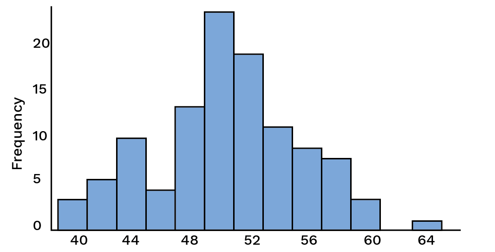
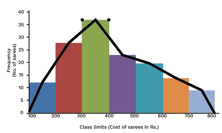
A 2D representation in graphical form of a continuous frequency distribution is known as histogram, also a special type of bar diagram. 


Histogram


A histogram summarizes data pictorially and shows the distribution of the data. They are constructed from a frequency table that is a summary of the data. The general format for a histogram is a vertical scale which demonstrates frequencies and a horizontal scale which represents the individual intervals also known as classes. Bars are used to represent each individual interval where the height of the bar corresponds to the frequency. 


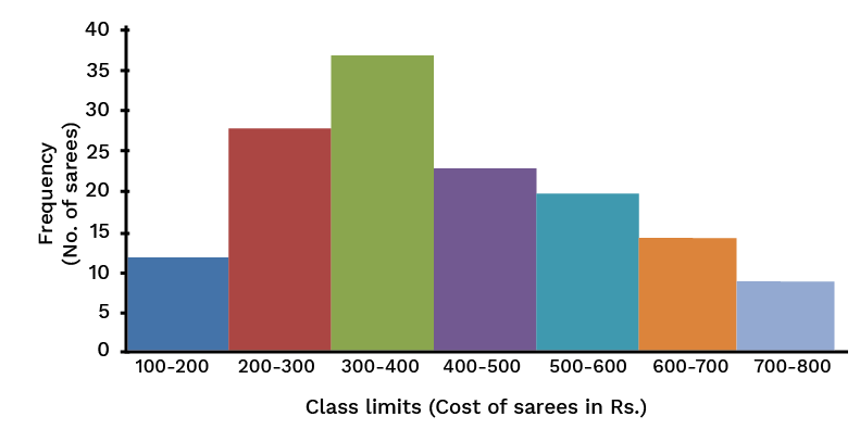
A histogram is drawn by the steps given below. 

  • Draw a grouped frequency distribution table of the given data. 

  • Show class-limits on $X$-axis with a suitable scale. 

  • Show frequencies on $Y$-axis with a suitable scale. 

  • Draw rectangles joined to each other having base equal to the class limits and heights proportional to the frequencies. 


A frequency distribution table is shown below.


Class

(Cost of Saree in

Rs.)


Frequency

(No. of

Sarees sold

in a week)


100-200

12

200-300

28

300-400

37

400-500

23

500-600

20

600-700

14

700-800

09


Example for an Histogram


From the above histogram the following points can be inferred. 

  • It is not necessary that the scale on the $X$-axis and the $Y$-axis be the same, it can be different considering the nature of the data, size of the paper etc and it should look neat and attractive. 

  • The position of origin on the $Y$-axis is according to the scale, which is not so on the $X$-axis. This is indicated by drawing 

    Frequency Polygon
    mark on the $X$-axis near the origin and if necessary, the mark can be made on the $Y$-axis or on both axes. 

  • In a histogram, it is necessary for the adjacent rectangles to be to each other. Therefore, if the given classes are non continuous, it becomes important to make them continuous e.g.; if the classes are $2$ to $5$, $6$ to $9$, $10$ to $13$,…. It should be as $1.5$ to $5.5$, $5.5$ to $9.5$, $9.5$ to $13.5$… 


b. Frequency Polygon 

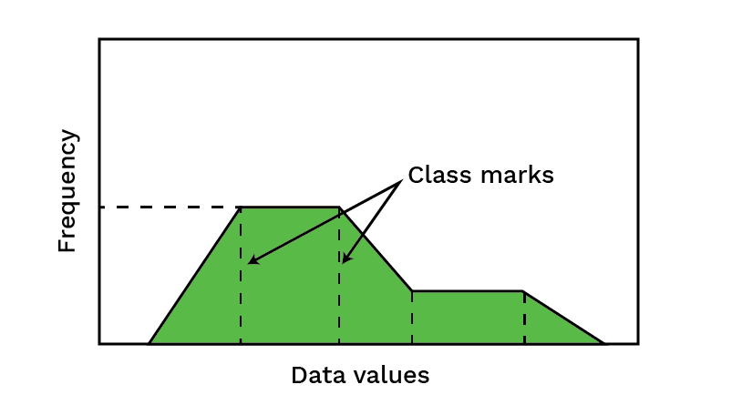
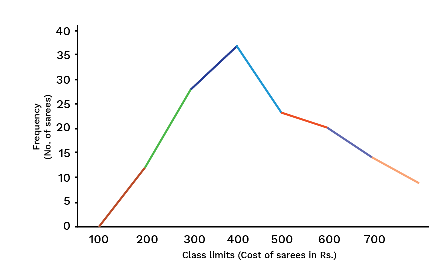
A frequency polygon is a way of picturing data in which the class mark is plotted on the horizontal axis and the frequency of the class on the vertical axis and the points are connected. It is completed by extending the class marks one-class width on either end with a frequency of zero for both.


Frequency Polygon


A frequency polygon can be drawn by following the given steps.


Frequency polygon by method of point plotting


  • First draw a histogram from the given data. 

  • Join all the mid-points of the upper horizontal sides of the rectangles in the histogram in a straight line. 

  • It is assumed that the class before the first class and the class after the last class in the classification exist and the frequency of each of them is zero. Class marks of those classes are combined with the mid-points of the upper horizontal sides of the extreme rectangles of the histogram. 


The figure above is the frequency polygon drawn with the help of the histogram. Observe it carefully. A frequency polygon can also be drawn without drawing a histogram. 


By applying the method of point plotting, a frequency polygon can be drawn as follows:


seo images


6. Recap 

Graphical representation of statistical data implies construction of 


a. Histogram 

Class-intervals on the x-axis and cumulative frequencies on the y-axis, the corresponding rectangles are drawn. 


b. Frequency polygon 

Draw a histogram and then join the midpoints of the rectangles by straight lines. 


7. Arithmetic Mean 

a. Arithmetic Mean for Ungrouped Data 

The arithmetic mean of a set of raw data is the division of the sum of all the values of the variable given by the total number of values.


Let '$n$' be the total number of values and ${x_1}$, ${x_2}$, ${x_3}...{x_n}$ be the values recorded in the data. Then the arithmetic mean is written as follows, 

${\text{Arithmetic Mean}} = \overline x  = \dfrac{{{x_1} + {x_2} + {x_3} + ... + {x_n}}}{n}$ 

or $\overline x  = \dfrac{{\sum {{x_n}} }}{n}$ 


The symbol $\sum $ denotes: ' Sum of '


b. Direct Method for Arithmetic Mean of Ungrouped Data 

In the previous example, all the $50$ marks are not distinct, for example, $3$ students have $7$ marks each, $4$ students have $19$ marks each etc. 


Therefore the sum can be written as

$\sum {{x_n} = 3 \times 7 + 4 \times 19 + ... + 4 \times 91} $ 


Marks

Frequency

$F_i$

$f_{i}x_{i}$

7

3

21

19

4

76

31

5

155

40

7

280

49

9

441

62

7

434

73

6

438

83

5

415

91

4

364


n=50

$\sum {f_{i}x_{i}} = 2624$


Arithmetic Mean $ = \dfrac{{\sum {fx} }}{n} = \dfrac{{2624}}{{50}} = 52.48$ 


c. Direct Method for Arithmetic Mean of Grouped Data 

Example: 

Find the arithmetic mean for the given frequency distribution.


Marks

F

Mid-pt $X_i$

fx

5-15

3

10

30

15-25

4

20

80

25-35

5

30

150

35-45

7

40

280

45-55

9

50

450

55-65

7

60

420

65-75

6

70

420

75-85

5

80

400

85-95

4

90

360


n=50


2590


${\text{Mean}} = \dfrac{{\sum {fx} }}{N}$ 


$ = \dfrac{{2590}}{{50}}$ 


${\text{Mean}} = 51.80$ 


8.For Calculating the Mean Assumed Mean or Short-Cut Method 

a. Short-Cut Method for Ungrouped Data 

In this method, an assumed mean $\left( A \right)$ is taken from the scores, usually about the middle. If there are two middle scores, the one which has the higher frequency is taken as the assumed mean and then the arithmetic mean is obtained by using the formula.


${\text{Mean}} = A + \dfrac{{\sum {fd} }}{{\sum f }}$  


where $A$ is the assumed mean, $d$ is the deviation of $x$ from the assumed mean $A$. 


b.  Shortcut Method for Grouped Data 

In this method, an assumed mean $\left( A \right)$ is taken from the mid-values near about the middle of the table and then the Arithmetic Mean is obtained by using the following formula, 


${\text{Mean}} = A + \dfrac{{\sum {fd} }}{{\sum f }}$


where, '$A$' is the assumed mean, '$d$' is the deviation of '$x$' from assumed mean '$A$'.


c. Step-Deviation Method 

According to this method, 


${\text{Mean}} = A + \dfrac{{\sum {fd} }}{{\sum f }} \times i$


where, $A = {\text{Assumed Mean}}$, $u = \dfrac{{x - A}}{i}$ and

$i = {\text{class size}}$ [i.e., upper limit - lower limit] 


d. Median and Mode 

Median 

When the given statistical data is arranged in ascending or descending order of their values, then the value of the middle term is called the median.


Let '$n$' be the number of scores in ascending or descending order. 


Then, ${\text{Median = }}{\left( {\dfrac{n}{2} + 1} \right)^{th}}term$, '$n$' is odd

${\text{Median = }}\dfrac{{{{\left( {\dfrac{n}{2}} \right)}^{th}}term + {{\left( {\dfrac{n}{2} + 1} \right)}^{th}}term}}{2}$, when '$n$' is even


Mode 

The number which appears the highest times in the given statistical data is called mode or it is the number whose frequency is maximum.

Key Features of Statistics Class 9 Maths Chapter 12 Revision Notes

  • It will help students revise all the chapter's major concepts easily and quickly.

  • These notes are prepared in a simple language, so students can easily understand them.

  • It is considered a useful resource to prepare the chapter Statistics effectively for the upcoming Class 9 Maths exam.

  • Referring to Class 9 Maths Chapter 12 notes helps students to analyse which topic they need to focus more on. 

  • All relevant formulas of the chapter are explained with simple examples in Class 9 Maths Chapter 12 notes free pdf.

Extra Questions for Practice

  1. If the mean of five observations are given as x, x + 2, x + 4, x + 6, and x + 8 is 11, then find  the value of x.

  2. Calculate the mean of the first 10 natural numbers.

  3. In a Hindi test given to 15 students of Class 9, the following marks (out of 100) are recorded: 41, 39, 48, 52, 46, 62, 54, 40, 96, 52, 98, 40, 42, 52, 60. Find the mean, median, and mode of this data. 

  4. Find the range of the following data : 25, 18, 20, 22, 16, 6, 17, 15, 12, 30, 32, 10, 19, 8, 11, 20

  5.  Calculate the class mark of an interval 90 – 120.


These Class 9 Maths Chapter 12 Statistics notes are useful for students during revision. Students can recall all the important concepts of the chapter they have learned by going through these notes. Thus, it will help them to save time during exams, and they will also get all the important topics the chapter compiled in one place.


Key Features of Statistics Class 9 Maths Chapter 12 Revision Notes

  • It will help students revise all the chapter's major concepts easily and quickly.

  • These notes are prepared in a simple language, so students can easily understand them.

  • It is considered a useful resource to prepare the chapter Statistics effectively for the upcoming Class 9 Maths exam.

  • Referring to Class 9 Maths Chapter 12 notes helps students to analyse which topic they need to focus more on. 

  • All relevant formulas of the chapter are explained with simple examples in Class 9 Maths Chapter 12 notes free pdf.


Conclusion

For an enhanced comprehension of this subject, NCERT - Class 9 Maths Chapter 12 “Statistics”, thoughtfully prepared by experienced educators at Vedantu is your invaluable companion. These notes break down the complexities of Statistics into easily digestible sections, helping you grasp new concepts, master formulas, and navigate through questions effortlessly and quickly at the last minute as well. By immersing yourself in these notes, you not only prepare for your studies more efficiently but also develop a profound understanding of the subject matter.

FAQs on Statistics Class 9 Notes CBSE Maths Chapter 12 (Free PDF Download)

1. What is the meaning of Statistics according to NCERT Solutions for Chapter 12 of Class 9 Maths?

Statistics is a branch of Mathematics that deals with a large number of given raw data and is associated with the collection, arrangement, tabulation, calculation, interpretation, and finally, the analysis of that data. These processes are carried out by certain pre-developed statistical tools and methods that help the users efficiently conduct their analysis. In Class 9, you will be introduced to this concept and must concentrate on it properly to solve the problems accurately.

2. What is raw data in Chapter 12 of Statistics of Class 9?

When it comes to statistics, you will come across the term raw or numerical data. This is the original or primary data that the researcher collects.  Raw data is unarranged scores of a group or an individual. Raw data must be arranged and interpreted for detailed analysis and present a conclusion easily understood by the general population. You can refer to the Vedantu app or website for more information on Chapter 12 of Class 9 Maths.

3. According to Chapter 12 of Class 9 Maths, what is the class boundary?

In Statistics, when you have a set of data, you also have lower limits and upper limits to the class from that data set. Now these upper and lower limits are nothing but the two ends of an entire set of scores or values given for analysis. The average is calculated for these two limits then what you will get is the class boundary. This important aspect of statistical analysis helps you interpret and draw results.

4. What is the range of data according to Chapter 12 of Class 9 Maths?

You will learn about the data range when you study the Statistics chapter from Class 9 Maths Chapter 12 regions notes provided by Vedantu. This data is nothing but the scores and values that are primarily collected for interpretation. Now, this data is not endless. They have a starting and ending point. When you are given raw data, you need first to arrange that data properly, and then you will notice the two extreme limits of that data set. The entire data between these limits is called the range of data in statistics.

5. How are frequency polygons drawn in Statistics?

In Statistics, frequency polygons can be drawn independently without drawing histograms. For this, you just need the midpoints of the class intervals used in the data. The midpoints of the class intervals are also known as class marks. To find the class marks, you just need to calculate the sum of the upper and the lower limit of a class- interval and divide it by 2.