


Draw the histogram of the following data:
Height of student(m) 135 - 140 140 - 145 145 - 150 150-155 No. of students 4 12 16 8
| Height of student(m) | 135 - 140 | 140 - 145 | 145 - 150 | 150-155 |
| No. of students | 4 | 12 | 16 | 8 |
Answer
614.7k+ views
Hint: We start solving the problem by analyzing the data given in the problem. We then decide what to be taken in x-axis and y-axis to draw a histogram. We check the frequency to take the scale on x and y-axes to plot. After checking all these factors, we draw the histogram.
Complete step by step answer:
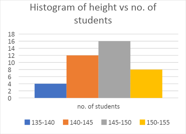
According to the problem, we need to draw the histogram for the given data which is listed in the table below:
Before drawing the histogram, we find the frequency of height of the students to take as scale on the x-axis.
We can see that the interval of 5m is taken to count the no. of students that lie in that interval. So, we scale on the x-axis as 1cm = 5m.
We take scale on the y-axis as 1cm = 2 to distribute the given date.
We take the height of the students on the x-axis and no. of students on the y-axis.
Now, we draw the histogram for the given data present in the table.
So, the histogram is as follows:
Note: We should not confuse histogram with bar graph as we take distance between bars bar graph which doesn’t in histogram. Histograms give a better idea about data to analyze than bar and other graphs. Most of the histograms follow normal distribution. We can also expect problems to draw bar graphs, pie charts for a given data.
Complete step by step answer:
According to the problem, we need to draw the histogram for the given data which is listed in the table below:
| Height of students(m) | 135 - 140 | 140 - 145 | 145 - 150 | 150-155 |
| No. of students | 4 | 12 | 16 | 8 |
Before drawing the histogram, we find the frequency of height of the students to take as scale on the x-axis.
We can see that the interval of 5m is taken to count the no. of students that lie in that interval. So, we scale on the x-axis as 1cm = 5m.
We take scale on the y-axis as 1cm = 2 to distribute the given date.
We take the height of the students on the x-axis and no. of students on the y-axis.
Now, we draw the histogram for the given data present in the table.
So, the histogram is as follows:
Note: We should not confuse histogram with bar graph as we take distance between bars bar graph which doesn’t in histogram. Histograms give a better idea about data to analyze than bar and other graphs. Most of the histograms follow normal distribution. We can also expect problems to draw bar graphs, pie charts for a given data.
Recently Updated Pages
Master Class 12 Business Studies: Engaging Questions & Answers for Success
Master Class 12 Biology: Engaging Questions & Answers for Success
Master Class 12 Chemistry: Engaging Questions & Answers for Success
Class 12 Question and Answer - Your Ultimate Solutions Guide
Master Class 11 Social Science: Engaging Questions & Answers for Success
Master Class 11 English: Engaging Questions & Answers for Success
Trending doubts
What is BLO What is the full form of BLO class 8 social science CBSE
What are the 12 elements of nature class 8 chemistry CBSE
Citizens of India can vote at the age of A 18 years class 8 social science CBSE
Right to vote is a AFundamental Right BFundamental class 8 social science CBSE
Advantages and disadvantages of science
Full form of STD, ISD and PCO