Courses
Courses for Kids
Free study material
Offline Centres
More
Store Icon
Store

NCERT Solutions for Class 7 Maths Chapter 3 Data Handling Ex 3.3

ffImage

NCERT Solutions for Class 7 Maths Chapter 3 (EX 3.3)

NCERT Solutions for Class 7 Maths Chapter 3 - Data Handling Exercise 3.3 provide clear and concise explanations of data representation methods. This exercise focuses on bar graphs, double bar graphs, and their interpretation. Understanding these concepts is crucial as they form the foundation for data analysis, an important skill in mathematics and real-life applications.

toc-symbol
Table of Content
1. NCERT Solutions for Class 7 Maths Chapter 3 (EX 3.3)
2. Glance on NCERT Solutions Class 7 Maths Chapter 3 Exercise 3.3 | Vedantu
3. Access NCERT Solutions for Maths Class 7 Chapter 3 - Data Handling Exercise 3.3
4. Conclusion
5. Class 7 Maths Chapter 3: Exercises Breakdown
6. CBSE Class 7 Maths Chapter 3 Other Study Materials
7. Chapter-Specific NCERT Solutions for Class 7 Maths
8. Important Related Links for NCERT Class 7 Maths
FAQs


The solutions emphasize important points such as how to accurately draw and interpret bar graphs. Special attention is given to comparing different sets of data using double bar graphs. Students should focus on practicing these problems to build a strong understanding of data representation and analysis techniques. These solutions by Vedantu ensure that students grasp the essential concepts effectively.

Glance on NCERT Solutions Class 7 Maths Chapter 3 Exercise 3.3 | Vedantu

  • NCERT Solutions Maths Chapter 3 Exercise 3.3 Class 7 covers and focuses on data handling, including organizing and interpreting data using bar graphs.
  • Utilizes basic mathematical operations for data analysis and interpretation.

  • Interpret data effectively using two popular methods:

  1. Bar graphs

  2. Pictographs

  • There are links to video tutorials explaining class 7 chapter 3 Exercise 3.3 - Data Handling  for better understanding.

  • There are three examples and 6 questions covered in NCERT Class 7th Maths Chapter 3 Exercise 3.3 Data Handling

Access NCERT Solutions for Maths Class 7 Chapter 3 - Data Handling Exercise 3.3

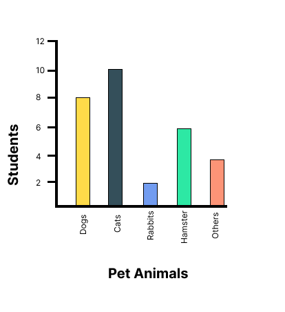
1. Use the bar graph to answer the following questions:


pet animals


(a) Which is the most popular pet?

Ans: Since the bar representing cats is the tallest, Cat is the most popular pet.

(b) How many students have dog as a pet?

Ans: From the bar graph, 8 students have a dog as a pet.


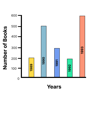
2. Read the bar graph which shows the number of books sold by a bookstore during five consecutive years and answer the following questions:


the bar graph which shows the number of books sold by a bookstore during five consecutive years


(i) About how many books were sold in 1989? 1990? 1992?

Ans: (a) In 1989, 180 books were sold.

(b) In 1990, 475 books were sold.

(c) In 1992, 225 books were sold.


(ii) In which year were about 475 books sold? About 225 books sold?

Ans: From the graph, in 1990, about 475 books were sold and in 1992, about 225 books were sold.


(iii) In which years were fewer than 250 books sold?

Ans: From the graph, it can be concluded that in 1989 and 1992 fewer than 250 books were sold.


(iv) Can you explain how you would estimate the number of books sold in 1989?

Ans: From the graph, it can be concluded that the number of books sold in the year 1989 is about 1 and \[\dfrac{3}{4}{\text{th }}\] part of \[{\text{1cm}}\].

We know that the scale is taken as \[{\text{1cm }} = {\text{ 100 books}}\].

\[100 + \dfrac{3}{4} \times 100 = 100 + 75 = 175\]

Therefore, about 175 books were sold in the year 1989.


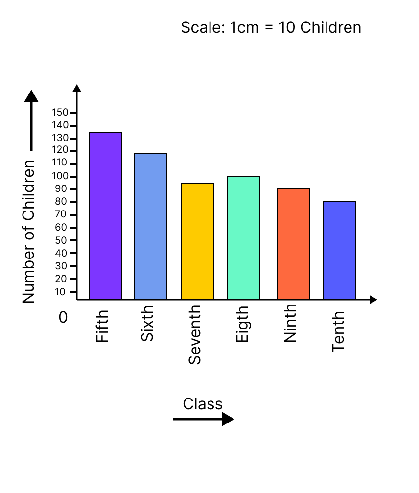
3. Number of children in six different classes are given below. Represent the data on a bar graph.

Class

Fifth

Sixth

Seventh

Eighth

Ninth

Tenth

No.of children

135

120

95

100

90

80


(a) How would you choose a scale?


ifference between the number of students of class 7th and that of class 9th by this scale


Ans: We will choose a scale as 1 unit = 10 children because we can represent a more clear difference between the number of students of class 7th and that of class 9th by this scale.


(b) Answer the following questions:

(i) Which class has the maximum number of children? And the minimum?

Ans:  Since the bar representing the number of children for class fifth is the tallest, there are maximum number of children in class fifth. Similarly, since the bar representing the number of children for class tenth is the smallest, there are minimum number of children in class tenth.


(ii) Find the ratio of students of class sixth to the students of class eighth.

Ans: The number of students in class sixth is 120 and the number of students in class eighth is 100.

Therefore, the ratio \[{\text{ = }}\dfrac{{{\text{the number of students of class sixth}}}}{{{\text{the number of students of class eighth}}}}\]

\[ = \dfrac{{120}}{{100}} = \dfrac{6}{5} = 6:5\]


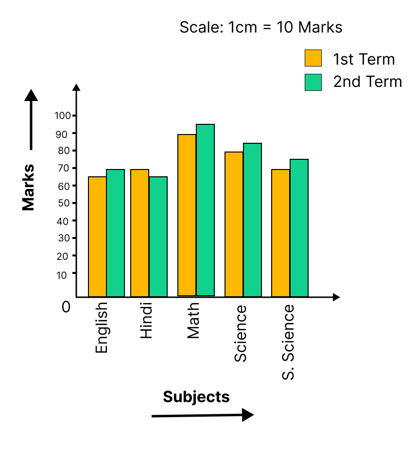
4. The performance of a student in \[{1^{st}}\] term and \[{2^{nd}}\] term is given. Draw a double bar graph choosing appropriate scale and answer the following:

Subject

English

Hindi

Maths

Science

S.Science

1st term

67

72

88

81

73

2nd term

70

65

95

85

75


The difference of marks in both terms of each subject


The difference of marks in both terms of each subject.

English \[ = 70 - 67 = 3\]

Hindi \[ = 65 - 72 =  - 7\]

Maths \[ = 95 - 88 = 7\]

Science \[ = 85--81 = 4\]

S. Science \[ = 75--73 = 2\]


(i) In which subject has the child improved his performance the most?

Ans: There was a maximum increase in the marks obtained in Maths, which is 7 marks. Therefore, the child has improved his performance the most in Maths.

(ii) In which subject is the improvement the least?

Ans: From the graph, it can be concluded that he only improved 2 marks in S.Science. Therefore, the improvement was the least in S. Science.

(iii) Has the performance gone down in any subject?

Ans: From the graph, it can be observed, in Hindi his marks decreased from 72 to 65. Therefore, in Hindi, his performance has gone down.


5. Consider this data collected from a survey of a colony.

Favourite sport

Cricket

Basket

Ball

Swimming

Hockey

Athletics

Watching

1240

470

510

423

250

Participating

620

320

320

250

105


(i) Draw a double bar graph choosing an appropriate scale. What do you infer from the bar graph?

Ans: A double bar graph for the given data is as follows.


The double bar graph represents the number of people who like watching and participating in different sports


The double bar graph represents the number of people who like watching and participating in different sports. It can be observed that most of the people like watching and participating in cricket while the least number of people like watching and participating in athletics.


(ii) Which sport is most popular?

Ans: From the bar graph, it can be observed that the bar representing the number of people who like watching and participating in cricket is the tallest among all the bars. Hence, cricket is the most popular sport.


(iii) Which is more preferred, watching or participating in sports?

Ans: The bars representing watching sport are longer than the bars representing participating in sport. Hence, watching different types of sports is more preferred than participating in the sports.


6. Take the data giving the minimum and the maximum temperature of various cities given in the beginning of this Chapter. Plot a double bat graph using the data and answer the following:

Temperatures of the cities on 20.6.2006

City

Ahmedabad

Amritsar

Bangalore

Chennai

Max.

Min.

\[{38^ \circ }{\text{C}}\]

\[{37^ \circ }{\text{C}}\]

\[{28^ \circ }{\text{C}}\]

\[{36^ \circ }{\text{C}}\]

\[{29^ \circ }{\text{C}}\]

\[{26^ \circ }{\text{C}}\]

\[{21^ \circ }{\text{C}}\]

\[{27^ \circ }{\text{C}}\]

City

Delhi

Jaipur

Jammu

Mumbai

Max.

\[{38^ \circ }{\text{C}}\]

\[{39^ \circ }{\text{C}}\]

\[{41^ \circ }{\text{C}}\]

\[{32^ \circ }{\text{C}}\]

Min.

\[{28^ \circ }{\text{C}}\]

\[{29^ \circ }{\text{C}}\]

\[{26^ \circ }{\text{C}}\]

\[{27^ \circ }{\text{C}}\]


(i) Which city has the largest difference in the minimum and maximum temperature on the given data?

Ans: A double bar graph for the given data is constructed as follows.


From the graph, it can be concluded that Jammu has the largest difference in its minimum and maximum temperatures on 20.6.2006.


From the graph, it can be concluded that Jammu has the largest difference in its minimum and maximum temperatures on 20.6.2006.

i.e. Maximum temperature \[ = \]\[{41^ \circ }{\text{C}}\] Minimum temperature \[ = \]\[{26^ \circ }{\text{C}}\]

Therefore, Difference \[ = {41^ \circ }{\text{C}} - {26^ \circ }{\text{C = }}{15^ \circ }{\text{C}}\]


(ii) Which is the hottest city and which is the coldest city?

Ans: From the graph, it can be concluded that Jammu is the hottest city due to maximum temperature and Bangalore is the coldest city due to lowest minimum temperature.


(iii) Name two cities where maximum temperature of one was less than the minimum temperature of the order.

Ans: Bangalore and Jaipur, Bangalore and Ahmedabad.

For Bangalore, the maximum temperature was \[{28^ \circ }{\text{C}}\], while minimum temperature of both cities, Ahmedabad and Jaipur, was \[{29^ \circ }{\text{C}}\].


(iv) Name the city which has the least difference between its minimum and the maximum temperature.

Ans: From the graph, it can be concluded that the city which has the least difference between its minimum and maximum temperatures is Mumbai.

i.e. Maximum temperature \[ = {32^o}{\text{C}}\]Minimum temperature \[ = {27^o}{\text{C}}\]

Therefore, Difference \[ = {32^o}{\text{C}} - {27^o}{\text{C}} = {5^o}{\text{C}}\]


Conclusion

The NCERT Solutions for Maths Exercise 3.3 of Class 7 Chapter 3 on Data Handling focuses on teaching students how to organize and interpret data using various methods like bar graphs and pictographs. Important points include understanding how to collect data, create frequency tables, and represent data visually. It’s crucial to focus on the steps of drawing and interpreting bar graphs. Emphasizing data interpretation and graph creation. Practicing these concepts will help build a strong foundation in data handling.

Class 7 Maths Chapter 3: Exercises Breakdown

Exercises

Number of Questions

Exercise 3.1

9 Questions and Solutions 

Exercise 3.2

5 Questions and Solutions


CBSE Class 7 Maths Chapter 3 Other Study Materials


Chapter-Specific NCERT Solutions for Class 7 Maths

Given below are the chapter-wise NCERT Solutions for Class 7 Maths. Go through these chapter-wise solutions to be thoroughly familiar with the concepts.


Important Related Links for NCERT Class 7 Maths

Access these essential links for NCERT Class 7 Maths, offering comprehensive solutions, study guides, and additional resources to help students master language concepts and excel in their exams.


FAQs on NCERT Solutions for Class 7 Maths Chapter 3 Data Handling Ex 3.3

1. Where can I obtain NCERT Solutions for Class 7 Maths Chapter 3 Data Handling (EX 3.3) Exercise 3.3  standard objective questions?

Experts created these standard questions for  NCERT Solutions for Class 7 Maths Chapter 3 Data Handling (EX 3.3) Exercise 3.3  in accordance with the CBSE syllabus (2024-25) and NCERT recommendations. Vedantu offers chapter-by-chapter multiple-choice questions to help all students learn the material fully and perform better on tests.

2. What do you mean when you say that Data is represented graphically?

A graph shows data in a categorized manner. It makes the data simple for us to understand. A collection of numerical figures gathered through research is called data. The gathered information is then organized, summarised, categorises, and finally represented graphically. This is the idea behind graphical data representation to get more information we can refer to the notes created by Vedantu’s experienced teachers which are designed to help students understand and retain the material they are studying. The notes are often interactive, with examples and practice problems included to help students apply what they have learned.

3. What are the different types of Graphs used in  NCERT Solutions for Class 7 Maths Chapter 3 Data Handling (EX 3.3) Exercise 3.3 for data representation?

The different types of Graphs that can be used for data representation are:

  • Bar Graph

  • Column Chart

  • Line Graph

  • Dual Axis Chart

  • Area Chart

  • Stacked Bar Graph

  • Mekko Chart

  • Pie Chart

Graphs are a powerful tool for representing and visualizing data. Different types of graphs are used to represent different types of data and to convey different types of information and with the help of Vedantu provides students with a wide range of educational resources, including practice problems, video lessons, and interactive quizzes. These resources can be used to supplement classroom instruction and help students solidify their understanding of key concepts.

4. What is Ratio and it is important in NCERT Solutions for Class 7 Maths Chapter 3 Data Handling (EX 3.3) Exercise 3.3?

A ratio is a mathematical comparison of two or more values. It is usually expressed as a fraction or a decimal, and it represents the relationship between the values in terms of size or quantity. Ratios can be used to compare quantities of different units A ratio can also be used to compare parts of a whole. It's also important to know that when a ratio is equal to 1, it means that the two quantities are equal in value. So because of its various application, it is used very often in  NCERT Solutions for Class 7 Maths Chapter 3 Data Handling (EX 3.3) Exercise 3.3

5. Define Double Bar-Graph.

A Double bar graph is a visual representation of data that uses two parallel bars of varying heights. The bars can be set up either horizontally or vertically. Two sets of data can be compared using a double-bar graph.

The axes in a double bar graph are two. A double bar graph's x-axis displays the comparison categories, and the y-axis shows the scale.

6. What topics are covered in class 7 maths chapter 3 exercise 3.3 solutions?

Exercise 3.3 focuses on data handling, specifically on interpreting data using bar graphs and pictographs.

7. How do you interpret data presented in bar graphs in class 7 maths exercise 3.3?

To interpret data in bar graphs, observe the height of the bars to understand the frequency or quantity represented for each category.

8. What is the purpose of using pictographs in class 7 maths ex 3.3?

Pictographs help in representing data visually using pictures or symbols to make it easier to understand and interpret.

9. Can you explain how to draw a bar graph for the data given in Exercise 3.3?

Sure, to draw a bar graph, first, label the categories on the horizontal axis and the corresponding frequencies or quantities on the vertical axis. Then, draw bars for each category with heights proportional to the data values.

10. How do you compare data using bar graphs and pictographs in Exercise 3.3?

In bar graphs, compare the heights of bars directly, while in pictographs, compare the number of pictures or symbols used to represent each category.

11. What are the common mistakes to avoid while interpreting data in class 7 exercise 3.3?

Common mistakes include misreading the scale, misinterpreting the data represented by each bar or picture, and overlooking key details in the graph or pictograph.

12. How can I improve my skills in data interpretation for class 7th maths exercise 3.3 solutions ?

Practice analyzing different types of data representations, pay attention to details, and verify your interpretations to ensure accuracy.