Courses
Courses for Kids
Free study material
Offline Centres
More
Store Icon
Store

NCERT Solutions For Class 8 Maths Chapter 4 Data Handling Exercise 4.1 - 2025-26

ffImage
banner
widget title icon
Latest Updates

NCERT Solutions For Class 8 Maths Chapter 4 Data Handling Exercise 4.1 - 2025-26

NCERT Solutions for class 8 chapter 4 Maths Ex 4.1, Data Handling, focuses on teaching students how to collect, organize, and interpret data effectively. This chapter is crucial as it lays the foundation for understanding various data representation methods, such as bar graphs, histograms, and pie charts, which are essential for solving real-world problems.

toc-symbolTable of Content
toggle-arrow


Class 8 Maths Exercise 4.1 Solutions PDF provides practical application of these concepts, offering problems that help students practice organizing and interpreting data. Understanding the proper methods to solve the NCERT solutions for Class 8 Maths will help students tackle different types of exam questions. Mastery of these solutions will enhance their problem-solving speed and boost their self-confidence, as highlighted by Vedantu.


Formula Used in Class 8 Chapter 4 Exercise 4.1 

  • Mean (Average): Mean = $\dfrac{\sum observations}{number of observations}$

Access NCERT Solutions for Class 8 Maths Chapter 4 Data Handling Exercise 4.1

1. A survey was made to find the type of music that a certain group of young people liked in a city. The pie chart shows the findings of this survey. From this pie chart, answer the following: 


Pie chart Representing type of Music


Pie chart Representing type of Music


(i) If \[{\mathbf{20}}\] people liked classical music, how many young people were surveyed?

Ans: In this part it is given that 20 people liked classical music and we have to find the total number of people who were surveyed.

So, from a given pie chart it is given that \[10\% \] peoples like classical music.

Let the total number of people who were surveyed be $x$.

So, \[10\% \] of $x$ must be equal to \[20\].

That is,

$x \times \frac{{10}}{{100}} = 20$

$\frac{x}{{10}} = 20$

By cross multiplication we get,

$x = 200$

So, \[200\] young people were surveyed.


(ii) Which type of music is liked by the maximum number of people? 

Ans: In this part we have to find which type of music is liked by the maximum number of people.

So, from the given pie chart it is clear that light music is liked by the maximum number of people (\[40\% \]of the total number of people which is maximum in all categories).


(iii) If a cassette company were to make \[{\mathbf{1000}}\] CDs, how many of each type would they make?

Ans: In this part it is given that if a cassette company were to make \[100\] CDs, then how many of each type would they make?


For CDs of classical music:$$

Cassette Company has to make \[10\% \]CDs of classical music.

That is, \[10\% \]of the total number of CDs.

Let, \[x\]be the number of classical music CDs made by the company.

So,

$x = 1000 \times \frac{{10}}{{100}}$

$x = 100$

That is, the number of classical music CDs made by the company is\[100\].


For CDs of semi classical music:

Cassette Company has to make \[20\% \] CDs of semi classical music.

That is, \[20\% \] of the total number of CDs.

Let, \[y\] be the number of semi classical music CDs made by the company.

So, $y = 1000 \times \frac{{20}}{{100}}$

 $y = 200$

That is, the number of semi classical music CDs made by the company is \[200\].


For CDs of light music:

Cassette Company has to make \[40\% \] CDs of light music.

That is, \[40\% \]of the total number of CDs.

Let, \[z\] be the number of light music CDs made by the company.

So, $z = 1000 \times \frac{{40}}{{100}}$

$z = 400$

That is, the number of light music CDs made by the company is\[400\].


For CDs of Folk music:

Cassette Company has to make \[30\% \] CDs of Folk music.

That is, \[30\% \]of the total number of CDs.

Let $t$ be the number of Folk music CDs made by the company.

So, $t = 1000 \times \frac{{30}}{{100}}$

$t = 300$

That is, the number of Folk music CDs made by the company is \[300\].


2. A group of \[{\mathbf{360}}\] people were asked to vote for their favorite season from the three seasons: rainy, winter, and summer.

Season

No. of Votes

Summer

\[90\]

Rainy

\[120\]

Winter

\[150\]


(i) Which season got the most votes?

Ans: From the given table it is clear that winter season got the most votes

That is,\[150\]votes.


(ii) Find the central angle of each sector.

Ans: In this part we have to find the central angle of each sector. That is the angle made by each sector at the Centre of circle or pie chart.

So, the total number of votes is \[360\].

Therefore, the central angle of summer season$ = \frac{{90 \times {{360}^ \circ }}}{{360}}$

\[ = 90\]

The central angle of rainy season $ = \frac{{120 \times {{360}^ \circ }}}{{360}}$

\[ = {\text{ }}120\]

The central angle of winter season \[\]$ = \frac{{150 \times {{360}^ \circ }}}{{360}}$

\[ = {\text{ }}150\]


(iii) Draw a pie chart to show this information.

Ans: To draw the pie chart we use the central angle which is calculated in the part (i) of this question.

The pie chart of the following data is as follows:


Pie chart representing favorite seasons of people


Pie chart representing favorite seasons of people


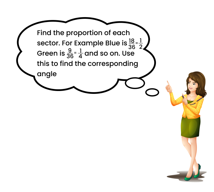
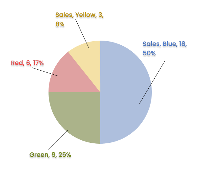
3. Draw a pie chart showing the following information. The table shows the colours preferred by a group of people.


Find the Proportion of each sector


Colours

Number of People

Blue

Green

Red

Yellow

\[{\mathbf{18}}\]

0

\[{\mathbf{6}}\]

\[{\mathbf{3}}\]

Total

\[{\mathbf{36}}\]


Ans: To draw the pie chart of the following information we have to calculate the central angle of each sector first.

Total central angle \[ = 360\]

Total number of people \[ = {\text{ }}36\]

So, the central angle of Blue colour$ = \frac{{18 \times {{360}^ \circ }}}{{36}}$

$ = {180^ \circ }$

The central angle of Green colour$ = \frac{{9 \times {{360}^ \circ }}}{{36}}$

$ = {90^ \circ }$

The central angle of Red colour$ = \frac{{6 \times {{360}^ \circ }}}{{36}}$

$ = {60^ \circ }$

The Central angle of Yellow colour$ = \frac{{3 \times {{360}^ \circ }}}{{36}}$

$ = {30^ \circ }$

The pie chart is as follows:


Pie chart representing colours preferred by a group of people


Pie chart representing colours preferred by a group of people


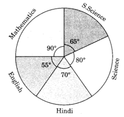
4. The adjoining pie chart gives the marks scored in an examination by a student in Hindi, English, Mathematics, Social Science and Science. If the total marks obtained by the students were\[{\mathbf{540}}\], answer the following questions: 


Pie chart representing the marks scored


Pie chart representing the marks scored


(i) In which subject did the student score \[{\mathbf{105}}\] marks? 

(Hint: for \[{\mathbf{540}}\] marks, the central angle =\[{\mathbf{360}}\]. So, for \[{\mathbf{105}}\] marks, what is the central angle?)

Ans: Given, Total marks\[ = 540\].

And we know that the central angle\[ = 360^ \circ\].

So, the central angle made by the sector having 105 marks$ = \frac{{105 \times {{360}^ \circ }}}{{540}}$

$ = {70^ \circ }$

Therefore, In Hindi students score \[105\] marks.


(ii) How many more marks were obtained by the student in Mathematics than in Hindi? 

Ans: From the previous part we know that the student scores \[105\] marks in Hindi.

Now we have to calculate the marks in Mathematics.

 We know that the central angle made by the Mathematics sector$ = {90^ \circ }$.

And the total scored marks\[ = 540\].

Let the marks scored in Mathematics be $x$.

Therefore, 

$\frac{{x \times {{360}^ \circ }}}{{540}} = {90^ \circ }$

\[x = \frac{{90 \times 54}}{{36}}\]

So, 

\[x = 135\]

Now, the difference of marks scored in Mathematics and Hindi \[ = {\text{ }}30\].

So, the student obtained \[30\] more marks in Mathematics than in Hindi.


(iii) Examine whether the sum of the marks obtained in Social Science and Mathematics is more than that in Science and Hindi. 

(Hint: Just study the central angles)

Ans: From the previous parts we know that the student score \[105\] marks in Hindi and \[135\] marks in Mathematics.

Now we have to calculate the marks in Science and Social Science.

For Science:

We know that the central angle made by the Science sector $ = {80^ \circ }$.

And the total scored marks \[ = 540\].

Let the marks scored in science be y.

Therefore, 

$\frac{{y \times 360}}{{540}} = 80$

$y = \frac{{80 \times 54}}{{36}}$

So, $y = 120$

That is, students score \[120\] marks in science.

For Social Science:

As we know that the central angle is made by the Social Science sector $ = {65^ \circ }$.

And the total scored marks \[ = 540\].

Let the marks scored in Social Science be $y$.

Therefore, 

$\frac{{y \times 360}}{{540}} = 65$

$y = \frac{{65 \times 54}}{{36}}$

So,

\[y = 97.5\]

That is, student score \[97.5\] marks in Social Science.

Now, the sum of the marks scored in Social Science and Mathematics \[ = 97.5 + 135\]

\[ = 232.5\]

And the sun of the marks scored in Science and Hindi \[ = {\text{ }}120 + 105\]

\[ = {\text{ }}225\]

Therefore, the sum of the marks obtained in Social Science and Mathematics is more than that in Science and Hindi.


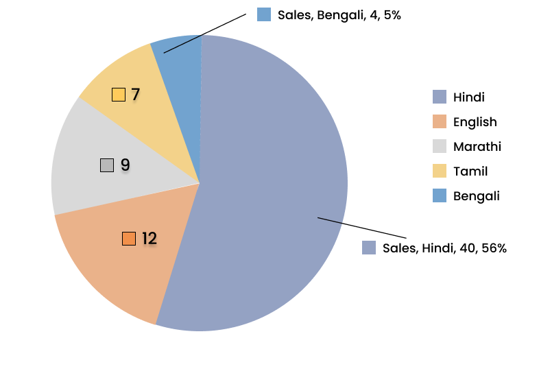
5. The number of students in a hostel, speaking different languages is given below. Display the data in a pie chart. 

Language

Hindi

English

Marathi

Tamil

Bengali

Total

No. of Students

\[{\mathbf{40}}\]

\[{\mathbf{12}}\]

\[{\mathbf{9}}\]

\[{\mathbf{7}}\]

\[{\mathbf{4}}\]

\[{\mathbf{72}}\]


Ans: To draw the pie chart of the given data. First we have to find the central angle of each sector.

Given, the total number of students \[ = {\text{ }}72\].

The total central angle $ = {360^ \circ }$

Now, calculating the central angle of each sector.


For Hindi:

Central angle of Hindi $ = \frac{{40 \times 360}}{{72}}$

So, the central angle of Hindi \[ = 200\]


For English:

Central angle of English $ = \frac{{12 \times 360}}{{72}}$

So, the central angle of English \[ = 60\]


For Marathi:

Central angle of Marathi $ = \frac{{9 \times 360}}{{72}}$

So, the central angle of Marathi \[ = 45\]


For Tamil:

Central angle of Tamil $ = \frac{{7 \times 360}}{{72}}$

So, the central angle of Tamil \[ = 35\]


For Bengali:

Central angle of Bengali $ = \frac{{4 \times 360}}{{72}}$

So, the central angle of Bengali\[ = 20\]

Now, the pie chart of the following data is as follows:


Pie chart representing different languages spoken


Pie chart representing different languages spoken


Conclusion

Class 8 Exercise 4.1 Maths Chapter 4 focuses on the foundational concepts of data handling. It teaches students how to organize data using frequency distribution tables and calculate the mean. Understanding these basics is crucial as they form the basis for more complex data representation methods, like bar graphs and pie charts, covered in later exercises. Students should focus on accurately organizing data and computing the mean, as these skills are essential for interpreting data effectively. By mastering these techniques, students will enhance their analytical abilities and be better prepared for solving various data-related problems. This exercise is a stepping stone towards building confidence in handling data, which is vital for academic success.


Class 8 Maths Chapter 4: Exercises Breakdown

Exercise

Number of Questions

Exercise 4.2

5 Questions with Solutions


CBSE Class 8 Maths Chapter 4 Other Study Materials


Chapter-Specific NCERT Solutions for Class 8 Maths

Given below are the chapter-wise NCERT Solutions for Class 8 Maths. Go through these chapter-wise solutions to be thoroughly familiar with the concepts.


Important Related Links for CBSE Class 8 Maths

WhatsApp Banner

FAQs on NCERT Solutions For Class 8 Maths Chapter 4 Data Handling Exercise 4.1 - 2025-26

1. Where can I find accurate and step-by-step NCERT Solutions for Class 8 Maths Chapter 4, Data Handling, for the 2025-26 session?

You can find detailed and reliable NCERT Solutions for Class 8 Maths Chapter 4 (Data Handling) right here on Vedantu. Our solutions are crafted by subject matter experts to provide a clear, step-by-step methodology for solving every problem in the textbook, ensuring alignment with the latest CBSE 2025-26 curriculum guidelines.

2. What is the correct method to create a frequency distribution table for ungrouped data as per the NCERT Class 8 Maths solutions?

The correct method for creating a frequency distribution table, as demonstrated in the NCERT solutions, involves these steps:

  • First, create a table with three columns: the data item (observation), tally marks, and frequency (the count).
  • Go through the raw data one by one and make a tally mark ('|') against the corresponding data item.
  • To make counting easier, group the tally marks in sets of five (the fifth mark crosses the previous four).
  • Finally, count the tally marks for each data item to get its frequency and write the number in the frequency column.

3. How do the NCERT Solutions for Chapter 4 explain the step-by-step process of constructing a pie chart?

The NCERT Solutions for Chapter 4 break down the construction of a pie chart into clear steps:

  • Calculate the fraction or percentage that each category represents out of the total.
  • Find the central angle for each category by multiplying its fraction by 360°. The formula is: (Value of the component / Total value) × 360°.
  • Draw a circle of a convenient radius.
  • Use a protractor to draw sectors corresponding to the calculated central angles for each category.
  • Label each sector clearly to represent the data accurately.
This step-by-step method ensures precision in data representation.

4. Why do the NCERT Solutions for Chapter 4 recommend using a histogram instead of a bar graph for continuous data?

The NCERT Solutions implicitly guide us to use a histogram for continuous data (grouped in class intervals) because a histogram visually represents the continuous nature of the data. Unlike a bar graph, which has gaps between bars for discrete categories, a histogram has no gaps between its bars. This signifies that the data flows from one class interval to the next without a break, which is the correct way to represent a continuous frequency distribution.

5. What is the standard approach to solving problems involving probability in NCERT Class 8 Maths Chapter 4?

The standard approach to solving probability problems, as per the NCERT solutions, is to use the fundamental probability formula. The steps are:

  • First, identify the total number of possible outcomes in the experiment. This will be the denominator.
  • Next, determine the number of favourable outcomes for the specific event you are interested in. This will be the numerator.
  • Finally, calculate the probability using the formula: P(Event) = (Number of Favourable Outcomes) / (Total Number of Possible Outcomes).

6. How does following the Vedantu NCERT Solutions for Data Handling help in avoiding common mistakes in exams?

Following our NCERT Solutions helps you avoid common mistakes by emphasising the correct methodology. For example, students often get confused between using a bar graph and a histogram. The solutions clarify this by applying the correct graph for the given data type. They also provide a structured format for creating tables and calculating angles for pie charts, which reduces calculation errors and ensures you present your answers exactly as per the CBSE pattern, securing full marks.

7. When solving questions from Exercise 4.1, how do the solutions demonstrate the importance of organising raw data first?

The solutions for Exercise 4.1 consistently demonstrate that organising raw data into a frequency distribution table is the crucial first step. By doing this, the data becomes structured and easy to interpret. This organised format makes it simpler to answer subsequent questions about the frequency of specific items, identify patterns, or prepare the data for creating graphs. The solutions show that without this initial organisation, analysing the data would be chaotic and prone to errors.

8. What key data representation techniques are covered in the NCERT Solutions for Class 8 Maths Chapter 4?

The NCERT Solutions for Class 8 Maths Chapter 4 provide detailed methods for several key data representation techniques essential for the syllabus. The main techniques covered are:

  • Frequency Distribution Tables: For organising both raw and grouped data.
  • Bar Graphs: To compare discrete categories of data.
  • Histograms: Specifically for representing grouped data with continuous class intervals.
  • Pie Charts (or Circle Graphs): To show the relationship between a whole and its parts.