


How to Interpret Graphs Tables and Equations in Maths
Do you know what interpreting is? Understanding, organising, and analysing the provided data to make sense of it and reach a meaningful conclusion is the data interpretation process. The significance of data interpretation is evident. Data interpretation is arbitrary and differs from company to company. The fundamental idea behind data interpretation is to review the gathered data using analytical techniques and reach suitable conclusions.
Methods to Interpret Data:
There are two methods to analyse data:
Qualitative Method:
Analysing categories or qualitative data is done using this technique. Texts were used to represent the data in the qualitative data interpretation rather than numbers or patterns. The two types of qualitative data are nominal and ordinal data. Interpreting ordinal data is substantially simpler than interpreting nominal data.
Quantitative Method:
Analysing numerical or quantitative data is done using this method. When interpreting quantitative data, numbers rather than texts represent the data. Discrete and continuous data are the two main types of quantitative data interpretation. Statistical techniques and methods like mean, median, and standard deviation are needed to interpret the data using the quantitative method.
Types of Interpretation:
Interpretation can be of four types:
Bar Graphs:
We can interpret the relationship between the variables in the shape of rectangular bars by using bar graphs. We might draw these rectangular bars either horizontally or vertically. Bars indicate the many categories of data, and each bar's length corresponds to its value. Grouped, segmented, stacked, and bar graphs are examples.
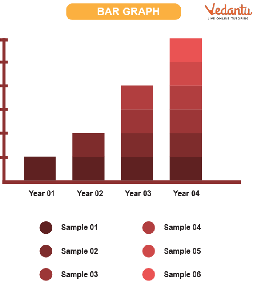
Bar Graph
Pie Chart:
A pie chart is a circular diagram showing a variable's proportion. Pie charts show numerical data as percentages or proportions. Simple pie charts, doughnut pie charts, and 3D pie charts are a few varieties of pie charts.
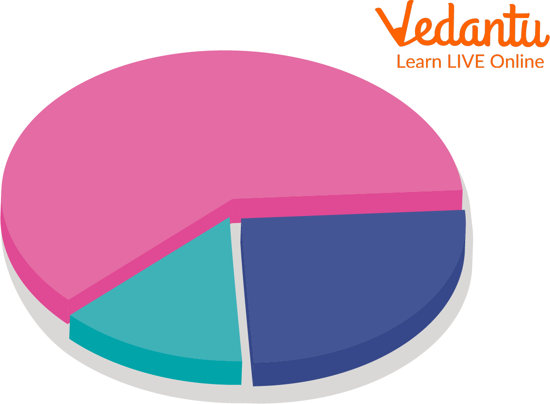
Pie Chart
Tables:
Tables are used to display statistical data. Data is organised using rows and columns. Simple tables and complex tables are two different types of tables.
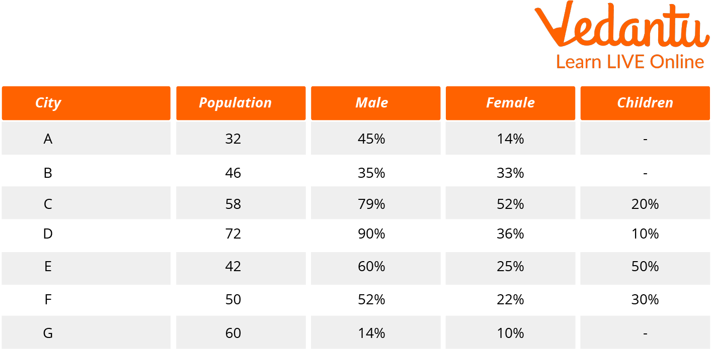
Table
Line Graph:
The line graphs comprise the charts or graphs that display data as a series of points. Line charts are excellent for displaying continuous data or a sequence of values. Simple line graphs, stacked line graphs, and other line graphs are among them.
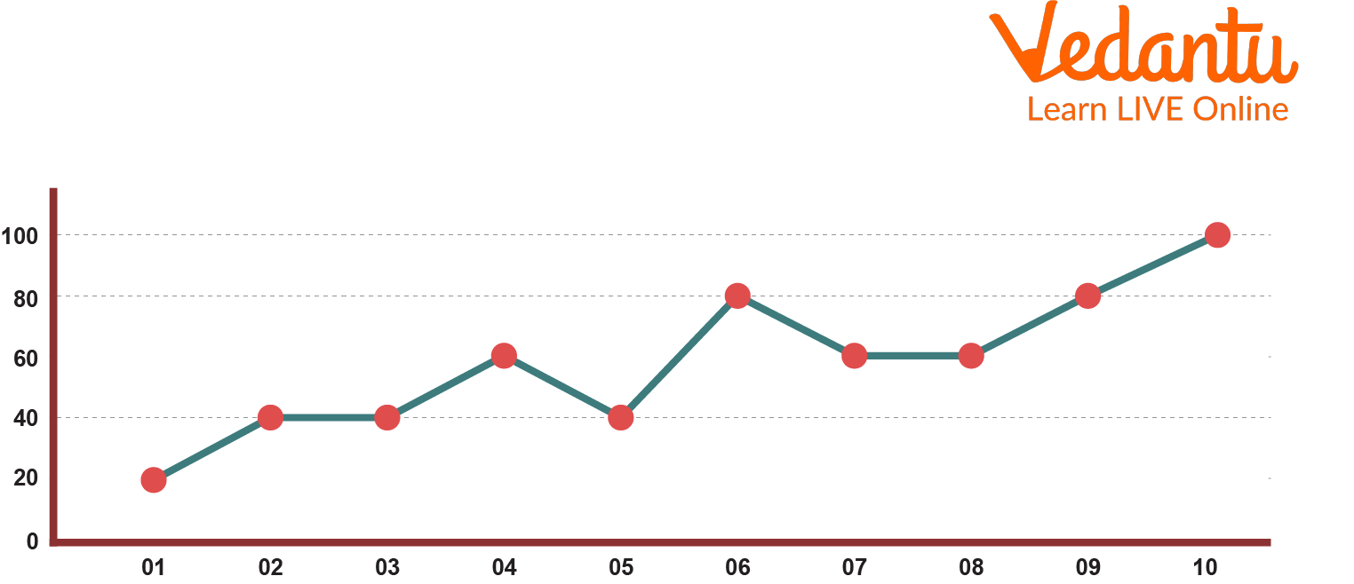
Line Graph
Examples of Interpreting Graphs:
Let us look at some examples of Interpreting Graphs Examples or
Interpreting Graphs, charts, tables, and Diagrams:
Example :
The cloud symbol represents 25cm of rainfall.
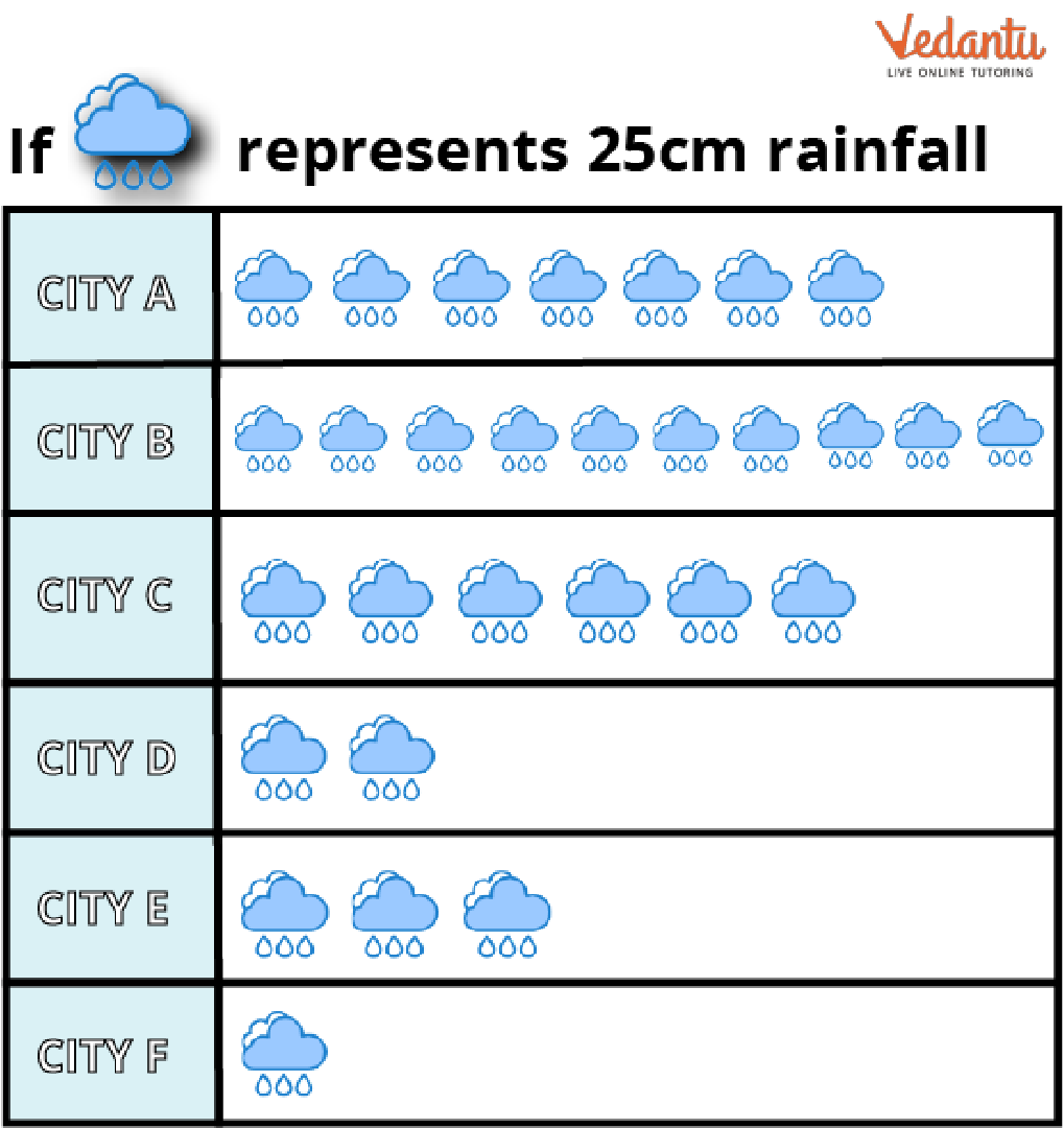
Give the amount of rainfall in centimetres for the following cities: A, B, C, D, E, and F.
Compare the cities B with E's rainfall amounts.
Solution:
a) From the question, we know 1 cloud symbol represents 25cm of rainfall.
In city A, there are 7 cloud symbols in the pictures.
Rain received in city A$ = 25 \times 7 = 175cm$
In city B, there are 10 cloud symbols in the pictures.
Rain received in city B$ = 25 \times 10 = 250cm$
In city C, there are 6 cloud symbols in the pictures.
Rain received in city C$ = 25 \times 6 = 150cm$
In city D, we can see there are 2 cloud symbols in the pictures.
Rain received in city D$ = 25 \times 2 = 50cm$
In city E, there are 3 cloud symbols in the pictures.
Rain received in city E$ = 25 \times 3 = 75cm$
In city F, we can see 1 cloud symbol in the pictures.
Rain received in city F$ = 25 \times 1 = 25cm$
b) We can see from the last part the rainfall in city B is 250cm, and in city E, it is 75cm. Therefore, we can say that city B recorded more rain than city E.
Conclusion:
Data interpretation is examining data using analytical techniques that will give the data some meaning and lead to a helpful conclusion. The fundamental idea behind data interpretation is that it focuses significantly on statistical knowledge, particularly data analysis. Every field can benefit from data interpretation. The gathering of data has advantages for a variety of organisations and people.
FAQs on Interpreting in Maths Explained with Clear Concepts
1. What does interpreting data mean in Maths?
Interpreting data in Maths means analyzing information presented in graphs, tables, or charts to understand and draw conclusions. It involves:
- Reading values accurately from graphs or tables
- Identifying patterns or trends
- Comparing quantities
- Making logical conclusions based on the data
2. How do you interpret a bar graph?
To interpret a bar graph, read the categories on one axis and the corresponding values on the other axis to compare quantities. Follow these steps:
- Identify what each axis represents
- Check the scale used
- Read the height or length of each bar
- Compare the bars to find the largest, smallest, or differences
3. How do you interpret a line graph in Maths?
A line graph is interpreted by analyzing how data changes over time or across intervals. Look for:
- Overall trend (increasing, decreasing, constant)
- Highest and lowest points
- Steepness of slopes (rate of change)
4. What is the difference between interpreting and analyzing data?
Interpreting data means understanding what the data shows, while analyzing data involves examining it in detail using calculations or statistical methods. In simple terms:
- Interpreting: Explaining trends, patterns, and meaning
- Analyzing: Calculating measures like mean, median, or percentages
5. How do you calculate the mean when interpreting data?
The mean is calculated by adding all values and dividing by the total number of values. The formula is:
Mean = (Sum of values) ÷ (Number of values).
- Example: Data = 4, 6, 8
- Sum = 4 + 6 + 8 = 18
- Mean = 18 ÷ 3 = 6
6. What should you look for when interpreting a pie chart?
When interpreting a pie chart, focus on the proportion or percentage each sector represents of the whole. Important steps include:
- Check the total (usually 100%)
- Read the percentage or angle of each sector
- Compare sector sizes
7. How do you find the range when interpreting a data set?
The range is found by subtracting the smallest value from the largest value. The formula is:
Range = Maximum − Minimum.
- Example: Data = 3, 9, 12, 5
- Maximum = 12
- Minimum = 3
- Range = 12 − 3 = 9
8. Why is interpreting data important in statistics?
Interpreting data is important because it allows us to draw meaningful conclusions and make informed decisions. In statistics, it helps to:
- Understand trends and relationships
- Summarize large data sets
- Support predictions or conclusions
9. What are common mistakes when interpreting graphs?
Common mistakes when interpreting graphs include misreading the scale, ignoring labels, and overlooking units. Frequent errors are:
- Not checking whether the axis starts at zero
- Confusing categories
- Ignoring key or legend information
- Assuming trends without evidence
10. Can you give an example of interpreting data from a table?
Interpreting data from a table means extracting values and identifying patterns or comparisons. Example:
- Math scores: 70, 85, 90, 75
- Highest score = 90
- Lowest score = 70
- Range = 90 − 70 = 20
- Mean = (70 + 85 + 90 + 75) ÷ 4 = 320 ÷ 4 = 80