


Read the bar graph and answer the following questions:
How many tickets of the Assam State Lottery were sold by the agent?
Answer
539.7k+ views
Hint: Bar graph is a pictorial representation of a grouped data, in the form of vertical or horizontal rectangular bars, where the lengths of the bars are equivalent to the measure of data. The heights or the lengths of the bars denote the value of the variable. From the given bar graph, we have to find the corresponding Y-axis values of Assam state.
Complete step-by-step solution:
Let us understand how data are plotted in a bar graph. We know that a bar graph is a pictorial representation of a grouped data, in the form of vertical or horizontal rectangular bars, where the lengths of the bars are equivalent to the measure of data. In a bar graph, we know that bars are of uniform width, and the variable quantity is represented on one of the axes. We represent the measure of the variable on the other axes. The heights or the lengths of the bars denote the value of the variable, and these graphs are also used to compare certain quantities.
There are four types of bar graph, viz. horizontal, vertical, grouped and stacked. In vertical bar graphs, the grouped data are represented vertically in a graph with the help of bars, where the bars denote the measure of data. The data is represented along the y-axis of the graph, and the height of the bars shows the values. We can conclude that the given bar graph is a vertical bar graph.
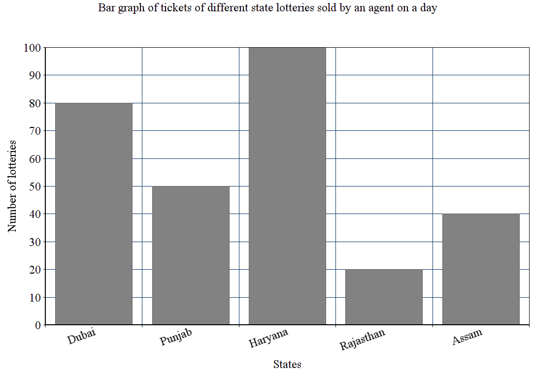
From the given bar graph, we can see that x-axis holds different state lotteries and the y-axis denotes their corresponding number of lotteries sold. From the given graph, we can infer that:
Number of Dubai lottery tickets sold by the agent $=80$
Number of Punjab lottery tickets sold by the agent $=50$
Number of Haryana lottery tickets sold by the agent $=100$
Number of Rajasthan lottery tickets sold by the agent $=20$
Number of Assam lottery tickets sold by the agent $=40$
Hence, the number of Assam State Lottery sold by the agent is 40.
Note: Students must read the graph carefully since it is more likely to make mistakes when checking the y-axis values. They must check the units and values in the y-axis. Bar graph summarizes the large set of data in simple visual form. It displays each category of data in the frequency distribution. The bar graph fails to reveal the patterns, cause, effects, etc.
Complete step-by-step solution:
Let us understand how data are plotted in a bar graph. We know that a bar graph is a pictorial representation of a grouped data, in the form of vertical or horizontal rectangular bars, where the lengths of the bars are equivalent to the measure of data. In a bar graph, we know that bars are of uniform width, and the variable quantity is represented on one of the axes. We represent the measure of the variable on the other axes. The heights or the lengths of the bars denote the value of the variable, and these graphs are also used to compare certain quantities.
There are four types of bar graph, viz. horizontal, vertical, grouped and stacked. In vertical bar graphs, the grouped data are represented vertically in a graph with the help of bars, where the bars denote the measure of data. The data is represented along the y-axis of the graph, and the height of the bars shows the values. We can conclude that the given bar graph is a vertical bar graph.
From the given bar graph, we can see that x-axis holds different state lotteries and the y-axis denotes their corresponding number of lotteries sold. From the given graph, we can infer that:
Number of Dubai lottery tickets sold by the agent $=80$
Number of Punjab lottery tickets sold by the agent $=50$
Number of Haryana lottery tickets sold by the agent $=100$
Number of Rajasthan lottery tickets sold by the agent $=20$
Number of Assam lottery tickets sold by the agent $=40$
Hence, the number of Assam State Lottery sold by the agent is 40.
Note: Students must read the graph carefully since it is more likely to make mistakes when checking the y-axis values. They must check the units and values in the y-axis. Bar graph summarizes the large set of data in simple visual form. It displays each category of data in the frequency distribution. The bar graph fails to reveal the patterns, cause, effects, etc.
Recently Updated Pages
Three beakers labelled as A B and C each containing 25 mL of water were taken A small amount of NaOH anhydrous CuSO4 and NaCl were added to the beakers A B and C respectively It was observed that there was an increase in the temperature of the solutions contained in beakers A and B whereas in case of beaker C the temperature of the solution falls Which one of the following statements isarecorrect i In beakers A and B exothermic process has occurred ii In beakers A and B endothermic process has occurred iii In beaker C exothermic process has occurred iv In beaker C endothermic process has occurred
Master Class 10 Social Science: Engaging Questions & Answers for Success
Master Class 10 Science: Engaging Questions & Answers for Success
Master Class 10 Maths: Engaging Questions & Answers for Success
Master Class 10 General Knowledge: Engaging Questions & Answers for Success
Master Class 10 Computer Science: Engaging Questions & Answers for Success
Three beakers labelled as A B and C each containing 25 mL of water were taken A small amount of NaOH anhydrous CuSO4 and NaCl were added to the beakers A B and C respectively It was observed that there was an increase in the temperature of the solutions contained in beakers A and B whereas in case of beaker C the temperature of the solution falls Which one of the following statements isarecorrect i In beakers A and B exothermic process has occurred ii In beakers A and B endothermic process has occurred iii In beaker C exothermic process has occurred iv In beaker C endothermic process has occurred
Master Class 10 Social Science: Engaging Questions & Answers for Success
Master Class 10 Science: Engaging Questions & Answers for Success
Trending doubts
Explain the Treaty of Vienna of 1815 class 10 social science CBSE
In cricket, what is the term for a bowler taking five wickets in an innings?
Who Won 36 Oscar Awards? Record Holder Revealed
What is the median of the first 10 natural numbers class 10 maths CBSE
Why is it 530 pm in india when it is 1200 afternoon class 10 social science CBSE
What is deficiency disease class 10 biology CBSE