


How to Read Pictographs and Bar Graphs for Age 7 to 8
An Introduction to Year 3 Statistics
Do you know what statistics is? Statistics is a branch of Mathematics where we collect, analyse, understand and represent data. What is data? It is a collection of information, could be numbers, facts, etc., that is assembled through measurement, questioning or observing. Data in statistics are collected through experiments and surveys. It is used in different fields for dealing with data and is helpful for storing information in simple form.
Children are able to identify and interpret different types of graphs at the age of 7 to 8 years. In this article, we will learn about statistics for kids who are in the learning phase of year 3.
How Can You Represent Data in Statistics?
Data can be presented in different ways. Some main methods of data presentation are given below.
1. Bar Graph
A bar chart is used to represent data which is distributed such as the number of students in a class, number of fruits in a basket, etc. Hence, a bar graph is used where data can only have a limited number of possible values. In a bar chart, data is represented by the lengths of a set of bars. Some gaps are usually present between the bars. The bars in such graphs can be drawn vertically or horizontally. For example, a bar graph of the number of children vs favourite fruit is drawn below. In the following bar graph, data of different fruits are drawn as bars.
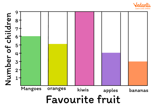
Example of Bar Graph
2. Pictogram
A pictogram is also used for the representation of data in statistics. It is also known as pictographs or picture graphs. Pictures are used in pictograms to show quantities. A picture is used to show one thing or a number of things. The same example of the number of children vs favourite fruit example is shown below in the form of a presentation of a pictogram. Here, pictures are used to represent the quantities, that is, which fruit is most liked by the maximum number of children.
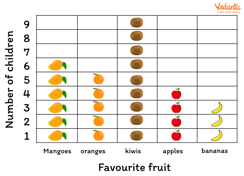
Example of Pictogram
3. Pie Chart
Data or information is represented in a circle in a pie chart. The slices in a pie chart or different-sized sectors of the circle stand for the different quantities they represent. For example, the slices of a pie chart can represent the percentage of the children who like different fruits. If the same example of the number of children and their favourite fruits data is drawn in the form of a pie chart, it will look like the following figure. The one with the highest percentage or great area of slice has the most liked fruit.
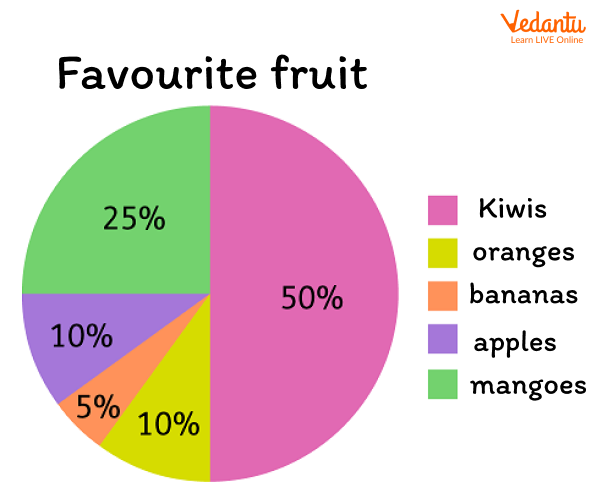
Example of Pie- Chart
The Collection of Information Through Data
Different types of information can be gathered from bar graphs, pie charts, pictographs etc. Interpretation of data is also an important part of statistical analysis. It provides useful information that has been stored in the form of bars and graphs. In the above example, the favourite fruits of children are analysed such as what percentage of kids like apples, bananas, oranges, grapes and apples.
Conclusion
Statistics is used where data is important to store in an easy way. The above article is useful for kids in order to understand the concept of statistics. Bar graph, pictograph and pie chart is discussed in the article with help of examples.
FAQs on Statistics Concepts for 7 to 8 Year Olds
1. What is statistics for Year 3 (age 7 to 8)?
Statistics for Year 3 is the study of collecting, organising, and interpreting data using simple charts and tables.
In this age group, children learn to:
- Collect simple data (e.g., favourite fruit)
- Record results using tally charts
- Draw and read pictograms and bar charts
- Answer questions about the data
It helps build early data handling and problem-solving skills.
2. What is a tally chart and how do you use it?
A tally chart is a table used to count and record data using groups of five tally marks.
How to use a tally chart:
- Draw a table with categories (e.g., apples, bananas)
- Make one tally mark for each item counted
- Every fifth mark crosses the previous four (|||| = 5)
- Add the totals at the end
Example: If 7 children choose apples, the tally is |||| || and the total is 7.
3. What is a pictogram in statistics?
A pictogram is a chart that uses pictures or symbols to represent data.
Key points about pictograms:
- Each picture represents a number (e.g., 1 picture = 2 votes)
- A key explains the value of each symbol
- Half symbols may represent smaller values
Example: If 1 smiley face = 2 children, then 3 smiley faces represent 6 children.
4. How do you read a bar chart in Year 3?
To read a bar chart, look at the height of each bar and match it to the numbers on the scale.
Steps to read a bar chart:
- Check the title to know what the data shows
- Look at the labels on the horizontal axis
- Read the numbers on the vertical axis
- Find the height of each bar
The tallest bar shows the greatest value, and the shortest bar shows the smallest value.
5. How do you collect data in statistics?
Data is collected by asking questions, observing, or counting items.
Simple ways Year 3 students collect data:
- Survey classmates (e.g., favourite colour)
- Count objects (e.g., number of red cars)
- Record answers in a tally chart
The collected data can then be shown in a table, pictogram, or bar chart.
6. What is the most common value in a data set?
The most common value in a data set is called the mode.
To find the mode:
- Count how many times each value appears
- Identify the value that appears the most
Example: In 2, 3, 3, 5, 3, the number 3 appears most often, so the mode is 3.
7. How do you answer questions about data?
You answer questions about data by carefully reading the chart or table and comparing values.
Common types of questions include:
- Which has the most or least?
- How many in total?
- How many more or fewer?
Always check the scale and key before giving your final answer.
8. What is the difference between a pictogram and a bar chart?
A pictogram uses pictures or symbols, while a bar chart uses rectangular bars to represent data.
Main differences:
- Pictogram: has a key showing value of each symbol
- Bar chart: uses a number scale on one axis
- Pictograms are more visual; bar charts show exact values clearly
Both are used in Year 3 statistics to display and compare data.
9. How do you find the total from a bar chart?
To find the total from a bar chart, add all the values shown by the bars.
Steps:
- Read the value of each bar using the scale
- Write down each number
- Add them together
Example: If the bars show 4, 6, and 5, the total is 4 + 6 + 5 = 15.
10. Why is learning statistics important for children?
Learning statistics is important because it helps children understand and interpret information in everyday life.
Statistics skills help children:
- Make sense of charts and graphs
- Compare numbers and quantities
- Ask and answer questions using data
- Develop logical thinking skills
These early data handling skills support future learning in maths and real-world problem solving.