


Steps to Draw a Line Graph with Examples and Proper Scale
Overview
How to Draw Line Graph in Statistics
It’s a graph that uses lines to connect individual data points from one to another. A line graph shows the quantitative values over a specified time interval.
In line graphs, the "markers" for the data points are connected by straight lines. Visualization is aided by the straight lines connecting these data points. Although line graphs are used in a wide range of industries and for a variety of reasons, they are particularly useful when it comes to creating a graphical representation of changes in values over time.
Types of Line Graphs
The line graphs can be divided into several groups:
1. Simple Line Graph: Only one line is plotted on the graph.
2. Multiple Line Graph: More than one line is plotted on the same set of axis. A multiple-line graph can help us to compare similar or different items over the same period.
Vertical Line Graph
Vertical line graphs are graphs in which a vertical line extends from each point of the data point down to the horizontal axis of the graph.
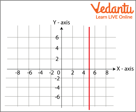
Vertical Line Graph
Horizontal Line Graph
Horizontal line graphs are graphs in which a horizontal line extends from each point of the data point parallel. A horizontal line graph is sometimes also known as row graph.
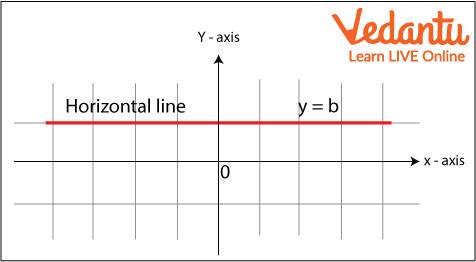
Horizontal Line
Different Terms of Line Graph
Title: The title tells what we are showing in the graph.
Scale: The scale is the numbers that explain the units taken on the linear graph.
Labels: Both the side and the bottom of the linear graph have a label that which data is represented on the given graph. The X-axis tells the data points on the line and the y-axis shows the numeric value for each point on the line.
Bars: They measure the data number.
Data values: They are the actual numbers represented for each data point.
How To Draw a Line Graph
Steps of Construction of Line Graph:
On a graph, draw two lines perpendicular to each other intersecting at point O. Mark points at equal intervals along the x-axis and writes the names of the data items whose values are to be mentioned.
Along the y-axis, choose an appropriate scale considering the given values.
Now, make the points
Join each and every point with the point using a ruler. Thus, a line graph is a ready
Example Graph
Line Graph in Statistics
A line graph is a tool used in statistics to analyze the trend of data that changes over a specified period of time. Here the time and data are represented on the x-and-y-axis. It is also known as a line chart.
Line Frequency Diagram
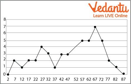
Line Frequency 1
In the above diagram you can see that the lines are not straight. It's because the data is not in the pattern when data is not in a pattern or you can say in a sequence that time the diagram turns out to be like frequency. That's why it’s called a frequency line diagram.
Line Graph Examples
Question: A bookstore created a line graph of how many books it sold each week during a specific time period. Determine how many fewer books were sold in week 8 than in week 7 using the data from the line graph above.
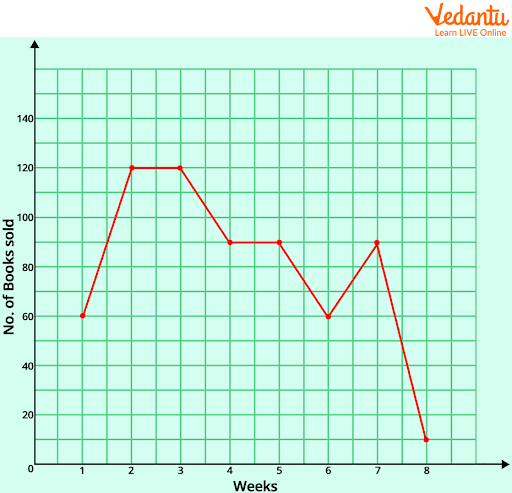
Week Sale Graph
Solution:
Number of books sold in week 7 = 90
Number of books sold in week 8 = 10
So, the difference = 80
Therefore, there were 80 fewer books sold in week 8 as compared to week 7.
Solved Questions
1. The following table gives information on the sum scored by McKay in 10 matches. Represent this online graph.
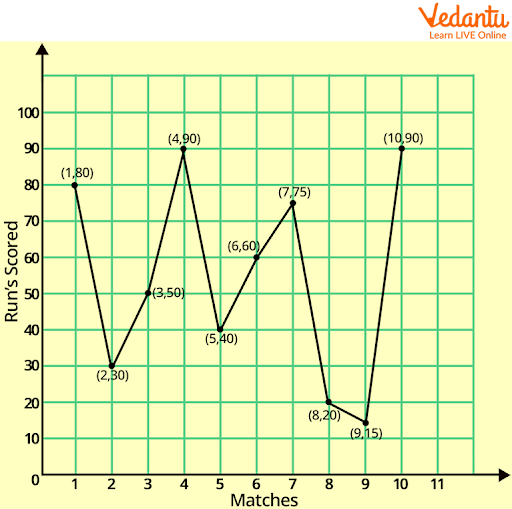
McKay Graph
2. Mobile phones sold by a shop in some week are as follows:
Represent the above data by using a line graph.
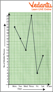
Mobile Phone Sold Graph
Summary
In this chapter we have studied the line graph, what is line graph, and how to draw and we have also studied the terms included in the graphs. We have solved various examples and questions to understand it better. Line graphs are frequently used in the financial industry to produce visual representations of values over time, including variations in security prices, financial statements from businesses, and histories of significant stock indices.
Line graphs can be compared with other visualizations of data like bar charts, pie charts, etc.
FAQs on How To Draw A Line Graph Easily and Correctly
1. What is a line graph in maths?
A line graph is a type of chart that displays data points connected by straight line segments to show changes over time or continuous data. It is commonly used in mathematics to represent trends, patterns, and relationships between two variables.
- The horizontal axis (x-axis) usually shows time or independent values.
- The vertical axis (y-axis) shows the measured quantity or dependent values.
- Points are plotted and joined with straight lines.
2. How do you draw a line graph step by step?
To draw a line graph, you plot data points on two axes and join them with straight lines.
- Step 1: Draw two perpendicular axes (x-axis and y-axis).
- Step 2: Label each axis with the correct variable and units.
- Step 3: Choose a suitable and equal scale for both axes.
- Step 4: Plot each data point accurately.
- Step 5: Join the points with straight line segments.
- Step 6: Add a title to describe the graph.
3. What are the parts of a line graph?
The main parts of a line graph are the axes, scale, data points, and connecting lines.
- X-axis (horizontal axis): Shows the independent variable (often time).
- Y-axis (vertical axis): Shows the dependent variable.
- Scale: Evenly spaced values used for measurement.
- Data points: Plotted coordinates representing values.
- Line segments: Straight lines connecting the points.
- Title and labels: Explain what the graph represents.
4. What is the difference between a line graph and a bar graph?
The main difference is that a line graph shows continuous data with connected points, while a bar graph uses separate bars to compare categories.
- Line graphs are used for trends over time.
- Bar graphs compare distinct groups or categories.
- Line graphs use connected points; bar graphs use rectangular bars.
5. How do you choose the scale for a line graph?
To choose a scale for a line graph, select evenly spaced values that cover the entire data range clearly.
- Find the minimum and maximum values in the data.
- Divide the axis into equal intervals (e.g., 1, 2, 5, 10 units).
- Ensure all data points fit comfortably on the graph.
- Keep intervals consistent throughout the axis.
6. Can you give an example of drawing a line graph?
Yes, for example, you can draw a line graph to show temperatures over 5 days: 20°C, 22°C, 25°C, 23°C, 24°C.
- Draw axes: days on the x-axis and temperature (°C) on the y-axis.
- Choose a scale (e.g., 1 square = 1°C).
- Plot points: (1,20), (2,22), (3,25), (4,23), (5,24).
- Join the points with straight lines.
7. When should you use a line graph?
You should use a line graph when you want to show trends or changes in continuous data over time.
- Tracking temperature changes.
- Monitoring sales growth each month.
- Showing population increase over years.
8. How do you plot points on a line graph?
To plot points on a line graph, locate the x-value first, then move vertically to the corresponding y-value.
- Start at the origin (0,0).
- Move along the x-axis to the required value.
- Move up or down to the y-value.
- Mark the point clearly.
9. What are common mistakes when drawing a line graph?
Common mistakes when drawing a line graph include incorrect scaling, missing labels, and inaccurate plotting.
- Using uneven or inconsistent scales.
- Forgetting to label axes or units.
- Not starting at zero when required.
- Joining points incorrectly.
10. How do you interpret a line graph?
To interpret a line graph, examine the direction and steepness of the line to understand trends and rate of change.
- An upward slope shows an increase.
- A downward slope shows a decrease.
- A flat line shows no change.
- A steeper line indicates a faster rate of change.