


What Is a Colour Palette and How It Works in Computer Graphics
A Colour Palette plays a crucial role in digital design, graphics, and user interface development. In computer science, especially in web design, multimedia, and graphic applications, a colour palette refers to a predefined set of colours used consistently in digital content. It helps maintain visual harmony, improves readability, and enhances user experience. Whether designing websites, mobile apps, games, or software interfaces, understanding colour palettes allows developers and designers to create attractive and functional digital products. Learning about colour palettes is essential for anyone working in UI, UX, graphic design, or front end development.
Definition and Meaning
The Colour Palette definition in computer science refers to a collection of selected colours used in digital design projects to ensure visual consistency and balance.
- Primary Colour - The dominant base colour in a design.
- Secondary Colour - Supports the primary colour and adds variation.
- Accent Colour - Used to highlight important elements like buttons or links.
- Hue, Saturation, Brightness - Properties that define how a colour appears on digital screens.
- Hex Code - A six digit code used in web development to represent colours.
How It Works / Working Principle
The Colour Palette working process is based on colour theory and digital colour models such as RGB and HEX. Designers select colours that complement each other and apply them consistently across a digital interface.
- Choose a base or primary colour that represents the theme.
- Select supporting colours using colour harmony rules like complementary or analogous.
- Define colour values using RGB, HEX, or HSL formats.
- Apply colours consistently to backgrounds, text, buttons, and graphics.
- Test the palette for readability, accessibility, and contrast.
Modern design tools and CSS frameworks help automate palette generation and ensure accessibility compliance.
Types and Classification
There are several Colour Palette types used in computer graphics and web design.
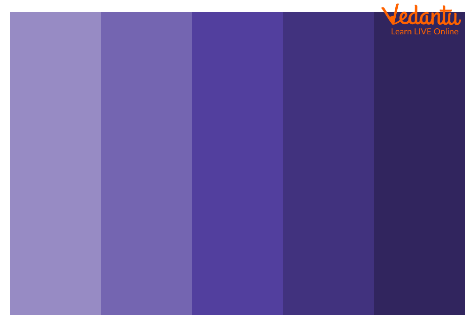
Monochromatic Colour Palette
Uses variations of a single colour with different shades and tints.
Complementary Colour Palette
Uses two opposite colours on the colour wheel to create strong contrast.

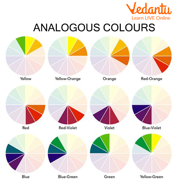
Analogous Colour Palette
Uses colours that are next to each other on the colour wheel for a harmonious look.
Triadic Colour Palette
Uses three evenly spaced colours on the colour wheel to maintain balance and vibrancy.

Features and Characteristics
- Ensures visual consistency across digital interfaces.
- Improves user experience and readability.
- Supports branding and identity design.
- Works with digital colour models like RGB and HEX.
- Enhances accessibility through proper contrast ratios.
Advantages
- Creates attractive and professional designs.
- Improves brand recognition.
- Enhances readability and clarity.
- Makes user interfaces intuitive.
- Simplifies design decisions.
Disadvantages / Limitations
- Poor colour choice can reduce readability.
- Limited palette may restrict creativity.
- Incorrect contrast may cause accessibility issues.
- Cultural differences may affect colour interpretation.
Applications and Use Cases
- Website and mobile app design.
- Game development and animation.
- Graphic design and branding.
- Data visualization and dashboards.
- Presentation slides and digital marketing materials.
Quick Facts About Colour Palette
| Category | Details | Usage Area |
|---|---|---|
| Type | Design Concept | UI and Graphic Design |
| Colour Model | RGB, HEX, HSL | Digital Screens |
| Purpose | Visual Harmony | Web and App Interfaces |
| Common Tools | Design Software and CSS | Front End Development |
These quick facts summarize the importance and practical usage of colour palettes in computer science and digital design.
Interesting Facts About Colour Palette
- The RGB colour model is used because screens emit light.
- Web safe colour palettes were popular in early web design.
- Accessibility guidelines define minimum contrast ratios.
- Dark mode and light mode use different palette strategies.
- CSS variables help manage colour palettes efficiently.
- Many brands register specific colour combinations for identity.
- AI tools can now automatically generate balanced colour palettes.
Conclusion
A Colour Palette in computer science is an essential concept in digital design and user interface development. It ensures consistency, improves readability, and enhances overall user experience. By understanding colour theory, palette types, and proper implementation techniques, developers and designers can create visually appealing and accessible digital products. Mastering colour palettes contributes significantly to effective web development, branding, and modern software design.
FAQs on Colour Palette in Computer Graphics and Digital Design
1. What is a Colour Palette in Computer Science?
Colour Palette is a predefined set of colors used in digital systems, graphics, and user interfaces to maintain visual consistency and efficient color management.
- Used in web development, UI/UX design, and game development
- Defined using formats like RGB, HEX, and HSL
- Helps in standardizing design across software applications
2. How does a Colour Palette work in computer graphics?
Colour Palettes work by mapping specific color values to pixels, allowing systems to display consistent colors across screens and digital platforms.
- Stores color codes in formats like RGB (Red, Green, Blue)
- Can be fixed (indexed color) or full-color (true color)
- Used by graphics libraries such as OpenGL and Canvas API
3. What are the different types of Colour Palettes?
Colour Palettes are classified based on their usage in design, graphics, and digital systems.
- Monochromatic – variations of a single color
- Complementary – opposite colors on the color wheel
- Analogous – adjacent colors
- Indexed Palette – limited set of predefined colors in image processing
4. What is the difference between RGB and HEX in a Colour Palette?
RGB and HEX are two formats used to represent colors in a Colour Palette, mainly in web development and graphic design.
- RGB uses decimal values like rgb(255, 0, 0)
- HEX uses hexadecimal notation like #FF0000
- Both represent the same color model but differ in syntax
5. Why is a Colour Palette important in web development?
Colour Palette ensures visual consistency, accessibility, and better user experience in web development projects.
- Maintains branding across websites
- Improves readability and accessibility standards like WCAG
- Simplifies CSS styling and theme management
6. What is an Indexed Colour Palette in image processing?
Indexed Colour Palette is a technique where each pixel stores an index that refers to a color in a fixed table instead of storing full color values.
- Reduces memory usage
- Common in GIF and older bitmap formats
- Efficient for simple graphics and icons
7. What are the advantages and disadvantages of using a limited Colour Palette?
Limited Colour Palettes help optimize performance but may reduce visual richness in digital applications.
- Advantages: Lower memory usage, faster rendering, consistent design
- Disadvantages: Limited realism, color banding in complex images
- Common in embedded systems and retro game development
8. How do you define a Colour Palette in CSS?
Colour Palette in CSS is defined using color variables or direct color codes to maintain consistent styling across web pages.
- Example using variables: :root { --primary: #3498db; }
- Used with properties like color and background-color
- Supports RGB, HEX, HSL, and named colors
9. What are the common tools used to create a Colour Palette?
Colour Palette tools help designers and developers generate and test color combinations for software and web projects.
- Adobe Color and Canva for design
- Figma and Sketch for UI/UX
- Built-in developer tools in modern browsers for testing
10. Is Colour Palette important for exams and interviews in Computer Science?
Colour Palette is important in exams and interviews, especially for topics related to computer graphics, web development, and UI design.
- Frequently asked in computer graphics theory questions
- Relevant for front-end developer interviews
- Helps in understanding color models and digital image representation