


Maths Notes for Chapter 13 Introduction to Graphs Class 8 - FREE PDF Download
Data presented in a graphical format is easier to comprehend.
To show comparisons between categories, a bar graph is employed.
To compare portions of a whole, a pie graph is employed.
A histogram is a bar graph with data displayed in intervals.
A line graph depicts data that is constantly changing throughout time.
A linear graph is a graph that consists of a single continuous line.
The $\text{x}$ -coordinate and $\text{y}$ -coordinate are required to fix a point on the graph sheet.
A graph depicts the relationship between the dependent and independent variables.
A Bar Graph:
A graphical representation of numerical data made out of uniformly sized bars (rectangles) with equal spacing.
Each bar's length (or height) symbolises the provided number.

A Pie Graph:
A pie graph is a visual representation of how sections of a whole are compared.
The sectors of the circle symbolise the numerous observations or components.
Histogram:
A histogram is a form of bar diagram in which the class intervals are shown on the horizontal axis and the heights of the bars (rectangles) represent the frequency of the class interval, but there is no gap between the bars because the class intervals are not separated by a gap.
Linear Graph:
A line graph with all of the line segments forming one continuous line.
Coordinates:
An ordered pair of numbers represents a point on the Cartesian plane.
Ordered Pair:
A set of numbers in a predetermined arrangement.
Class 8 Maths Notes of Introduction to Graphs
Introduction to Graphs In Revision Notes Class 8 Maths Chapter 13
Graphs are basically the visual illustrations of the data gathered. Graphical representation enables us to showcase the trend of the data. These graphs are applicable in different fields and it is of great help to the people. There are various types of Graphs and each of these serves a specific purpose.
Points to Remember for Introduction to Graphs
The x-coordinate of a point is actually the distance from the y-axis.
The y-coordinate of a point is actually its distance from the x-axis.
The coordinates of the origin in a graph are valued at (0, 0).
The x-coordinate of each point on y-axis is 0
The y-coordinate of each point on x-axis is 0
A line graph that’s completely an unbroken line is called a linear graph.
A bar graph helps to establish and express comparison among categories.
A pie graph helps to compare parts of a whole.
A line graph shows data that changes constantly over periods of time.
A histogram is a bar graph that depicts data in intervals.
To fix a point on the graph we require, x-coordinate and y-coordinate.
The relationship between dependent variable and independent variable is displayed through a graph.
Types of Graph Represented in Class 8 Revision Notes Introduction to Graphs
Bar Graph
A bar graph is a kind of graph which is made to show comparisons between different categories. In this kind of graph, bars of uniform width are used to display the different quantities and their height is kept proportional to their respective values.
The below bar graph is representing the kind of pet people usually own.
Double Bar Graph
This is almost similar to the bar graph, just that two types of data are shown here correspondingly. Usually, this form of graph is used to display a comparison between two data.
This Double bar graph shows the different sports preferred by male and female students Yellow bars show the sports liked by girls and red bars show the sports liked by boys . Hence we can easily compare the like and dislike of sports in average students.
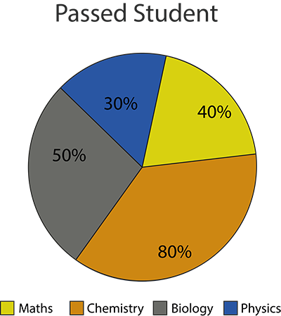
Pie Chart
Also known as Circle Graph is used to represent the given data in the circular form. When the data is represented in a circular form, it is termed as a pie chart. A pie chart basically shows the part of a whole.
This pie chart shows the percentage of people who like particular fruits. From the given pie chart, we can easily obtain that the maximum number of people like bananas and the least number of people like peaches
Line Graph
We use the line graph when we tend to see the changes continuously over a period of time.
Here the horizontal line (x-axis) displays the number of days and the vertical line (y-axis) displays the number of muffins sold on a particular day on every successive day.
By this line graph, we can easily understand the changes in the sale of muffins during these 7 days of a week.
Linear Graphs
A whole unbroken line is what we call a Linear Graph.
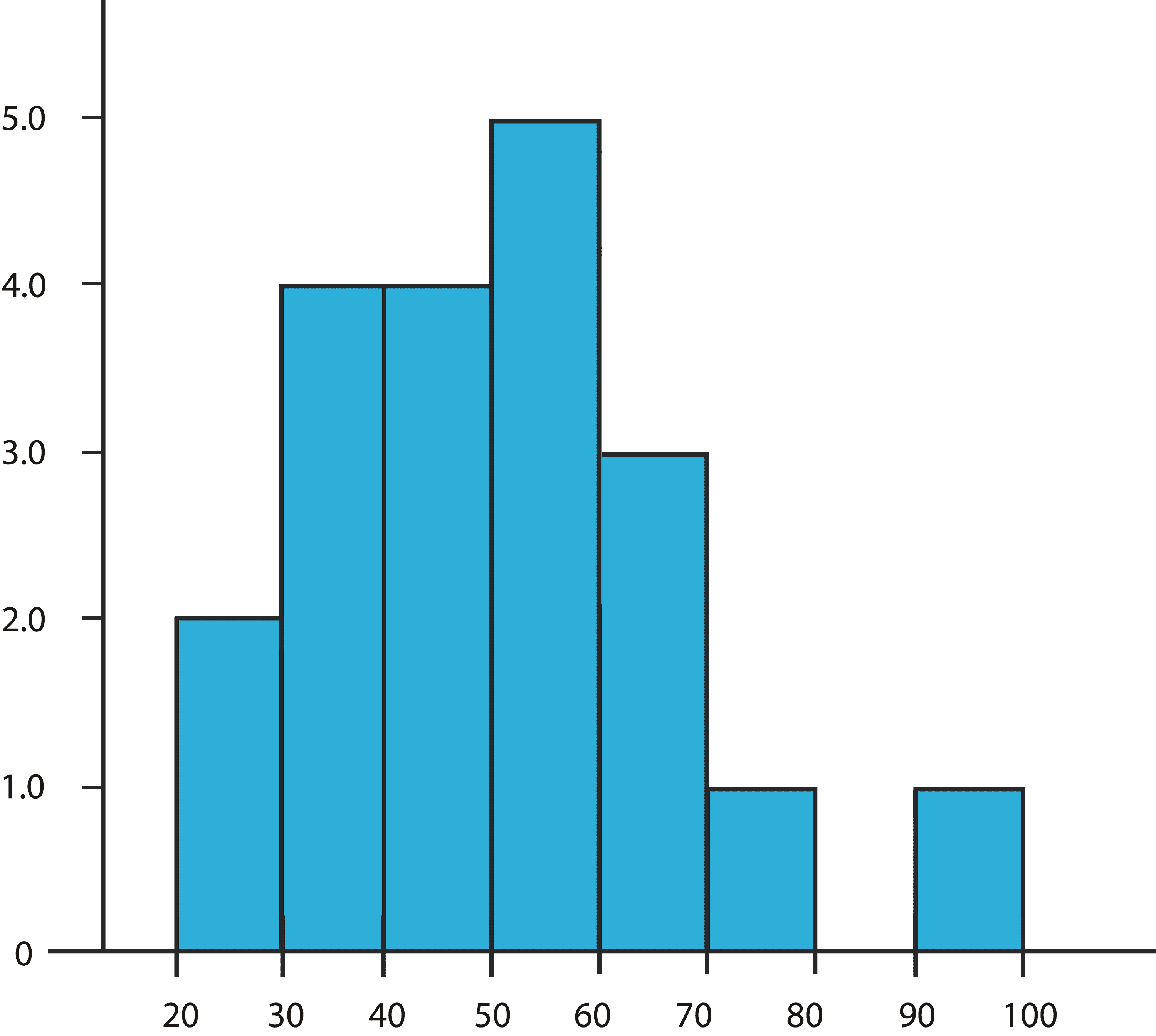
Histogram
We can construct a histogram when we have grouped the data in the form of class intervals. It is also a kind of bar graph. The only difference is that there is no gap between the bars as this is a graph of continuous data.
This histogram shows the height of the trees.
Benefits of the Ch 13 Class 8 Maths Revision Notes
The given introduction to graphs class 8 notes Pdf free download available at Vedantu will help you to understand the graphs better and the appropriate ways to use them. If you have any query regarding class 8 maths revision notes chapter 13, drop a comment at the Vedantu website and have your query resolved at the earliest. Features of Vedantu’s Revision Notes to mention are:
Provides quick, clear summaries of key concepts.
Simplifies complex topics for better understanding.
Efficient tool for last-minute exam prep.
Enhances retention of crucial information.
Supports effective exam preparation with key points and tips.
Saves time by consolidating information.
Prioritizes important topics and questions.
Offers practical examples for real-world connections.
Boosts student confidence for exams.
Conclusion
For an enhanced comprehension of this subject, NCERT - Class 8 Maths Chapter 13 - Introduction to Graph, thoughtfully prepared by experienced educators at Vedantu is your invaluable companion. These notes break down the complexities of Introduction to Graph into easily digestible sections, helping you grasp new concepts, master formulas, and navigate through questions effortlessly quickly in the last minute as well. By immersing yourself in these notes, you not only prepare for your studies more efficiently but also develop a profound understanding of the subject matter.
FAQs on CBSE Notes Class 8 Maths Chapter 13 - Introduction to Graphs - 2026-27
1. What are the key terms to remember for a quick revision of Introduction to Graphs Class 8?
For a quick revision of this chapter, you should focus on these key terms. A graph is plotted on a Cartesian plane, which has two perpendicular lines: the horizontal x-axis and the vertical y-axis. Their intersection is called the origin (0,0). The location of any point is given by its coordinates (x, y), which represent its distance from the y-axis and x-axis, respectively.
2. What is the main purpose of using a line graph in Class 8 Maths?
The main purpose of a line graph is to display data that changes continuously over a period of time. It consists of points connected by line segments, making it easy to see trends, such as an increase or decrease in temperature over a day or the growth of a plant over several weeks. It is an excellent tool for a visual summary of time-based data.
3. What is the concept of independent and dependent variables in a graph?
In any relationship shown on a graph, there are two types of variables. The independent variable is the one you can control or that changes on its own, like time or the number of items you buy. It is usually plotted on the x-axis. The dependent variable is the one that changes as a result of the independent variable, like the distance travelled or the total cost. It is plotted on the y-axis.
4. How is a linear graph different from a regular line graph?
This is a key concept for revision. While a line graph can be a series of connected line segments that may bend or change direction (zig-zag), a linear graph is a special type of line graph that is always a single straight line. This straight line indicates a constant rate of change or a direct proportional relationship between the two variables being plotted.
5. Why does the graph showing the cost of apples at a fixed price per kg form a straight line?
The graph forms a straight line because the relationship between the weight of apples (independent variable) and the total cost (dependent variable) is directly proportional. For every 1 kg increase in weight, the cost increases by a fixed, constant amount (the price per kg). This constant rate of change is what results in all the points lying on a single straight line when plotted on a graph.
6. What information can you get by just looking at the coordinates of a point, for example, P(5, 0)?
By looking at the coordinates, you can instantly understand the point's position relative to the axes. For a point P(5, 0):
- The x-coordinate is 5, meaning the point is 5 units to the right of the y-axis.
- The y-coordinate is 0, meaning the point has zero vertical distance from the x-axis.
Therefore, the point P(5, 0) lies directly on the x-axis.
7. In a real-world scenario, what does a horizontal line on a distance-time graph signify?
A horizontal line on a distance-time graph indicates that as time is passing (moving along the x-axis), the distance from the starting point (the value on the y-axis) is not changing. This means the object is not moving. In simple terms, a horizontal line on such a graph signifies that the object is stationary or at rest.