


The age group and number of persons, who donated blood in a blood donation camp is given below. Draw a pie diagram for it.
Age group (Yrs) 20-25 25-30 30-35 35-40 No. of persons 35% 20% 15% 30%
| Age group (Yrs) | 20-25 | 25-30 | 30-35 | 35-40 |
| No. of persons | 35% | 20% | 15% | 30% |
Answer
589.8k+ views
Hint: Here given a distribution of a data, and we have to represent the data in a graphical way, or presenting it graphically which is called the graphical representation, which refers to visually displaying and analyzing with the use of charts and graphs, which is also used to interpret numerical data. Here using a pie chart which is also called a circle graph, as it is a circular statistical graph, which is divided into pies (called slices) to illustrate the numerical proportion of the data.
Complete step-by-step solution:
As we already know that a pie chart is a special chart that uses pie sliced to show relative sizes of data.
Pie charts are generally used to show percentage or proportional data and usually the percentage represented by each category is provided next to the correspondence slice of pie.
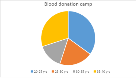
Now given in the distributed data that the age group of 20-25 years donated 35% of blood in the total blood donation camp.
As a maximum percentage is donated by the age group of 20-25 years. Hence a big slice in the pie chart is used to denote this age group which is shown in blue color below in the pie chart.
Now the age group of 35-40 years donated 30% of blood in the total blood donation camp. Hence the next big slice in the pie chart is used to denote this age group which is shown in yellow color below in the pie chart.
Now the age group of 25-30 years donated 20% of blood in the total blood donation camp. Hence a slice of 20% in the pie chart is used to denote this age group which is shown in orange color below in the pie chart.
Now the age group of 30-25 years donated 15% of blood in the total blood donation camp.
As a minimum percentage is donated by the age group of 30-25 years. Hence the smallest slice in the pie chart is used to denote this age group which is shown in grey color below in the pie chart.
Note: The data can be represented in any graphical format but pie charts are the best for displaying data for around 6 categories or lower. It is very easy to understand the distribution of the data through a pie chart as it is clearly visible.
Complete step-by-step solution:
As we already know that a pie chart is a special chart that uses pie sliced to show relative sizes of data.
Pie charts are generally used to show percentage or proportional data and usually the percentage represented by each category is provided next to the correspondence slice of pie.
Now given in the distributed data that the age group of 20-25 years donated 35% of blood in the total blood donation camp.
As a maximum percentage is donated by the age group of 20-25 years. Hence a big slice in the pie chart is used to denote this age group which is shown in blue color below in the pie chart.
Now the age group of 35-40 years donated 30% of blood in the total blood donation camp. Hence the next big slice in the pie chart is used to denote this age group which is shown in yellow color below in the pie chart.
Now the age group of 25-30 years donated 20% of blood in the total blood donation camp. Hence a slice of 20% in the pie chart is used to denote this age group which is shown in orange color below in the pie chart.
Now the age group of 30-25 years donated 15% of blood in the total blood donation camp.
As a minimum percentage is donated by the age group of 30-25 years. Hence the smallest slice in the pie chart is used to denote this age group which is shown in grey color below in the pie chart.
Note: The data can be represented in any graphical format but pie charts are the best for displaying data for around 6 categories or lower. It is very easy to understand the distribution of the data through a pie chart as it is clearly visible.
Recently Updated Pages
Master Class 11 Social Science: Engaging Questions & Answers for Success
Master Class 11 English: Engaging Questions & Answers for Success
Master Class 11 Maths: Engaging Questions & Answers for Success
Master Class 11 Chemistry: Engaging Questions & Answers for Success
Master Class 11 Biology: Engaging Questions & Answers for Success
Master Class 11 Physics: Engaging Questions & Answers for Success
Trending doubts
Differentiate between an exothermic and an endothermic class 11 chemistry CBSE
One Metric ton is equal to kg A 10000 B 1000 C 100 class 11 physics CBSE
Difference Between Prokaryotic Cells and Eukaryotic Cells
There are 720 permutations of the digits 1 2 3 4 5 class 11 maths CBSE
Two of the body parts which do not appear in MRI are class 11 biology CBSE
Which gas is abundant in air class 11 chemistry CBSE