


_____________ represents data that changes continuously over a period of time.
${\text{A)}}$ Line Graph
${\text{B)}}$ Pie Graph
${\text{C)}}$ Bar Graph
${\text{D)}}$ Histogram
Answer
596.4k+ views
Hint: Here we discuss the given option one by one and then we conclude the required answer. Also, we discuss each of the examples in the given option; it helps to get the required answer.
Complete step-by-step solution:
Line graph: When the given quantitative data is in individual series, we use line graphs. Line graphs are probably used to represent the individual series with a single line consisting of dots. The line is drawn by connecting the dots. It helps us represent data that changes frequently over the period of time. Line graphs are also known as line chart
Example:
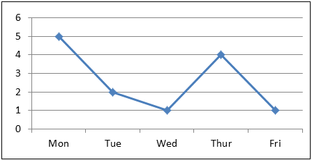
In this graph, it clearly depicts the changes occurring each day.
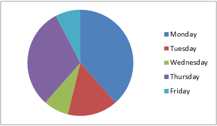
Pie graph: Pie graph is a very commonly used type of graph to represent things in circular form which is actually divided into different pieces or slices to represent the numerical values of the data. In the pie graph, the pieces length is known as arc length. The data given will be converted into degrees and represented in the table.
Example
The given data is:
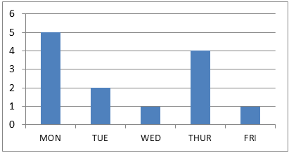
Bar graph: Bar graph is the one of the most frequently used graphs to represent statistical data or numerical values. Bar graphs are usually represented by rectangular blocks or bars to categorise each set of data. They are plotted both vertically and horizontally according to the presenter’s will.
Example
Let this be the given data:
Histogram: Histogram can be also called or said as a family of bar graphs. It is because histogram contains many features of the bar graph. It is often used to show the height of each block or bars to compare. Simply it is a graphical representation of data using the bars that are in different heights.
Example:
So, the correct answer is line graph.
Option A is the correct answer.
Note: Change in data continuously does not mean the difference in changes of each value among them or the differences between each value how one or more variables vary or changes over a continuous period of time. Students may go wrong in understanding the sentences given in the question and get confused.
Complete step-by-step solution:
Line graph: When the given quantitative data is in individual series, we use line graphs. Line graphs are probably used to represent the individual series with a single line consisting of dots. The line is drawn by connecting the dots. It helps us represent data that changes frequently over the period of time. Line graphs are also known as line chart
Example:
| Monday | Tuesday | Wednesday | Thursday | Friday |
| $5$ | $2$ | $1$ | $4$ | $1$ |
In this graph, it clearly depicts the changes occurring each day.
Pie graph: Pie graph is a very commonly used type of graph to represent things in circular form which is actually divided into different pieces or slices to represent the numerical values of the data. In the pie graph, the pieces length is known as arc length. The data given will be converted into degrees and represented in the table.
Example
The given data is:
| Monday | Tuesday | Wednesday | Thursday | Friday |
| $5$ | $2$ | $1$ | $4$ | $1$ |
Bar graph: Bar graph is the one of the most frequently used graphs to represent statistical data or numerical values. Bar graphs are usually represented by rectangular blocks or bars to categorise each set of data. They are plotted both vertically and horizontally according to the presenter’s will.
Example
Let this be the given data:
| Monday | Tuesday | Wednesday | Thursday | Friday |
| $5$ | $2$ | $1$ | $4$ | $1$ |
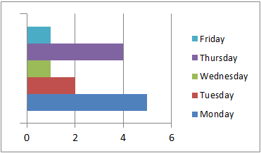
Histogram: Histogram can be also called or said as a family of bar graphs. It is because histogram contains many features of the bar graph. It is often used to show the height of each block or bars to compare. Simply it is a graphical representation of data using the bars that are in different heights.
Example:
| Monday | Tuesday | Wednesday | Thursday | Friday |
| $5$ | $2$ | $1$ | $4$ | $1$ |
So, the correct answer is line graph.
Option A is the correct answer.
Note: Change in data continuously does not mean the difference in changes of each value among them or the differences between each value how one or more variables vary or changes over a continuous period of time. Students may go wrong in understanding the sentences given in the question and get confused.
Recently Updated Pages
Master Class 12 Economics: Engaging Questions & Answers for Success
Master Class 12 English: Engaging Questions & Answers for Success
Master Class 12 Social Science: Engaging Questions & Answers for Success
Master Class 12 Maths: Engaging Questions & Answers for Success
Master Class 12 Physics: Engaging Questions & Answers for Success
Master Class 9 General Knowledge: Engaging Questions & Answers for Success
Trending doubts
1 ton equals to A 100 kg B 1000 kg C 10 kg D 10000 class 11 physics CBSE
How do I convert ms to kmh Give an example class 11 physics CBSE
Mention the important general characters of Urocho class 11 biology CBSE
Define pneumatic bones class 11 biology CBSE
10 examples of diffusion in everyday life
The relation between molarity M and molality m is given class 11 chemistry CBSE