


How to Draw a Bar Graph with Examples and Practice Questions
Bar Graph Definition
A bar graph is a great tool for representing data that are unrelated to one another and do not need to be displayed in any particular sequence. The bars provide a visual representation for comparing amounts in several categories. The x and y axes, commonly known as the horizontal and vertical axes, the title, labels, and a bar graph are all included.
Bar Graph shows all the data, the heights of the rectangular bars are proportional to the values they represent. The graph's bars can be displayed either vertically or horizontally. Bar graphs, commonly referred to as bar charts, are a visual depiction of groups of data. It is one method of processing data.
What is a Bar Diagram and How to Draw a Bar Graph?
With the help of an example, let's learn how to draw a bar graph. Lana visited the market to purchase a variety of fruits, including 5 apples, 3 mangoes, 2 watermelons, 3 strawberries, and 6 oranges. She wants to create a bar graph to present the data so she can see what kinds of fruits she purchases the most frequently.
Let's use the next few stages to create a bar graph of the fruit that is most frequently purchased.
Step 1: Take a piece of graph paper, and label the bars with a caption like "Most Bought Fruit."
Step 2: On a plane, draw the horizontal (x-axis) and vertical (y-axis) axes.
Step 3: Give the horizontal axis, which is an independent category, the name "Types of Fruits," and the vertical axis, which is a dependent category, the name "Number of Fruits."
Step 4: Write the names of the fruits on the horizontal axis, such as apples, mangoes, watermelon, strawberries, and oranges, and leave an equal gap or spacing between each fruit.
Step 5: Describe the graph's scale, which demonstrates how numbers are used in the data. It is a system of markers spaced at specific intervals that aids in object measurement.
Step 6: Start constructing rectangular bars for each fruit, leaving equal spaces between them, and assigning heights to the corresponding numbers.
Step 7: Now that the bar graph is complete, determine which fruit is the most popular by measuring the height of the rectangle bars for each fruit.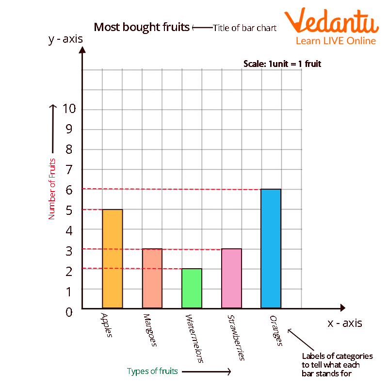
Bar Diagram Example
It is crucial to note four elements while creating a bar graph: the title, scale, and names of the axes.
Bar Graphs Parts
There are two basic categories for bar graphs:
Vertical Bar Graph
Horizontal Bar Graph

Bar Graph Parts
Properties of Bar Graph
The following list includes some characteristics that set a bar graph apart from other types of graphs:
The width and spacing between each rectangular bar should be the same.
Either horizontally or vertically can be used to draw the rectangular bars.
The rectangular bars' height is equal to the height of the data they depict.
There must be a common base for the rectangular bars.
Conclusion
A bar graph is a great method for showing data that does not need to be displayed in any specific order and is unconnected to one another. The bars offer a visual way to compare quantities across many categories. The title, labels, x and y axes, also known as the horizontal and vertical axes, as well as a bar graph are all present.
Solved Examples
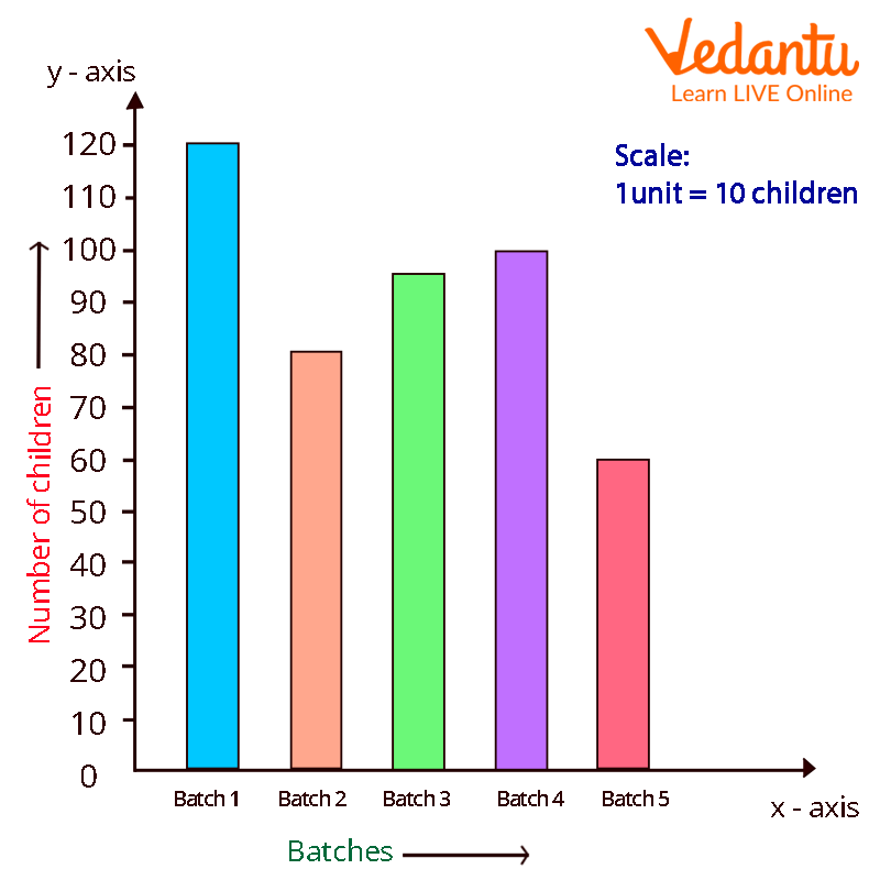
Example 1: The following information about a school's five separate batches of students. Create a bar graph to represent the following data.
Answer: The data can be represented as:
Example 2: What kinds of bar graphs are there?
Answer: Vertical bar graphs, horizontal bar graphs, stacked bar graphs, and grouped bar graphs are the four different types of bar graphs. A vertical bar graph shows the grouped data in a vertical direction. A horizontal bar graph shows the grouped data in a horizontal direction.
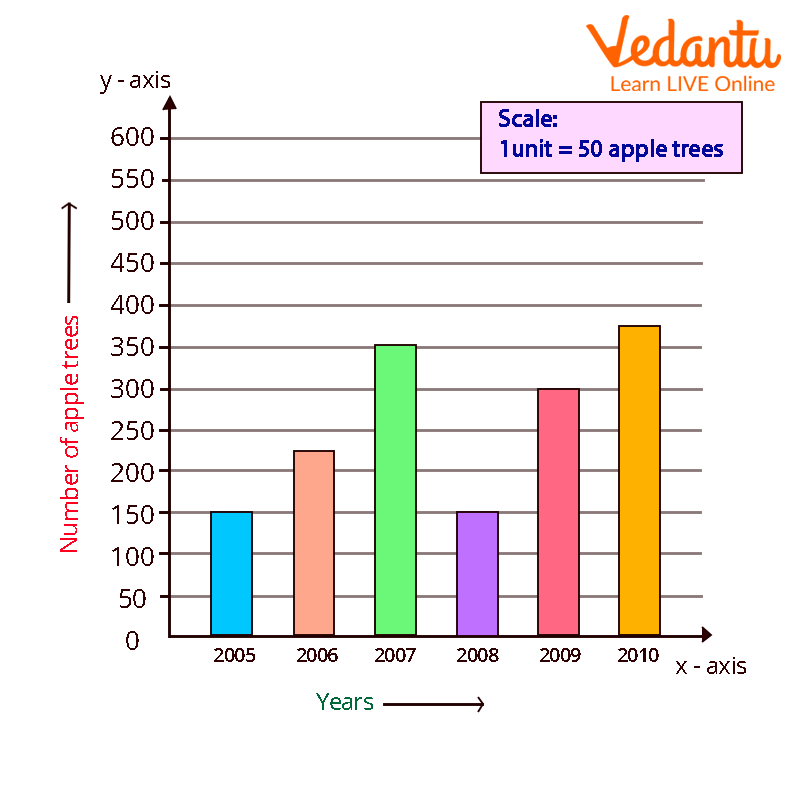
Example 3: The number of apple trees a school's gardener planted over the course of many years is displayed in the following table. Create a bar graph to represent the below given data.
Answer: Above data can be represented as:
FAQs on Drawing a Bar Graph in Maths Step by Step Guide
1. What is a bar graph in maths?
A bar graph is a graphical representation of data using rectangular bars of equal width to compare different categories. In a bar graph:
- Each bar represents a category.
- The height or length of the bar shows the value or frequency.
- Bars are separated by equal gaps to indicate distinct categories.
2. How do you draw a bar graph step by step?
To draw a bar graph, first draw two perpendicular axes and choose a suitable scale for the data. Follow these steps:
- Step 1: Draw the horizontal (x-axis) and vertical (y-axis).
- Step 2: Label the x-axis with categories and the y-axis with values.
- Step 3: Choose a proper scale (e.g., 1 unit = 10 students).
- Step 4: Draw equal-width bars with equal spacing.
- Step 5: Ensure each bar’s height matches the data value.
3. What is the difference between a bar graph and a histogram?
The main difference is that a bar graph represents categorical data, while a histogram represents continuous data. Key differences include:
- Bar graphs have gaps between bars; histograms have no gaps.
- Bar graphs compare categories; histograms show frequency distribution of intervals.
- In bar graphs, bar width is not important; in histograms, width represents class interval.
4. What are the parts of a bar graph?
The main parts of a bar graph are the axes, bars, scale, labels, and title. These include:
- X-axis: Shows categories.
- Y-axis: Shows values or frequency.
- Bars: Represent data values.
- Scale: Indicates measurement units.
- Title: Describes the data shown.
5. How do you choose a scale for a bar graph?
To choose a scale for a bar graph, select a unit that evenly fits the largest data value on the axis. For example:
- If the maximum value is 50, you may take 1 unit = 5 or 10.
- The scale should make plotting simple and clear.
- Use equal intervals throughout the axis.
6. Can you give an example of drawing a bar graph?
Yes, for example, if five students scored 40, 60, 50, 70, and 80 marks, you can represent this using a bar graph. Steps:
- Draw axes and label students on the x-axis.
- Mark marks (0–80) on the y-axis with scale 1 unit = 10 marks.
- Draw five bars with heights 40, 60, 50, 70, 80.
7. Why are bar graphs important in statistics?
Bar graphs are important because they provide a clear visual comparison of different categories of data. They help to:
- Compare quantities quickly.
- Identify the highest and lowest values.
- Simplify large data sets.
8. What are the types of bar graphs?
The main types of bar graphs are simple, double, and multiple bar graphs. These include:
- Simple bar graph: Represents one set of data.
- Double bar graph: Compares two sets of data.
- Multiple bar graph: Compares more than two sets.
9. What mistakes should you avoid when drawing a bar graph?
Common mistakes when drawing a bar graph include using an incorrect scale and unequal bar widths. Avoid these errors:
- Choosing an uneven or misleading scale.
- Drawing bars of different widths.
- Not leaving equal gaps between bars.
- Forgetting labels or title.
10. How do you interpret a bar graph?
To interpret a bar graph, compare the heights or lengths of the bars to understand differences in values. Follow these steps:
- Read the title to know what data is shown.
- Check the scale on the y-axis.
- Compare bar heights to identify maximum and minimum values.
- Calculate differences if needed (e.g., 70 − 50 = 20).