


Step by Step Process To Make A Pictograph With Examples
Before answering that question, we first need to understand what a pictograph is? Why is it used? Why does the tedious work of pictorially representing data (large sets of information are often called data) when there are easier ways to classify data?
Have you seen ad commercials using attractive pictures marked on graphs to show how many people are satisfied with their products? It’s a pretty common sight!
In this article, we are going to dive into the basics of a pictograph or pictogram, and understand how it’s done and represented.
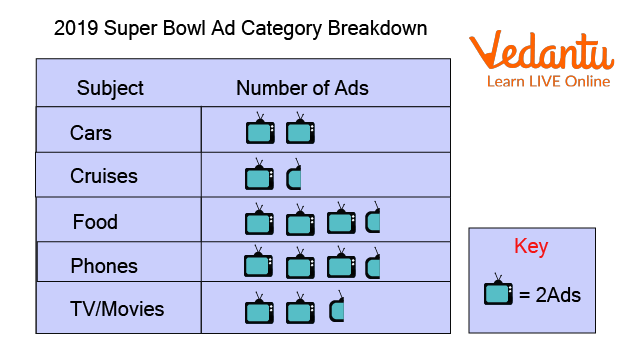
Pictograph on a Commercial
What is a Pictograph?
Pictographs are a form of representing data through pictures in the form of a graph (the name says it all!) It often has a key to understanding the data illustrated.
The pictures or icons used are of the same type and size. Fractions of these icons are also used to display one-half, one-third of the given data.
It is one of the simplest ways of showing data in a very interactive manner. Kids find pictographs very entertaining and help them learn faster.
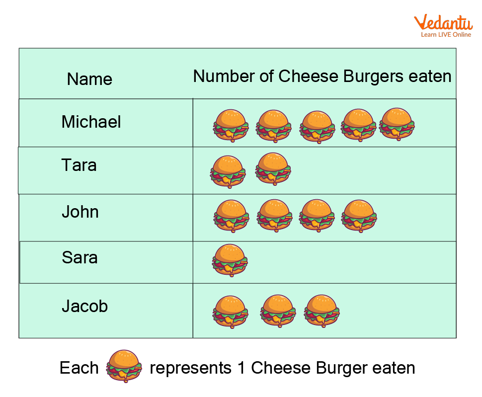
Pictograph Representing Burgers eaten by Children
How Can You Make a Pictograph?
The process of making a pictograph is a few simple steps. Looking into them in a detailed manner may make it seem like it’s a huge process, but once you get a hang of how it works it’s going to be super easy.
Step 1: Collect the data that has to be put in a pictograph or a pictogram. This can be done by simply gathering the data of what is required.
Step 2: Arrange the gathered data in an organised manner to understand it better. This step is pretty important so you know what goes where (Putting the data in the form of a nice table helps!)
Step 3: Look at the data and choose an appropriate symbol. This is a fun step, you get to choose symbols that represent the data. A clock or an hourglass can be used if your data is based on time.
Step 4: Assign a Key. It is kind of important to not forget this step. Data is often huge chunks of information, you can’t obviously draw 1000 apples on a pictograph. That’s a lot of work and kills the whole point of representing the data! A key is like a fixed value given to each symbol. In the previous case opting for 1 apple symbol=, 200 apples would be suitable.
Step 5: Start marking the pictograph by making appropriate columns and rows. Usually there are 2 columns giving the category (how organised is the data) and the actual pictogram. The number of rows depends on the number of data that needs to be interpreted.
Step 6: Don’t forget to put up the key for an easier understanding of the pictograph. Also, check everything before you’re done with the pictogram.
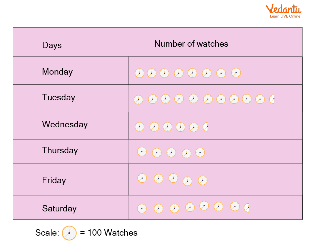
Pictograph Representing Watch Sales
Solved Example
Let’s understand how a pictogram is done better by looking into a solved example.
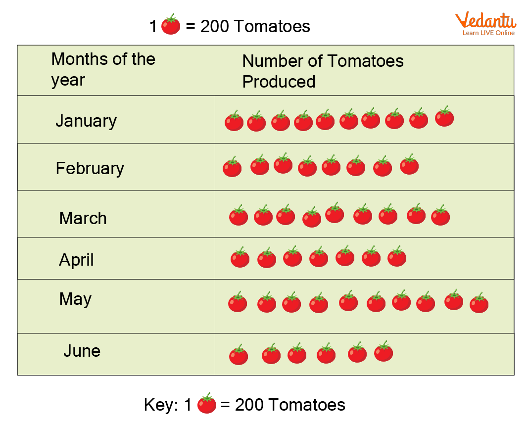
A farmer produced the following amount of tomatoes in the first six months of the year
(Now, usually pictographs have a set of questions that you will be expected to answer from what is given in the pictogram itself. We’re, however, skipping that here as the scope of this article is to understand how to make a pictograph)
Steps 1 and 2 are already done and given in the question, jumping to step 3 assigning the key.
1 🍅= 200 tomatoes
We are going to represent the months vertically and the number of tomatoes produced can be shown horizontally.
Solve Questions
The data can be understood per the reader's needs from the pictograph.
Answering a few questions based on the above-illustrated pictograph will give you an idea of how to read a pictograph.
Understanding the key of the pictograph is important, relating it to the actual data shown helps us read a pictograph easily.
Q1. What does the above pictograph represent?
Ans: Number of tomatoes produced by a farmer in 6 months
Q2. Which month had the maximum number of tomatoes produced?
Ans: January, May
Q3. Which two months have the same number or tomatoes produced?
Ans: January, May
Q 4. Which month had the minimum number of tomatoes produced?
Ans: June
Summary
Pictograph is a pictorial representation of data where the data is arranged in the form of a graph using symbols and a suitable key.
Steps involved to make a pictograph include Collecting the required data, Arranging the data in an organised manner, Choosing a symbol to represent the data, Giving a suitable key, Arranging the appropriate data in the pictogram, Reading the pictograph along with the key to ensuring that the data is represented in a correct manner in the pictogram
FAQs on How To Create A Pictograph In Maths
1. What is a pictograph in Maths?
A pictograph is a type of graph that uses pictures or symbols to represent data. Each picture stands for a fixed number of items, making data easy to understand visually.
- It represents data using images.
- Each symbol has a specific value (called a key).
- It is commonly used in primary-level data handling.
2. How do you make a pictograph step by step?
To make a pictograph, follow simple steps: collect data, choose a symbol, and create a key.
- Step 1: Collect and organize the data in a table.
- Step 2: Choose a suitable picture or symbol.
- Step 3: Decide a key (e.g., 1 symbol = 5 items).
- Step 4: Draw the symbols according to the data.
- Step 5: Add a title and label categories clearly.
3. What is a key in a pictograph?
A key in a pictograph tells how many items each symbol represents. It helps readers interpret the data correctly.
- Example: 1 star = 10 students.
- If there are 3 stars, it means 30 students.
4. How do you read a pictograph?
To read a pictograph, count the symbols in each category and multiply by the key value. This gives the total quantity represented.
- Identify the category.
- Count the number of symbols.
- Multiply by the value given in the key.
5. Can you give an example of a pictograph?
A simple example of a pictograph is showing the number of books read by students using book symbols.
- Key: 1 book symbol = 3 books
- Riya: 📘📘 (2 symbols = 6 books)
- Aman: 📘📘📘 (3 symbols = 9 books)
6. What is the difference between a pictograph and a bar graph?
The main difference is that a pictograph uses pictures to represent data, while a bar graph uses rectangular bars.
- Pictograph: Visual symbols with a key.
- Bar graph: Bars with numerical scale.
- Pictographs are simpler and used for basic data handling.
7. Why is a pictograph used in data handling?
A pictograph is used in data handling because it makes data easy to understand and visually appealing. It helps learners quickly compare quantities.
- Easy to read and interpret.
- Useful for beginners.
- Good for small data sets.
8. What are the rules for drawing a pictograph?
The main rules for drawing a pictograph include choosing a proper key and using equal symbols consistently.
- Use the same symbol throughout.
- Clearly mention the key.
- Give a suitable title.
- Arrange categories neatly.
9. How do you calculate totals from a pictograph?
To calculate totals from a pictograph, multiply the number of symbols by the value of each symbol in the key. This gives the total quantity.
- Count total symbols.
- Multiply by key value.
10. What are common mistakes when making a pictograph?
Common mistakes in making a pictograph include not giving a key or using inconsistent symbol values. These errors can make the data misleading.
- Forgetting to write the key.
- Using different symbol sizes or meanings.
- Incorrect counting of symbols.
- Missing title or labels.