


Answer in details:
Draw a pie-diagram using the following data:
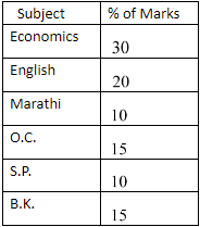
Answer
626.1k+ views
Hint: In this question we have to draw a pie chart for the given data. We need to change the percentage value into the measurement of angle. Then we will draw the pie chart according to that data.
Complete step-by-step answer:
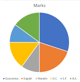
Pie charts are used to compare the size of different data categories. Here, we have to draw a pie chart of the given percentage of marks.
Here, the sum of the data is \[100.\] , so we need not change the percentage. It is already in percentage.
Now, draw a circle of any radius. Bigger the circle is easier to compare.
Multiply each category percentage by \[{360^ \circ }.\] each section needs to represent as a portion of \[{360^ \circ }.\] so, we will get the data as:
Economics \[ = \dfrac{{30}}{{100}} \times {360^ \circ } = {108^ \circ }\]
English \[ = \dfrac{{20}}{{100}} \times {360^ \circ } = {72^ \circ }\]
Marathi\[ = \dfrac{{10}}{{100}} \times {360^ \circ } = {36^ \circ }\]
O.C.\[ = \dfrac{{15}}{{100}} \times {360^ \circ } = {54^ \circ }\]
S.P. \[ = \dfrac{{10}}{{100}} \times {360^ \circ } = {36^ \circ }\]
B.K. \[ = \dfrac{{15}}{{100}} \times {360^ \circ } = {54^ \circ }\]
Now, draw the different sections with the help of a protractor.
Label the chart and draw each section into different colours. It looks attractive and it will be easy to compare.
Here is the pie chart with given data.
Note:A pie chart (or a circle chart) is a circular statistical graphic, which is divided into slices to illustrate numerical proportion. In a pie chart, the arc length of each slice (and consequently its central angle and area), is proportional to the quantity it represents. While it is named for its resemblance to a pie which has been sliced, there are variations on the way it can be presented.
Complete step-by-step answer:
Pie charts are used to compare the size of different data categories. Here, we have to draw a pie chart of the given percentage of marks.
Here, the sum of the data is \[100.\] , so we need not change the percentage. It is already in percentage.
Now, draw a circle of any radius. Bigger the circle is easier to compare.
Multiply each category percentage by \[{360^ \circ }.\] each section needs to represent as a portion of \[{360^ \circ }.\] so, we will get the data as:
Economics \[ = \dfrac{{30}}{{100}} \times {360^ \circ } = {108^ \circ }\]
English \[ = \dfrac{{20}}{{100}} \times {360^ \circ } = {72^ \circ }\]
Marathi\[ = \dfrac{{10}}{{100}} \times {360^ \circ } = {36^ \circ }\]
O.C.\[ = \dfrac{{15}}{{100}} \times {360^ \circ } = {54^ \circ }\]
S.P. \[ = \dfrac{{10}}{{100}} \times {360^ \circ } = {36^ \circ }\]
B.K. \[ = \dfrac{{15}}{{100}} \times {360^ \circ } = {54^ \circ }\]
Now, draw the different sections with the help of a protractor.
Label the chart and draw each section into different colours. It looks attractive and it will be easy to compare.
Here is the pie chart with given data.
Note:A pie chart (or a circle chart) is a circular statistical graphic, which is divided into slices to illustrate numerical proportion. In a pie chart, the arc length of each slice (and consequently its central angle and area), is proportional to the quantity it represents. While it is named for its resemblance to a pie which has been sliced, there are variations on the way it can be presented.
Recently Updated Pages
Master Class 12 Economics: Engaging Questions & Answers for Success
Master Class 12 English: Engaging Questions & Answers for Success
Master Class 12 Social Science: Engaging Questions & Answers for Success
Master Class 12 Maths: Engaging Questions & Answers for Success
Master Class 12 Physics: Engaging Questions & Answers for Success
Master Class 8 English: Engaging Questions & Answers for Success
Trending doubts
What is BLO What is the full form of BLO class 8 social science CBSE
Citizens of India can vote at the age of A 18 years class 8 social science CBSE
Right to vote is a AFundamental Right BFundamental class 8 social science CBSE
Full form of STD, ISD and PCO
What is the area formula of an obtuse triangle class 8 maths CBSE
Give me the opposite gender of Duck class 8 english CBSE