


A survey was conducted to study the various brands of soaps used by people in a village.
Brand of soap A B C Others Percent of Villagers $50\% $ $30\% $ $15\% $ $5\% $
Draw Pie Chart of given data.
| Brand of soap | A | B | C | Others |
| Percent of Villagers | $50\% $ | $30\% $ | $15\% $ | $5\% $ |
Answer
596.4k+ views
Hint: From the question, we have to draw a pie chart. First, we are going to calculate the portions of the pie chart that is to be represented. Here, the percentage of villagers using brand of soaps are given. After calculating the degrees in the pie chart, we will plot them.
Formula used: We will transfer each percentage in terms of degrees as a pie chart is of ${360^ \circ }$ in total.
So, any ${\text{soap usage}}$ = ${\text{percentage}}$ $\times$ ${360^ \circ }$
Complete step-by-step solution:
Now, we are going to find out the portions of the villagers that use a particular brand of soap.
From the given information,
Portion of villagers who use soap A= \[50\% \times {360^ \circ }\]
We calculate the percentage in terms of degree, by dividing the percentage term with 100= $\dfrac{{50}}{{100}} \times {360^ \circ }$
The proportion obtained is = ${180^ \circ }$
Portion of villagers who use soap B= $30\% \times {360^ \circ }$
We calculate the percentage in terms of degree, by dividing the percentage term with 100=$\dfrac{{30}}{{100}} \times {360^ \circ }$
The proportion obtained is =${108^ \circ }$
Portion of villagers who use soap C= $15\% \times {360^ \circ }$
We calculate the percentage in terms of degree, by dividing the percentage term with 100= $\dfrac{{15}}{{100}} \times {360^ \circ }$
The proportion obtained is = ${54^ \circ }$
Portion of villagers who use others= $5\% \times {360^ \circ }$
We calculate the percentage in terms of degree, by dividing the percentage term with 100= $\dfrac{5}{{100}} \times {360^ \circ }$
The proportion obtained is =${18^ \circ }$
We need to draw a pie chart representing the usage of soaps of the villagers with the calculated degrees.
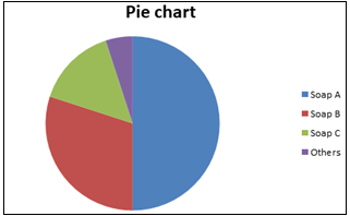
This is the pie chart for the given data. Here, the colours represent the particular soaps and the portions represent their proportions.
Note: A pie chart is used to represent the dataset in a graphical view. It is very easy to understand with a single glance at it. It shows the relative proportions of multiple datasets. It helps to summarize a large data set in a pictorial view.
Formula used: We will transfer each percentage in terms of degrees as a pie chart is of ${360^ \circ }$ in total.
So, any ${\text{soap usage}}$ = ${\text{percentage}}$ $\times$ ${360^ \circ }$
Complete step-by-step solution:
Now, we are going to find out the portions of the villagers that use a particular brand of soap.
From the given information,
Portion of villagers who use soap A= \[50\% \times {360^ \circ }\]
We calculate the percentage in terms of degree, by dividing the percentage term with 100= $\dfrac{{50}}{{100}} \times {360^ \circ }$
The proportion obtained is = ${180^ \circ }$
Portion of villagers who use soap B= $30\% \times {360^ \circ }$
We calculate the percentage in terms of degree, by dividing the percentage term with 100=$\dfrac{{30}}{{100}} \times {360^ \circ }$
The proportion obtained is =${108^ \circ }$
Portion of villagers who use soap C= $15\% \times {360^ \circ }$
We calculate the percentage in terms of degree, by dividing the percentage term with 100= $\dfrac{{15}}{{100}} \times {360^ \circ }$
The proportion obtained is = ${54^ \circ }$
Portion of villagers who use others= $5\% \times {360^ \circ }$
We calculate the percentage in terms of degree, by dividing the percentage term with 100= $\dfrac{5}{{100}} \times {360^ \circ }$
The proportion obtained is =${18^ \circ }$
We need to draw a pie chart representing the usage of soaps of the villagers with the calculated degrees.
This is the pie chart for the given data. Here, the colours represent the particular soaps and the portions represent their proportions.
Note: A pie chart is used to represent the dataset in a graphical view. It is very easy to understand with a single glance at it. It shows the relative proportions of multiple datasets. It helps to summarize a large data set in a pictorial view.
Recently Updated Pages
Master Class 11 Social Science: Engaging Questions & Answers for Success
Master Class 11 English: Engaging Questions & Answers for Success
Master Class 11 Maths: Engaging Questions & Answers for Success
Master Class 11 Chemistry: Engaging Questions & Answers for Success
Master Class 11 Biology: Engaging Questions & Answers for Success
Master Class 11 Physics: Engaging Questions & Answers for Success
Trending doubts
Differentiate between an exothermic and an endothermic class 11 chemistry CBSE
One Metric ton is equal to kg A 10000 B 1000 C 100 class 11 physics CBSE
Difference Between Prokaryotic Cells and Eukaryotic Cells
There are 720 permutations of the digits 1 2 3 4 5 class 11 maths CBSE
Draw a diagram of a plant cell and label at least eight class 11 biology CBSE
1 Quintal is equal to a 110 kg b 10 kg c 100kg d 1000 class 11 physics CBSE