


What is a simple bar diagram?
Construct a simple bar diagram from the following data
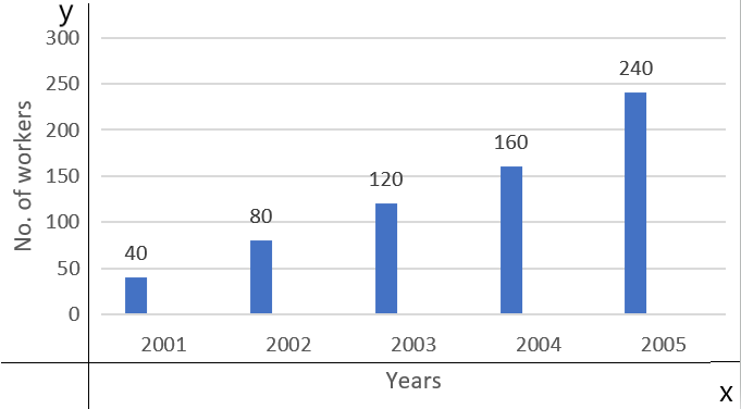
Year 2001 2002 2003 2004 2005 No. of workers. 40 80 120 160 240
| Year | 2001 | 2002 | 2003 | 2004 | 2005 |
| No. of workers. | 40 | 80 | 120 | 160 | 240 |
Answer
556.2k+ views
Hint: In this problem, we can see about a simple bar diagram and we can draw a bar diagram for the given data. We should know that a simple bar diagram is used to represent data involving only one variable classified on a spatial quantitative or temporal basis. In a simple bar chart, we make bars of equal width but vary in length, i.e. the magnitude of the quantity is represented by the height or length of the bars. We can also draw a bar diagram for the given data.
Complete step by step answer:
Here we can see a simple bar diagram.
We should know that a simple bar diagram is used to represent data involving only one variable classified on a spatial quantitative or temporal basis. In a simple bar chart, we make bars of equal width but vary in length, i.e. the magnitude of the quantity is represented by the height or length of the bars.
We can now draw a simple bar diagram for
Here we can see that, the x-axis has the number of workers and the y-axis has the year, where the number of workers increases gradually year by year.
Note: We should know that a simple bar diagram is used to represent data involving only one variable classified on a spatial quantitative or temporal basis. In a simple bar chart, we make bars of equal width but vary in length, i.e. the magnitude of the quantity is represented by the height or length of the bars.
Complete step by step answer:
Here we can see a simple bar diagram.
We should know that a simple bar diagram is used to represent data involving only one variable classified on a spatial quantitative or temporal basis. In a simple bar chart, we make bars of equal width but vary in length, i.e. the magnitude of the quantity is represented by the height or length of the bars.
We can now draw a simple bar diagram for
| Year | 2001 | 2002 | 2003 | 2004 | 2005 |
| No. of workers. | 40 | 80 | 120 | 160 | 240 |
Here we can see that, the x-axis has the number of workers and the y-axis has the year, where the number of workers increases gradually year by year.
Note: We should know that a simple bar diagram is used to represent data involving only one variable classified on a spatial quantitative or temporal basis. In a simple bar chart, we make bars of equal width but vary in length, i.e. the magnitude of the quantity is represented by the height or length of the bars.
Recently Updated Pages
Master Class 11 English: Engaging Questions & Answers for Success
Master Class 11 Social Science: Engaging Questions & Answers for Success
Master Class 11 Maths: Engaging Questions & Answers for Success
Master Class 11 Biology: Engaging Questions & Answers for Success
Master Class 11 Physics: Engaging Questions & Answers for Success
Master Class 11 Chemistry: Engaging Questions & Answers for Success
Trending doubts