


How to Draw and Interpret a Vertical Bar Graph with Steps and Solved Questions
In a vertical bar graph, the bars are plotted vertically along the Y-axis. This type of bar graph is known as a vertical bar graph. These types of graphs are generally drawn for the discrete data types and quantitative comparison between items or observations.
Here, the observation that is going to be compared is represented by the X-axis and the Y-axis represents the parameters on which this comparison is made. The bars of observation originate from the X-axis and are drawn vertically upwards towards the Y-axis.

An Example of Representing a Bar Graph
Types of Vertical Bar Graphs
According to the requirement of the information, there can be different types of vertical bar graphs. Vertical bar graphs are broadly categorised into two types:
Simple vertical bar graphs
Compound vertical graphs
Now let’s understand these types of graphs.
1. Simple vertical bar graphs
In a simple vertical bar graph, there is only one parameter of comparison for each observation. This means that there will be only one bar for each observation. For example, if 5 students of a class are ranked on the basis of the total percentage of marks, then the single vertical bar graph will look like the figure given below.
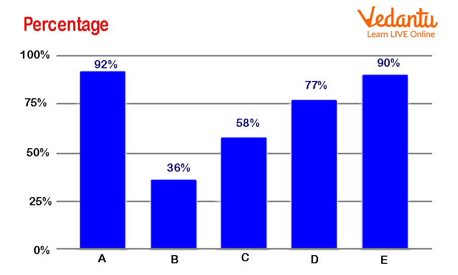
Example of Simple Vertical Bar Graphs
2. Compound vertical bar graphs
In a compound bar graph, there are at least two or more parameters of comparison for each observation. Hence, there will be two or more bars drawn. In compound vertical bar graphs, there can be confusion between bars of parameters, so different colours are assigned to bars.
Compound vertical bar graphs are further classified into two types:
(i) Multiple vertical bar graphs
(ii) Stacked vertical bar graphs
(i) Multiple vertical bar graphs: In this bar graph, different bars are made for different parameters for each observation. Hence, for each observation, different bars of different colours are drawn to represent the different parameters. For example, a multiple vertical bar graph is shown below for the percentage of sales for 4 different colour cars in a company.
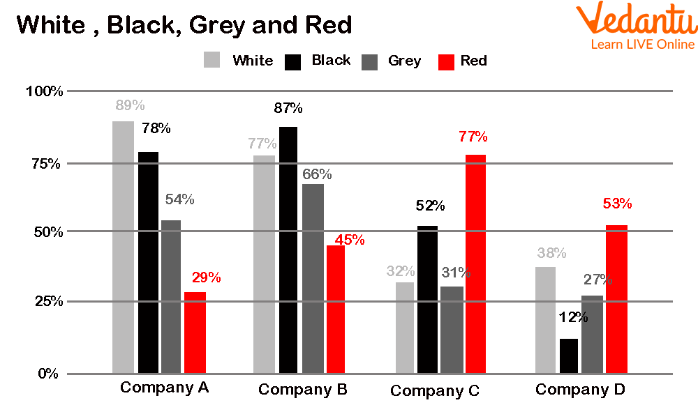
Example of Multiple Vertical Bar Graphs
(ii) Stacked vertical bar graphs
In a stacked vertical bar graph, all parameters of one observation are represented in a single bar or the bars are stacked on top of each other. For example, if we represent the same example of 4 different colour car sales in a company, the stacked vertical bar graph will look like the figure given below.
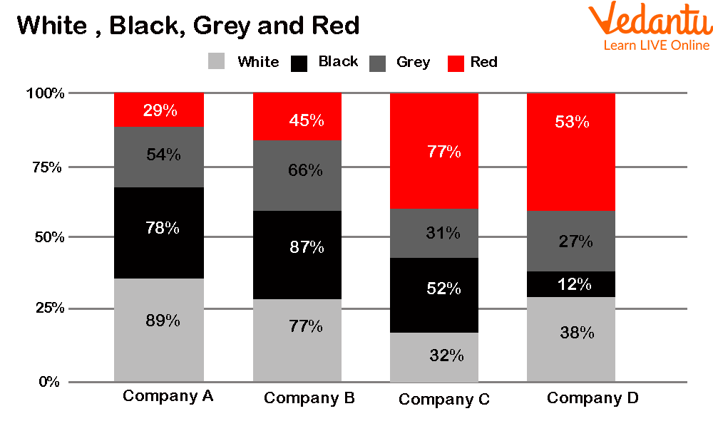
Example of Stacked Vertical Bar Graphs
Conclusion
Graphs and charts are very important; they are helpful in analysing and measuring data in a simple manner. In this article, the vertical bar graph is discussed with its types. Examples of each type of vertical bar graph are also provided.
FAQs on Vertical Bar Graph Explained with Clear Examples
1. What is a vertical bar graph?
A vertical bar graph is a graphical representation of data where rectangular bars are drawn vertically to show comparisons between different categories.
- The x-axis shows categories (e.g., subjects, products, months).
- The y-axis shows numerical values or frequencies.
- The height of each bar represents the value of that category.
2. How do you draw a vertical bar graph step by step?
To draw a vertical bar graph, first label the axes and then draw bars according to the data values.
- Step 1: Draw two perpendicular axes (x-axis and y-axis).
- Step 2: Label the x-axis with categories.
- Step 3: Choose a suitable scale for the y-axis.
- Step 4: Mark numerical values on the y-axis.
- Step 5: Draw vertical bars with equal width and spacing.
3. What is the difference between a vertical bar graph and a horizontal bar graph?
The main difference is that a vertical bar graph has vertical bars while a horizontal bar graph has horizontal bars.
- In a vertical bar graph, categories are on the x-axis and values on the y-axis.
- In a horizontal bar graph, categories are on the y-axis and values on the x-axis.
- Both are used to compare discrete data.
4. What type of data is best represented by a vertical bar graph?
A vertical bar graph is best used for discrete or categorical data.
- Examples include number of students in classes.
- Sales of different products.
- Marks obtained in different subjects.
5. What is the scale in a vertical bar graph?
The scale in a vertical bar graph is the fixed value assigned to each division on the y-axis.
- Example: 1 unit = 10 students.
- All intervals must be equal.
- A proper scale makes the graph clear and accurate.
6. Can you give an example of a vertical bar graph?
A simple example of a vertical bar graph is showing marks scored by a student in five subjects.
- Maths: 80
- Science: 70
- English: 90
- History: 60
- Art: 75
7. Why are all bars equal in width in a vertical bar graph?
All bars in a vertical bar graph are equal in width to ensure fair comparison between categories.
- Equal width avoids misleading visual effects.
- Only the height of the bar should represent the value.
- Unequal widths can distort data interpretation.
8. What are the important parts of a vertical bar graph?
The important parts of a vertical bar graph include the axes, scale, bars, and title.
- X-axis: Shows categories.
- Y-axis: Shows numerical values.
- Bars: Represent data values.
- Scale: Indicates value intervals.
- Title: Describes what the graph represents.
9. How do you interpret a vertical bar graph?
To interpret a vertical bar graph, compare the heights of the bars to understand differences between categories.
- Identify the highest and lowest bars.
- Check the scale on the y-axis.
- Read the exact value where the bar reaches.
10. What are common mistakes when drawing a vertical bar graph?
Common mistakes in a vertical bar graph include incorrect scaling and unequal bar spacing.
- Using an inconsistent scale.
- Drawing bars with unequal widths.
- Forgetting to label axes or add a title.
- Not starting the y-axis from 0 when required.