


How to Represent Data on a Bar Graph Step by Step with Solved Examples
A bar graph is a chart or a graphical depiction of information, amounts, or numbers using bars or strips. To make a comparison of numbers, frequencies, or other measurements of different categories of data, bar graphs are used. The bars offer a visual representation for comparing quantities in different categories. Bar graphs contain the x and y axes, also referred to as the horizontal and vertical axes, as well as the title, labels, and bars. Each bar's height can be used to display information such as the number of items in each category or the frequency of an event. Let's describe what a bar graph is, how kids are taught to recognise them, how to make a bar graph on graph paper, and how to make one with groups of discrete data.
Types of Bar Graph
There are mainly two types of bar graphs: horizontal graph and vertical graph.
Vertical Bar Graphs: Vertical bar graphs are those in which the given data are displayed vertically in a graph or chart with the aid of rectangular bars that display the measure of data. The y-axis displays the value of the height of the rectangular bars, which indicates the quantity of the variables written on the x-axis, and the rectangular bars are drawn vertically on the x-axis.
Vertical Bar Graphs
Horizontal Bar Graphs: These graphs are referred to as horizontal bar graphs when the given data is displayed horizontally by employing rectangular bars that display the data's measure. In this type, the categories or variables of the data must be put down before the rectangular bars are drawn horizontally on the y-axis and the length of the bars is displayed on the x-axis as the values of the various variables present in the data.

Horizontal Bar Graphs
Bar Graph of Population
Create a bar graph using the information below.
India's population in each of the subsequent census years:
We use the years on the X-axis and the population on the Y-axis to build the graph. We plot the graph in rectangles each year by assuming that both axes have a scale, which implies that we use 10 years as one unit, which will be the width of the rectangle, and the population as the length of the rectangle.
Let's now establish a table with the coordinates of the points that will be shown on the graph in one column, as shown below.
Let's use the scale now.
10 years are equal to 1 unit on the X-axis.
One unit equals 100 million on the Y-axis.
Let's plot the given data's bar graph using this scale.
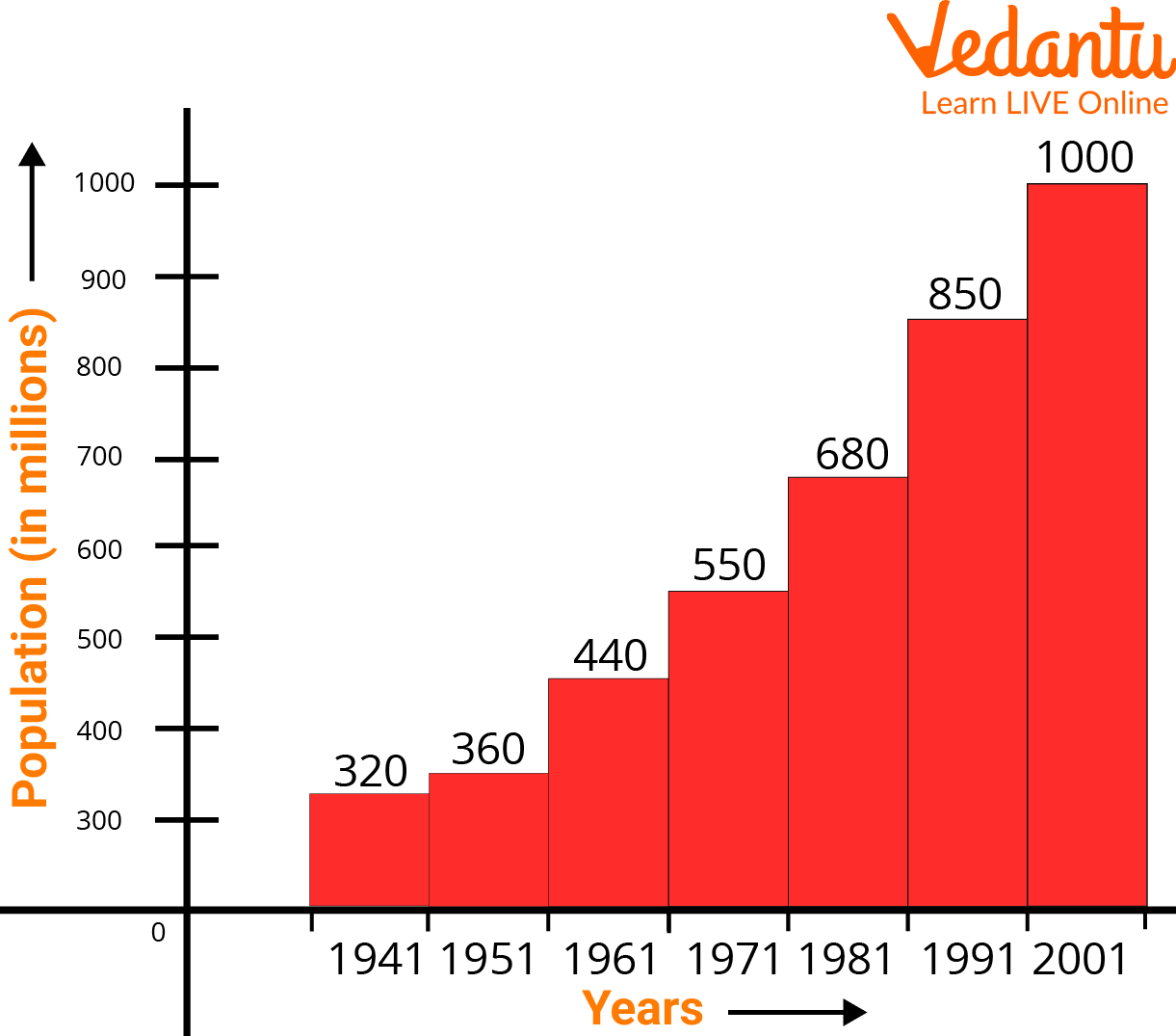
Bar Graph of Population
As a result, a bar graph showing the provided data is created.
How to Draw a Bar Graph on a Graph Paper?
With the aid of an example, let's learn how to draw a bar graph. Liza visited the market to purchase a variety of fruits, including 5 apples, 3 mangoes, 2 watermelons, 3 strawberries, and 6 oranges. She wants to create a bar graph to visualize the data so she can see what kinds of fruits she purchases the most frequently.
Let's use the next few stages to create a bar graph of the fruit that is most frequently purchased.
Step 1: Take a piece of graph paper, and label the bars with a caption like "Most Bought Fruit."
Step 2: On a plane, draw the horizontal (x-axis) and vertical (y-axis) axes.
Step 3: Next, give the horizontal axis, which is an independent category, the name "Types of Fruits," and the vertical axis, which is a dependent category, the name "Number of Fruits."
Step 4: Write the names of the fruits on the horizontal axis, such as apples, mangoes, watermelon, strawberries, and oranges, and leave an equal gap or spacing between each fruit.
Step 5: Describe the graph's scale, which demonstrates how numbers are used in the data. It is a system of markers spaced at specific intervals that aids in object measurement. The scale of a graph, for instance, could be expressed as 1 unit = 1 fruit.
Step 6: Start constructing rectangular bars for each fruit, leaving equal spaces between them, and assigning heights to the corresponding numbers.
Step 7: Now that the bar graph is complete, determine which fruit is the most popular by measuring the height of the rectangle bars for each fruit.
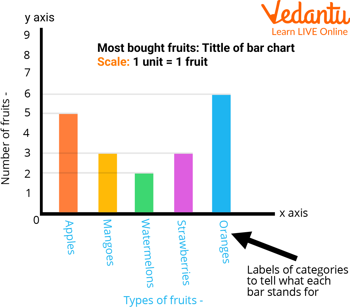
Bar Graph on Graph Paper
We may conclude from the graph above that Liza purchases oranges more frequently than any other fruit.
Green Bar Graph Paper
A piece of writing paper with thin lines printed on it to create a regular grid is known as graph paper, coordinate paper, grid paper, or squared paper. When producing graphs of functions or experimental data and sketching curves, the lines are frequently used as a guide. The green graph is one of the most often used graph papers with color-coded labels that you'll find. Graph paper is a generic term for a sheet of paper with grids or fine lines on it. These tiny lines are what give the paper's grid its ultimate shape as a graph. We use green graph paper to make bar graphs.
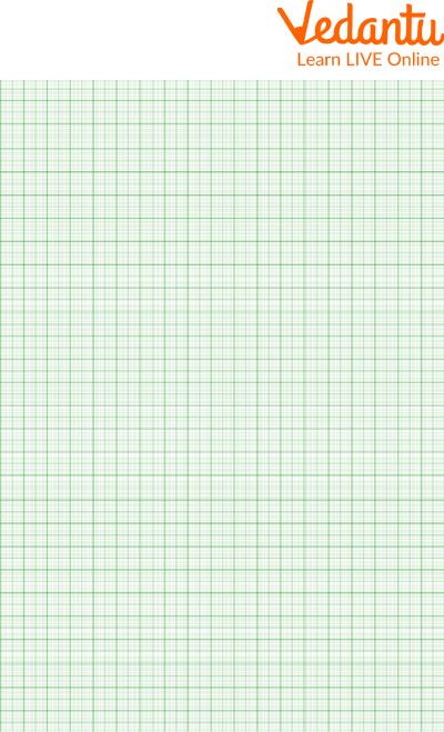
Green Graph Paper
Solved Examples
Example 1: We surveyed 100 youngsters to find out about their preferred method of transportation to school. The table below lists the findings of this survey. Draw a bar graph to illustrate this data.
Ans: We must first determine from the data in the table what our graph's requirements will be before we can create the bar graph:The y-axis scale must extend at least as high as 35 because there are 5 categories and there must be space for 5 bars. The highest frequency is 35.
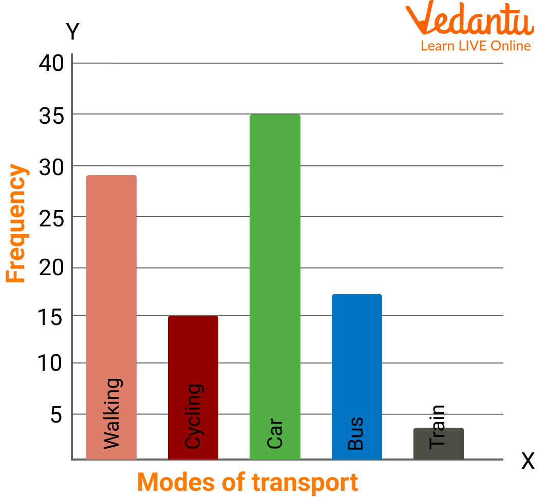
Bar Graph
Example 2: The data of a student's class test is given below. Draw a bar graph to illustrate this data.
Ans: The bar graph of the given data is given below:

Bar Graph
Practice Problems
1. A survey of 5 bike companies was conducted to determine "Which company sold the maximum bikes?"
Draw a horizontal bar graph for the given data.
Ans: Bar graph for the given data is:
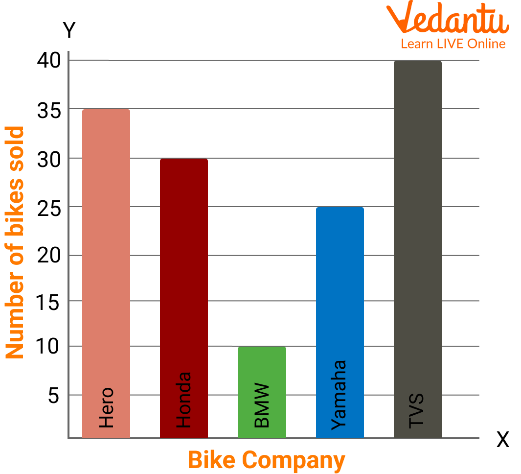
Bar Graph
TVS sold the maximum bike.
Summary
In this article we learned about a bar chart, often known as a bar graph, which is a diagram that displays categorical data as rectangular bars with heights or lengths proportional to the values they stand for. Bar graphs and charts give categorical data a visual representation. Categorical data is the categorization of data into distinct groups, such as age range, shoe size, and animal species. Typically, these classifications are qualitative.
FAQs on Representing Data on a Bar Graph with Clear Explanation and Examples
1. What is a bar graph in mathematics?
A bar graph is a visual representation of data using rectangular bars to compare different categories. Each bar’s height or length represents the value or frequency of a category.
- The bars can be vertical or horizontal.
- All bars have equal width.
- The height of each bar corresponds to the numerical value.
2. How do you represent data on a bar graph step by step?
To represent data on a bar graph, follow clear steps to ensure accuracy and readability.
- Step 1: Draw two perpendicular axes (x-axis and y-axis).
- Step 2: Label the horizontal axis with categories.
- Step 3: Choose a suitable scale for the vertical axis.
- Step 4: Draw equal-width bars according to the data values.
- Step 5: Give a proper title and label both axes.
3. What is the difference between a bar graph and a histogram?
The main difference is that a bar graph represents categorical data, while a histogram represents continuous data.
- In bar graphs, bars are separated by gaps.
- In histograms, bars touch each other.
- Bar graphs compare categories, while histograms show frequency distribution of intervals.
4. How do you choose the correct scale for a bar graph?
The correct scale for a bar graph is chosen based on the range and size of the data values.
- Find the highest value in the dataset.
- Select intervals (e.g., 1, 2, 5, 10) that fit the graph space.
- Ensure equal intervals on the axis.
5. Can you give an example of representing data on a bar graph?
Yes, a simple example helps in understanding how to draw a bar graph. Suppose the number of books read by four students is: A = 2, B = 5, C = 3, D = 4.
- Draw axes and label students on the x-axis.
- Choose scale: 1 unit = 1 book.
- Draw bars with heights 2, 5, 3, and 4 respectively.
6. Why are bar graphs important in data handling?
Bar graphs are important because they make comparison of data simple and visually clear.
- They help identify highest and lowest values quickly.
- They simplify complex data.
- They are widely used in statistics and real-life reports.
7. What are the parts of a bar graph?
The main parts of a bar graph include essential labeled components for clarity.
- Title – describes the data.
- X-axis – shows categories.
- Y-axis – shows values or frequency.
- Scale – defines unit measurement.
- Bars – represent the data values.
8. How do you interpret a bar graph?
To interpret a bar graph, compare the heights or lengths of the bars to understand the data values.
- Identify the tallest bar for the maximum value.
- Identify the shortest bar for the minimum value.
- Compare differences between categories.
9. What are the types of bar graphs?
The main types of bar graphs are simple, double, and multiple bar graphs.
- Simple bar graph – represents one set of data.
- Double bar graph – compares two sets of data.
- Multiple bar graph – compares more than two datasets.
10. What are common mistakes when drawing a bar graph?
Common mistakes when drawing a bar graph include incorrect scale selection and uneven bar widths.
- Choosing an inconsistent scale.
- Not leaving equal gaps between bars.
- Forgetting to label axes or title.
- Drawing bars with unequal widths.