


Write and draw the two differences between bar and histogram graph.
Answer
572.7k+ views
Hint: Bar and histogram graph can be differentiated based on their meaning, appearance and indications. Histogram is a graphical representation, which displays data by way of bars to show the frequency of numerical data. Bar graph is a pictorial. In histogram, bars touch each other while in the bar graph, spaces are present between the bars.
Complete step-by-step solution:
We can differentiate bar and histogram graphs based on their meaning, appearance and indications. We know that histogram is a graphical representation, which displays data by way of bars to show the frequency of numerical data while bar graph is a pictorial representation of data that uses bars to compare different categories of data.
We can differentiate bars and histograms based on the data they indicate. Histogram indicates the distribution of non-discrete variables while bar graph indicates comparison of discrete variables. Histogram presents quantitative data while bar graph presents categorical data.
The main difference that we can see from histogram and bar graph is that the former have bars that touch each other without spaces while in the latter there are spaces between the bars.
Another key difference that we can spot from the histogram and bar graph drawn below is that in histogram, the elements are grouped together, so that they are considered as ranges while in the bar graph elements are taken as individual entities.
Let us consider an example. The following table denotes the height of 10 students studying in eighth grade.
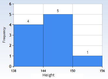
Let us first draw a histogram. On the X-axis, we will have a range of height. For example, we will consider 138cm to 144cm as range 1, 144cm to 150cm as range 2 and so on. On the Y-axis, we will denote the average number of students falling in a particular range. We have to note that the scales for both the axes have to be the same. Now, we will draw rectangles with bases as class intervals (range) and corresponding frequencies as heights. The height of each rectangle is proportional to the corresponding class frequency if the intervals are equal.
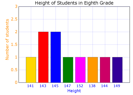
Now, let us draw the bar graph. The X-axis denotes the height and the Y-axis denotes the number of students (frequency).
From the above graphs we can see that histograms can have different widths of the bars while the bars in the bar graph must be of the same width.
Note: Students must know to draw histogram and bar graphs. There are many types of histograms viz. uniform, bimodal, symmetric and probability. We will use histogram to check whether the process changes from one period to another or to check the shape of the data distribution. It is also used to determine whether the output is different when it involves two or more processes or to analyze whether the given process meets the customer requirements. We use bar graphs to compare things between different groups or to track changes over time.
Complete step-by-step solution:
We can differentiate bar and histogram graphs based on their meaning, appearance and indications. We know that histogram is a graphical representation, which displays data by way of bars to show the frequency of numerical data while bar graph is a pictorial representation of data that uses bars to compare different categories of data.
We can differentiate bars and histograms based on the data they indicate. Histogram indicates the distribution of non-discrete variables while bar graph indicates comparison of discrete variables. Histogram presents quantitative data while bar graph presents categorical data.
The main difference that we can see from histogram and bar graph is that the former have bars that touch each other without spaces while in the latter there are spaces between the bars.
Another key difference that we can spot from the histogram and bar graph drawn below is that in histogram, the elements are grouped together, so that they are considered as ranges while in the bar graph elements are taken as individual entities.
Let us consider an example. The following table denotes the height of 10 students studying in eighth grade.
| Sr. No | Height (in cm) |
| 1 | 141 |
| 2 | 143 |
| 3 | 145 |
| 4 | 145 |
| 5 | 147 |
| 6 | 152 |
| 7 | 143 |
| 8 | 138 |
| 9 | 144 |
| 10 | 149 |
Let us first draw a histogram. On the X-axis, we will have a range of height. For example, we will consider 138cm to 144cm as range 1, 144cm to 150cm as range 2 and so on. On the Y-axis, we will denote the average number of students falling in a particular range. We have to note that the scales for both the axes have to be the same. Now, we will draw rectangles with bases as class intervals (range) and corresponding frequencies as heights. The height of each rectangle is proportional to the corresponding class frequency if the intervals are equal.
Now, let us draw the bar graph. The X-axis denotes the height and the Y-axis denotes the number of students (frequency).
From the above graphs we can see that histograms can have different widths of the bars while the bars in the bar graph must be of the same width.
Note: Students must know to draw histogram and bar graphs. There are many types of histograms viz. uniform, bimodal, symmetric and probability. We will use histogram to check whether the process changes from one period to another or to check the shape of the data distribution. It is also used to determine whether the output is different when it involves two or more processes or to analyze whether the given process meets the customer requirements. We use bar graphs to compare things between different groups or to track changes over time.
Recently Updated Pages
Basicity of sulphurous acid and sulphuric acid are
Master Class 12 Economics: Engaging Questions & Answers for Success
Master Class 12 Biology: Engaging Questions & Answers for Success
Master Class 11 English: Engaging Questions & Answers for Success
Master Class 11 Physics: Engaging Questions & Answers for Success
Master Class 11 Computer Science: Engaging Questions & Answers for Success
Trending doubts
What is the Total Duration of Football Match?
Explain the Treaty of Vienna of 1815 class 10 social science CBSE
In football, which nation is called "La Roja"?
Why is there a time difference of about 5 hours between class 10 social science CBSE
10 examples of evaporation in daily life with explanations
What is the full form of POSCO class 10 social science CBSE