


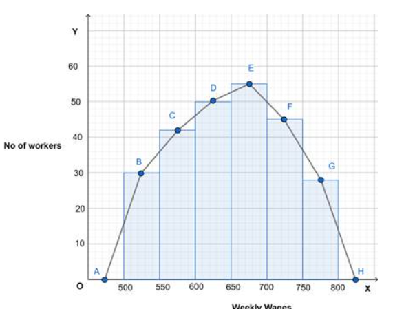
Weekly wages of 250 workers in a factory are given in the following table. Construct the histogram and frequency polygon on the same graph for the data given.
Weekly wage 500-550 550-600 600-650 650-700 700-750 750-800 No of workers 30 42 50 55 45 28
| Weekly wage | 500-550 | 550-600 | 600-650 | 650-700 | 700-750 | 750-800 |
| No of workers | 30 | 42 | 50 | 55 | 45 | 28 |
Answer
578.1k+ views
Hint:
Make a new tally chart in which there will be a midpoint row.
Histogram - a diagram consisting of rectangles whose area is proportional to the frequency of a variable and whose width is equal to the class interval.
Frequency polygon - frequency polygon is a graph constructed by using lines to join the midpoints of each interval, or bin.
Complete step by step solution:
We will take an x-y plane for the histogram.
On x- plane weekly wages are given and on y- plane no of workers are given.
First, we will take midpoint of the bar. And connect them to make a curve.
Note:
A frequency polygon is a graph constructed by using lines to join the midpoints of each interval, or bin. The heights of the points represent the frequencies. A frequency polygon can be created from the histogram or by calculating the midpoints of the bins from the frequency distribution table.
Steps to Draw a Frequency Polygon
1) Mark all the class marks on the horizontal axis. It is also known as the mid-value of every class.
2) Corresponding to each class mark, plot the frequency as given to you. ...
3) Join all the plotted points using a line segment. ...
4) This resulting curve is called the frequency polygon.
Histogram: a graphical display of data using bars of different heights. It is similar to a Bar Chart, but a histogram groups numbers into ranges . The height of each bar shows how many fall into each range. A frequency distribution shows how often each different value in a set of data occurs. A histogram is the most commonly used graph to show frequency distributions. It looks very much like a bar chart, but there are important differences between them.
Make a new tally chart in which there will be a midpoint row.
Histogram - a diagram consisting of rectangles whose area is proportional to the frequency of a variable and whose width is equal to the class interval.
Frequency polygon - frequency polygon is a graph constructed by using lines to join the midpoints of each interval, or bin.
Complete step by step solution:
| Weekly wages | Mid-point | No of workers |
| 500-550 | 525 | 30 |
| 550-600 | 575 | 42 |
| 600-650 | 627 | 50 |
| 650-700 | 672 | 55 |
| 700-750 | 725 | 45 |
| 750-800 | 775 | 28 |
We will take an x-y plane for the histogram.
On x- plane weekly wages are given and on y- plane no of workers are given.
First, we will take midpoint of the bar. And connect them to make a curve.
Note:
A frequency polygon is a graph constructed by using lines to join the midpoints of each interval, or bin. The heights of the points represent the frequencies. A frequency polygon can be created from the histogram or by calculating the midpoints of the bins from the frequency distribution table.
Steps to Draw a Frequency Polygon
1) Mark all the class marks on the horizontal axis. It is also known as the mid-value of every class.
2) Corresponding to each class mark, plot the frequency as given to you. ...
3) Join all the plotted points using a line segment. ...
4) This resulting curve is called the frequency polygon.
Histogram: a graphical display of data using bars of different heights. It is similar to a Bar Chart, but a histogram groups numbers into ranges . The height of each bar shows how many fall into each range. A frequency distribution shows how often each different value in a set of data occurs. A histogram is the most commonly used graph to show frequency distributions. It looks very much like a bar chart, but there are important differences between them.
Recently Updated Pages
Master Class 9 General Knowledge: Engaging Questions & Answers for Success
Master Class 9 Social Science: Engaging Questions & Answers for Success
Master Class 9 English: Engaging Questions & Answers for Success
Master Class 9 Maths: Engaging Questions & Answers for Success
Master Class 9 Science: Engaging Questions & Answers for Success
Class 9 Question and Answer - Your Ultimate Solutions Guide
Trending doubts
Difference Between Plant Cell and Animal Cell
Fill the blanks with the suitable prepositions 1 The class 9 english CBSE
Who is eligible for RTE class 9 social science CBSE
Which places in India experience sunrise first and class 9 social science CBSE
What is pollution? How many types of pollution? Define it
Name 10 Living and Non living things class 9 biology CBSE