


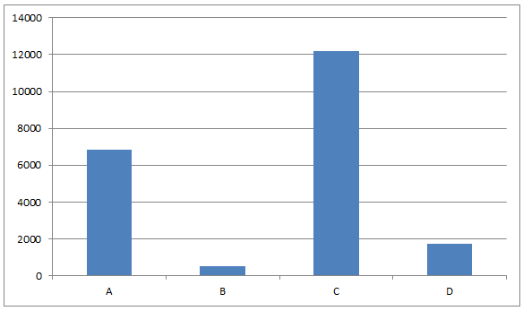
The population of four towns A, B, C and D as in 2011 are as follows:
Town Population A 6863 B 519 C 12185 D 1755
What is the appropriate diagram to present the above data?
(A) Pie Chart
(B) Bar Chart
(C) Histogram
(D) Line Graph
| Town | Population |
| A | 6863 |
| B | 519 |
| C | 12185 |
| D | 1755 |
Answer
547.8k+ views
Hint: Here, we must know that there are only two variables (Town and population) and only four data points. A bar chart is a graph with rectangular bars. The graph usually compares different categories. Although the graphs can be plotted vertically (bars standing up) or horizontally (bars lying flat from left to right), the most usual type of bar graph is vertical.
Complete step-by-step solution:
A bar chart is a way of summarizing a set of categorical data (continuous data can be made categorical by auto-binning).
Here we have to draw a bar chart for the given information as follows:
The bar chart displays data using a number of bars, each representing a particular category.
The height of each bar is proportional to a specific aggregation (for example the sum of the values in the category it represents).
The categories could be something like an age group or a geographical location.
It is also possible to color or split each bar into another categorical column in the data, which enables you to see the contribution from different categories to each bar or group of bars in the bar chart.
Thus a Bar Chart can be used to compare the population in four towns.
So the answer to the above question is option (B).
Note: That in some of the cases the category axis can be referred to as X-axis and the value axis can be referred to as Y-axis. This is the case in some varied curves and the lines. Bar graphs are used to compare things between different groups or to track changes over time. However, when trying to measure change over time bar graphs are best when the changes are larger.
Recently Updated Pages
Master Class 11 Computer Science: Engaging Questions & Answers for Success
Master Class 11 Business Studies: Engaging Questions & Answers for Success
Master Class 11 Economics: Engaging Questions & Answers for Success
Master Class 11 English: Engaging Questions & Answers for Success
Master Class 11 Maths: Engaging Questions & Answers for Success
Master Class 11 Biology: Engaging Questions & Answers for Success
Trending doubts
One Metric ton is equal to kg A 10000 B 1000 C 100 class 11 physics CBSE
There are 720 permutations of the digits 1 2 3 4 5 class 11 maths CBSE
Discuss the various forms of bacteria class 11 biology CBSE
Draw a diagram of a plant cell and label at least eight class 11 biology CBSE
State the laws of reflection of light
Explain zero factorial class 11 maths CBSE