


The number of hours, spent by a school boy in different activities in a working day, is given below:
Activities Number of hours Sleep $8$ School $7$ Home $4$ Play $2$ Other $3$ Total $24$
Present the information in the form of a pie-chart.
| Activities | Number of hours |
| Sleep | $8$ |
| School | $7$ |
| Home | $4$ |
| Play | $2$ |
| Other | $3$ |
| Total | $24$ |
Answer
590.1k+ views
Hint: In this question, we are given a table which states the number of hours a boy spends doing the various activities in the entire day and we have been asked to draw a pie chart out of the given information. At first, find out the degrees of each sector by putting the information in the formula $ \Rightarrow \dfrac{{{\text{Given data}}}}{{{\text{Total value of data}}}} \times 360^\circ $. After you have all the degrees, plot them in a pie chart. You can also color them if you want.
Complete step-by-step solution:
We are given a table stating the number of hours a boy spends doing the given activities in the entire day. We are asked to draw a pie chart out of the given information.
Before calculating the degrees covered by each activity, let us know the formula which will help us in doing so.
$ \Rightarrow \dfrac{{{\text{Given data}}}}{{{\text{Total value of data}}}} \times 360^\circ $
Let us start calculating each of the following one by one:
Now we have got the angles of all the activities and now we can plot them in the pie chart. To do so, follow the following steps:
Step 1: Draw a circle of whatever radius you feel is comfortable and draw a radius.
Step 2: Start with drawing any angle by taking the radius as an arm of the angle and the center as vertex.
Step 3: Construct other sectors by taking the arm of the pre-constructed angle and make the pie-chart.
Step 4: Label each sector with the given name as shown below:
Note: A pie chart (or a circle chart) is a circular statistical graphic, which is divided into slices to illustrate numerical proportion. In a pie chart, the arc length or each slice (and consequently its central angle and area), is proportional to the quantity it represents. While it is named for its resemblance to a pie which has been sliced, there are variations on the way it can be presented.
The students can also color the sectors with different colors to make sectors look more differentiated and attractive.
Complete step-by-step solution:
We are given a table stating the number of hours a boy spends doing the given activities in the entire day. We are asked to draw a pie chart out of the given information.
Before calculating the degrees covered by each activity, let us know the formula which will help us in doing so.
$ \Rightarrow \dfrac{{{\text{Given data}}}}{{{\text{Total value of data}}}} \times 360^\circ $
Let us start calculating each of the following one by one:
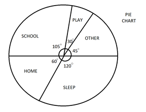
| Activities | Number of hours | Angle |
| Sleep | $8$ | $\dfrac{8}{{24}} \times 360^\circ = 120^\circ $ |
| School | $7$ | $\dfrac{7}{{24}} \times 360^\circ = 105^\circ $ |
| Home | $4$ | $\dfrac{4}{{24}} \times 360^\circ = 60^\circ $ |
| Play | $2$ | $\dfrac{2}{{24}} \times 360^\circ = 30^\circ $ |
| Other | $3$ | $\dfrac{3}{{24}} \times 360^\circ = 45^\circ $ |
| Total | $24$ | $360^\circ $ |
Now we have got the angles of all the activities and now we can plot them in the pie chart. To do so, follow the following steps:
Step 1: Draw a circle of whatever radius you feel is comfortable and draw a radius.
Step 2: Start with drawing any angle by taking the radius as an arm of the angle and the center as vertex.
Step 3: Construct other sectors by taking the arm of the pre-constructed angle and make the pie-chart.
Step 4: Label each sector with the given name as shown below:
Note: A pie chart (or a circle chart) is a circular statistical graphic, which is divided into slices to illustrate numerical proportion. In a pie chart, the arc length or each slice (and consequently its central angle and area), is proportional to the quantity it represents. While it is named for its resemblance to a pie which has been sliced, there are variations on the way it can be presented.
The students can also color the sectors with different colors to make sectors look more differentiated and attractive.
Recently Updated Pages
Master Class 11 Social Science: Engaging Questions & Answers for Success
Master Class 11 Physics: Engaging Questions & Answers for Success
Master Class 11 Maths: Engaging Questions & Answers for Success
Master Class 11 Economics: Engaging Questions & Answers for Success
Master Class 11 Computer Science: Engaging Questions & Answers for Success
Master Class 11 Chemistry: Engaging Questions & Answers for Success
Trending doubts
One Metric ton is equal to kg A 10000 B 1000 C 100 class 11 physics CBSE
There are 720 permutations of the digits 1 2 3 4 5 class 11 maths CBSE
1 Quintal is equal to a 110 kg b 10 kg c 100kg d 1000 class 11 physics CBSE
State and prove Bernoullis theorem class 11 physics CBSE
Difference Between Prokaryotic Cells and Eukaryotic Cells
Which among the following are examples of coming together class 11 social science CBSE