


The following table represents the income of Gram Panchayat from different sources in a particular year:
Sources Income Income from local taxes \[75000\] Funds received from government \[150000\] Donations \[25000\] Income from other resources \[50000\]
Draw a bar graph to represent the above information.
| Sources | Income |
| Income from local taxes | \[75000\] |
| Funds received from government | \[150000\] |
| Donations | \[25000\] |
| Income from other resources | \[50000\] |
Answer
521.4k+ views
Hint: First, we have to draw a graph for represent the income of gram panchayat. All the information also given in the question.
A bar graph refers to the graph or graphical representation that is used to represent the data or quantities in rectangular bars or stripes to represent the categorical presentation of data. The bar can be presented vertically or horizontally.
The bar graph is used to compare different information or groups or to keep a track of change over time.
Complete step by step solution:
We are given the following table represents the income of Gram Panchayat from different sources in a particular year:
Now, we have to plot a bar graph with respect to the above information.
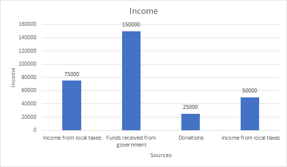
The above bar graph represents the income distribution of various sources. The four bars represent different sources and the income received from those sources. The X-axis is of Sources and the Y-axis is of Income. The bars have been presented vertically. The bar compares the income from various sources. According to the bar graph comparison, the highest income is from the source of funds received from the government and the lowest income is from the donations. The second position according to the height of the bar is income from local taxes and third position is income from local taxes.
Note:
While drawing the bar graph the space between each graph should be equal. There is a difference between histogram and bar graph. Hyetographs shows the graphical representation in the form of frequency of data whereas, bar graph is used for comparing the data.
A bar graph refers to the graph or graphical representation that is used to represent the data or quantities in rectangular bars or stripes to represent the categorical presentation of data. The bar can be presented vertically or horizontally.
The bar graph is used to compare different information or groups or to keep a track of change over time.
Complete step by step solution:
We are given the following table represents the income of Gram Panchayat from different sources in a particular year:
| Sources | Income |
| Income from local taxes | \[75000\] |
| Funds received from government | \[150000\] |
| Donations | \[25000\] |
| Income from other resources | \[50000\] |
Now, we have to plot a bar graph with respect to the above information.
The above bar graph represents the income distribution of various sources. The four bars represent different sources and the income received from those sources. The X-axis is of Sources and the Y-axis is of Income. The bars have been presented vertically. The bar compares the income from various sources. According to the bar graph comparison, the highest income is from the source of funds received from the government and the lowest income is from the donations. The second position according to the height of the bar is income from local taxes and third position is income from local taxes.
Note:
While drawing the bar graph the space between each graph should be equal. There is a difference between histogram and bar graph. Hyetographs shows the graphical representation in the form of frequency of data whereas, bar graph is used for comparing the data.

Recently Updated Pages
Master Class 7 English: Engaging Questions & Answers for Success
Master Class 7 Maths: Engaging Questions & Answers for Success
Master Class 7 Science: Engaging Questions & Answers for Success
Class 7 Question and Answer - Your Ultimate Solutions Guide
Master Class 9 General Knowledge: Engaging Questions & Answers for Success
Master Class 9 Social Science: Engaging Questions & Answers for Success
Trending doubts
The value of 6 more than 7 is A 1 B 1 C 13 D 13 class 7 maths CBSE
Convert 200 Million dollars in rupees class 7 maths CBSE
List of coprime numbers from 1 to 100 class 7 maths CBSE
The plural of Chief is Chieves A True B False class 7 english CBSE
What are the controls affecting the climate of Ind class 7 social science CBSE
Fill in the blanks with appropriate modals a Drivers class 7 english CBSE