


The following table gives the life time of 400 neon Lamps:
i) Represent the given information with the help of a histogram
ii) How many lamps have a lifetime 4 more than 700 hours?
Lifetime (in hours) Number lamps 300-400 14 400-500 56 500-600 60 600-700 86 700-800 74 800-900 62 900-1000 48
| Lifetime (in hours) | Number lamps |
| 300-400 | 14 |
| 400-500 | 56 |
| 500-600 | 60 |
| 600-700 | 86 |
| 700-800 | 74 |
| 800-900 | 62 |
| 900-1000 | 48 |
Answer
543.1k+ views
Hint: Whenever we represent a set of data in a histogram, we need to check if the given data is continuous or discontinuous. If it is continuous, as of this problem, we can directly start plotting the graph. If the data is discontinuous, then we should convert it into continuous intervals and then plot a histogram
Complete step-by-step answer:
The Difference Between Bar Charts and Histograms
With bar charts, each column represents a group defined by a categorical variable; and with histograms, each column represents a group defined by a continuous, quantitative variable.
Histograms are used to show distributions of variables while bar charts are used to compare variables. Histograms plot quantitative data with ranges of the data grouped into bins or intervals while bar charts plot categorical data
(i) We shall take the life time along the X-axis and number of lamps along the Y-axis, keeping in mind the intervals.
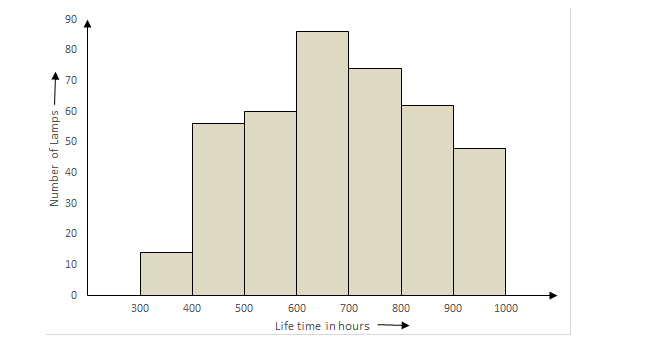
(ii) Number of lamps having their life time more than 700 = number of lamps having life time in between 700 to 1000 = 700 to 800 + 800 to 900 + 900 to 1000
= 74+62 +48 = 184
Note: Remember that in order to draw a histogram, there should be continuous class intervals. Otherwise drawing a histogram is not possible. So, 4 the given data has discontinuous intervals, then convert it into continuous intervals and then plot the graph.
Complete step-by-step answer:
The Difference Between Bar Charts and Histograms
With bar charts, each column represents a group defined by a categorical variable; and with histograms, each column represents a group defined by a continuous, quantitative variable.
Histograms are used to show distributions of variables while bar charts are used to compare variables. Histograms plot quantitative data with ranges of the data grouped into bins or intervals while bar charts plot categorical data
(i) We shall take the life time along the X-axis and number of lamps along the Y-axis, keeping in mind the intervals.
(ii) Number of lamps having their life time more than 700 = number of lamps having life time in between 700 to 1000 = 700 to 800 + 800 to 900 + 900 to 1000
= 74+62 +48 = 184
Note: Remember that in order to draw a histogram, there should be continuous class intervals. Otherwise drawing a histogram is not possible. So, 4 the given data has discontinuous intervals, then convert it into continuous intervals and then plot the graph.
Recently Updated Pages
Master Class 8 Social Science: Engaging Questions & Answers for Success
Master Class 8 Science: Engaging Questions & Answers for Success
Master Class 8 Maths: Engaging Questions & Answers for Success
Class 8 Question and Answer - Your Ultimate Solutions Guide
Master Class 9 Social Science: Engaging Questions & Answers for Success
Master Class 9 Science: Engaging Questions & Answers for Success
Trending doubts
What are gulf countries and why they are called Gulf class 8 social science CBSE
What is BLO What is the full form of BLO class 8 social science CBSE
Give full form of LPG and CNG class 8 chemistry CBSE
Citizens of India can vote at the age of A 18 years class 8 social science CBSE
Advantages and disadvantages of science
Full form of STD, ISD and PCO