


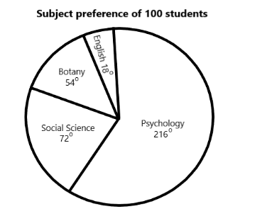
The following pie chart shows the result of a survey among 100 students regarding their subject preference.
How many students prefer Social Science?
Answer
610.5k+ views
Hint: A pictorial representation of data is called a pie chart. A circle is divided into several sectors depending on the data given. It is named for its resemblance to a pie (as it is circular) which has been sliced, it can be presented in various ways. The size of the slices/sectors represents the relative sizes of the data. The same data is represented in different sizes with the help of pie charts. We can find out the amount of quantity represented by a single slice if the total quantity is given.
Complete step-by-step answer:
We are given that the pie chart shows a survey among students regarding their subject of preference.
Total number of students = 100
That is, $ 360^\circ = 100\,students $
Now, we see that the number of students who prefer social science is given as $ 72^\circ $
$
360^\circ = 100\,students \\
\Rightarrow 1^\circ = \dfrac{{100}}{{360}}\,students \\
72^\circ = 72 \times \dfrac{{100}}{{360}} = 20\,students \\
$
Hence, 20 students prefer social science.
So, the correct answer is “20”.
Note: Many experts recommend avoiding the pie charts and criticizing them; the research has shown that comparing different sections of a given pie chart, or comparing data across different pie charts is a very difficult task. Pie charts can be replaced in most cases by other plots such as the bar chart, box plot, dot plot, etc. A research method used for collecting data to gain information and insights into various topics of interest from a predefined group of respondents is called a survey.
Recently Updated Pages
Master Class 11 English: Engaging Questions & Answers for Success
Master Class 11 Social Science: Engaging Questions & Answers for Success
Master Class 11 Maths: Engaging Questions & Answers for Success
Master Class 11 Biology: Engaging Questions & Answers for Success
Master Class 11 Physics: Engaging Questions & Answers for Success
Master Class 11 Chemistry: Engaging Questions & Answers for Success
Trending doubts