


The below table shows the percentage of students who dropped out of school after completing high school.
Year 2005 2007 2009 2011 2013 2015 2017 Percentage of students who dropped $6\%$ $5.5\%$ $5\%$ $4.7\%4 $4.9\%$ $4\%$ $4.5\%$
Study the above table carefully and draw a line graph to depict it.
| Year | 2005 | 2007 | 2009 | 2011 | 2013 | 2015 | 2017 |
| Percentage of students who dropped | $6\%$ | $5.5\%$ | $5\%$ | $4.7\%4 | $4.9\%$ | $4\%$ | $4.5\%$ |
Answer
516k+ views
Hint: For solving this question you have to know about the graph and have a good knowledge to plot the graph for a given analytics. In this problem the analytics for a reason are given already, we will set them in order and then we will plot the graph for these according to x-axis and y-axis.
Complete step by step solution:
According to our question it is asked to us to find or plot a graph for the given analytics. If we take a brief knowledge about a graph, then in a graph there are always two axes, one is x-axis and the second one is y-axis. And these both decide how a graph will be formed for the given details. The general meaning of a graph is that it shows how variations will be there in the y-axis value if we change the x-axis value or vice-versa.
If we make a theoretical analysis of the given data, then we can see that from 2005 to 2007 to 2009 to 2011, the percentage for dropped students was continuously decreasing, so there will be a decreasing graph. And suddenly it becomes high, so the graph will be increasing, and then it again starts decreasing. So, if we make a graph for that, then:
Consider the percentage of students who dropped out of school on the x-axis and year on the y-axis. So, the line graph is:
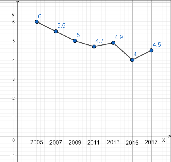
So, this is the final graph.
Note: You have to be careful during plotting a graph that you can select any notation at any axis, but you have to select the axis as it shows the current or exact data. If we take at one-another’s place in this question, then it will not be so clear for us to understand our data easily.
Complete step by step solution:
According to our question it is asked to us to find or plot a graph for the given analytics. If we take a brief knowledge about a graph, then in a graph there are always two axes, one is x-axis and the second one is y-axis. And these both decide how a graph will be formed for the given details. The general meaning of a graph is that it shows how variations will be there in the y-axis value if we change the x-axis value or vice-versa.
If we make a theoretical analysis of the given data, then we can see that from 2005 to 2007 to 2009 to 2011, the percentage for dropped students was continuously decreasing, so there will be a decreasing graph. And suddenly it becomes high, so the graph will be increasing, and then it again starts decreasing. So, if we make a graph for that, then:
Consider the percentage of students who dropped out of school on the x-axis and year on the y-axis. So, the line graph is:
So, this is the final graph.
Note: You have to be careful during plotting a graph that you can select any notation at any axis, but you have to select the axis as it shows the current or exact data. If we take at one-another’s place in this question, then it will not be so clear for us to understand our data easily.

Recently Updated Pages
Master Class 8 Social Science: Engaging Questions & Answers for Success
Master Class 8 English: Engaging Questions & Answers for Success
Class 8 Question and Answer - Your Ultimate Solutions Guide
Master Class 8 Maths: Engaging Questions & Answers for Success
Master Class 8 Science: Engaging Questions & Answers for Success
Master Class 9 General Knowledge: Engaging Questions & Answers for Success
Trending doubts
What is BLO What is the full form of BLO class 8 social science CBSE
Citizens of India can vote at the age of A 18 years class 8 social science CBSE
Full form of STD, ISD and PCO
Advantages and disadvantages of science
Right to vote is a AFundamental Right BFundamental class 8 social science CBSE
What are the 12 elements of nature class 8 chemistry CBSE