


Solve the following question:
Electricity used by the farmers during parts of a day for irrigation is as follows:
Draw pie diagram.
Part of a day Morning Afternoon Evening Night Percentage of electricity used \[30\] \[40\] \[20\] \[10\]
| Part of a day | Morning | Afternoon | Evening | Night |
| Percentage of electricity used | \[30\] | \[40\] | \[20\] | \[10\] |
Answer
595.2k+ views
Hint: First we calculate the total percentage of the electricity used. Then we take that and multiply the percentage of each time with the angle of the circle to obtain that certain angle for that particular slot. Using those angles, we construct a pie-chart with the angle measures.
Complete step-by-step solution:
Given are the electricity percentages used in each part of the day by the farmers.
Let us break it as given below;
Morning \[ = 30\]
Afternoon \[ = 40\]
Evening \[ = 20\]
Night \[ = 10\]
Total percentage or total electricity used \[ = 100\]
Now, to draw a pie chart, we need to find the central angles of consumption of electricity in all the parts. Since we draw a pie chart in the form of a circle, the total angle is \[{360^ \circ }\]
We take the parts out of \[{360^ \circ }\]as given below;
The central angle for the consumption of electricity in the morning \[ = \dfrac{{30}}{{100}} \times 360\]
Cancelling out the zeros and reducing the above term, we get;
\[108\]
The central angle for the consumption of electricity in the afternoon \[ = \dfrac{{40}}{{100}} \times 360\]
Cancelling out the zeros and reducing the above term, we get;
\[144\]
The central angle for the consumption of electricity in the evening \[ = \dfrac{{20}}{{100}} \times 360\]
Cancelling out the zeros and reducing the above term, we get;
\[72\]
The central angle for the consumption of electricity in the night \[ = \dfrac{{10}}{{100}} \times 360\]
Cancelling out the zeros and reducing the above term, we get;
\[36\]
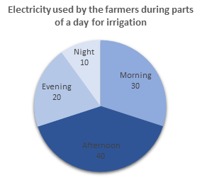
We got the angles to be distributed on the pie-chart as \[108,144,72,36\] as morning, afternoon, evening and night respectively. We get the pie chart as shown below;
Note: We have to know about pie charts, a pie chart (or circle chart) is a circular statistical graphic, which is divided into slices to illustrate numerical proportion. In a pie chart, the arc length of each slice (and consequently its central angle and area), is proportional to the quantity it represents. While it is named for its resemblance to a pie which has been sliced, there are variations on the way it can be presented. Pie charts are very widely used in the business world and the mass media. Pie charts can be replaced in most cases by other plots such as the bar chart, box plot, dot plot.
Complete step-by-step solution:
Given are the electricity percentages used in each part of the day by the farmers.
Let us break it as given below;
Morning \[ = 30\]
Afternoon \[ = 40\]
Evening \[ = 20\]
Night \[ = 10\]
Total percentage or total electricity used \[ = 100\]
Now, to draw a pie chart, we need to find the central angles of consumption of electricity in all the parts. Since we draw a pie chart in the form of a circle, the total angle is \[{360^ \circ }\]
We take the parts out of \[{360^ \circ }\]as given below;
The central angle for the consumption of electricity in the morning \[ = \dfrac{{30}}{{100}} \times 360\]
Cancelling out the zeros and reducing the above term, we get;
\[108\]
The central angle for the consumption of electricity in the afternoon \[ = \dfrac{{40}}{{100}} \times 360\]
Cancelling out the zeros and reducing the above term, we get;
\[144\]
The central angle for the consumption of electricity in the evening \[ = \dfrac{{20}}{{100}} \times 360\]
Cancelling out the zeros and reducing the above term, we get;
\[72\]
The central angle for the consumption of electricity in the night \[ = \dfrac{{10}}{{100}} \times 360\]
Cancelling out the zeros and reducing the above term, we get;
\[36\]
We got the angles to be distributed on the pie-chart as \[108,144,72,36\] as morning, afternoon, evening and night respectively. We get the pie chart as shown below;
Note: We have to know about pie charts, a pie chart (or circle chart) is a circular statistical graphic, which is divided into slices to illustrate numerical proportion. In a pie chart, the arc length of each slice (and consequently its central angle and area), is proportional to the quantity it represents. While it is named for its resemblance to a pie which has been sliced, there are variations on the way it can be presented. Pie charts are very widely used in the business world and the mass media. Pie charts can be replaced in most cases by other plots such as the bar chart, box plot, dot plot.
Recently Updated Pages
Master Class 11 English: Engaging Questions & Answers for Success
Master Class 11 Maths: Engaging Questions & Answers for Success
Class 11 Question and Answer - Your Ultimate Solutions Guide
Master Class 11 Biology: Engaging Questions & Answers for Success
Master Class 11 Physics: Engaging Questions & Answers for Success
Master Class 11 Accountancy: Engaging Questions & Answers for Success
Trending doubts
Differentiate between an exothermic and an endothermic class 11 chemistry CBSE
One Metric ton is equal to kg A 10000 B 1000 C 100 class 11 physics CBSE
Difference Between Prokaryotic Cells and Eukaryotic Cells
There are 720 permutations of the digits 1 2 3 4 5 class 11 maths CBSE
Draw a diagram of a plant cell and label at least eight class 11 biology CBSE
1 Quintal is equal to a 110 kg b 10 kg c 100kg d 1000 class 11 physics CBSE