


Represent the following frequency distribution by means of a histogram

Answer
601.5k+ views
Hint: Here, we have to draw Histogram for the data given in the question. Histogram is the graph in which the data is plotted using the rectangular bars of different heights. In histograms each bar represents the range of the data which is represented on that axis and higher the height of the bar higher the data falls on that range. Using the given data we will draw the histogram.
Complete step-by-step answer:
Firstly, we will draw a graph in which the x-axis represents the class interval of marks and on the y -axis we will represent the frequency i.e. number of students for each class interval.
Now, the value on the x-axis starts with the value 0. As in the given table the class intervals start from 10, so we have to take a class of 0-10 which has the frequency of 0 i.e. the number of students in the range of 0-10 marks is 0.
Further the range is given from 10-20 and the no
After this we will make the bars according to the data given in the table.
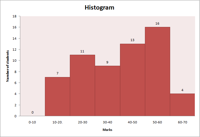
After plotting the Histogram we can easily conclude a lot of things from the data like maximum number of students i.e. 16 scored 50 to 60 marks and no student scored marks in the range of 0 to 10 marks and also more than 50% of the students have scored less than 50 marks.
Therefore, by these steps we are able to draw the Histogram for the given data.
Note: Statistics is the science of collecting some data in the form of the number and with the help of Histogram we can study the data very easily and help us to forecast or predict its future possibility. An array is an arrangement of numbers or symbols in rows and columns. Frequency is defined as the number of times a value or some particular data is repeating itself. Also Frequency distribution is defined as the distribution of frequency corresponding to some class intervals. Histograms help us a lot for the prediction and probability purpose and it also helps us to analyse real life data like to predict the sale of some specific product or to analyse the sales of the same type of products in the market.
Complete step-by-step answer:
Firstly, we will draw a graph in which the x-axis represents the class interval of marks and on the y -axis we will represent the frequency i.e. number of students for each class interval.
Now, the value on the x-axis starts with the value 0. As in the given table the class intervals start from 10, so we have to take a class of 0-10 which has the frequency of 0 i.e. the number of students in the range of 0-10 marks is 0.
Further the range is given from 10-20 and the no
After this we will make the bars according to the data given in the table.
After plotting the Histogram we can easily conclude a lot of things from the data like maximum number of students i.e. 16 scored 50 to 60 marks and no student scored marks in the range of 0 to 10 marks and also more than 50% of the students have scored less than 50 marks.
Therefore, by these steps we are able to draw the Histogram for the given data.
Note: Statistics is the science of collecting some data in the form of the number and with the help of Histogram we can study the data very easily and help us to forecast or predict its future possibility. An array is an arrangement of numbers or symbols in rows and columns. Frequency is defined as the number of times a value or some particular data is repeating itself. Also Frequency distribution is defined as the distribution of frequency corresponding to some class intervals. Histograms help us a lot for the prediction and probability purpose and it also helps us to analyse real life data like to predict the sale of some specific product or to analyse the sales of the same type of products in the market.
Recently Updated Pages
Master Class 11 English: Engaging Questions & Answers for Success
Master Class 11 Maths: Engaging Questions & Answers for Success
Class 11 Question and Answer - Your Ultimate Solutions Guide
Master Class 11 Biology: Engaging Questions & Answers for Success
Master Class 11 Physics: Engaging Questions & Answers for Success
Master Class 11 Accountancy: Engaging Questions & Answers for Success
Trending doubts
Find the sum of series 1 + 2 + 3 + 4 + 5 + + 100 class 9 maths CBSE
Fill the blanks with the suitable prepositions 1 The class 9 english CBSE
Difference Between Plant Cell and Animal Cell
How many hours before the closure of election must class 9 social science CBSE
What is the Full Form of ICSE / ISC ?
What is pollution? How many types of pollution? Define it