


How do you make a bell curve using excel?
Answer
586.5k+ views
Hint: To solve this question first we need to recall the definition of bell curve also known as normal distribution curve. Then we will discuss the steps involved in making a bell curve using excel.
Complete step by step solution:
We know that a bell curve is a way to plot and analyze the data that looks like a bell curve.
We have to follow some steps to create a bell curve in excel. The steps are as follows:
First we need to enter the data in the A1 column. We calculate the mean and standard deviation.
Now, in the cell adjacent to the first data we need to enter the formula : NORM.DIST (A1, mean, standard deviation, FALSE).
Now, by using the autofill option we have to copy paste the same formula to all the cells.
Now, select the dataset and go to the insert tab.
Insert the scatter with a smooth lines chart.
It gives the bell curve in excel.
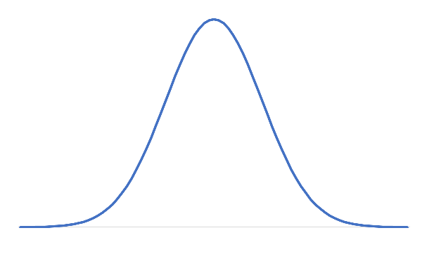
The bell curve generally looks like
Note:
The point to be noted is that when we have a low standard deviation we get a packed slim bell curve and when we have a high standard deviation we get a wide bell curve and it covers more area on the chart. We can calculate the mean using AVERAGE function in excel and standard deviation using STDEV.P function.
Complete step by step solution:
We know that a bell curve is a way to plot and analyze the data that looks like a bell curve.
We have to follow some steps to create a bell curve in excel. The steps are as follows:
First we need to enter the data in the A1 column. We calculate the mean and standard deviation.
Now, in the cell adjacent to the first data we need to enter the formula : NORM.DIST (A1, mean, standard deviation, FALSE).
Now, by using the autofill option we have to copy paste the same formula to all the cells.
Now, select the dataset and go to the insert tab.
Insert the scatter with a smooth lines chart.
It gives the bell curve in excel.
The bell curve generally looks like
Note:
The point to be noted is that when we have a low standard deviation we get a packed slim bell curve and when we have a high standard deviation we get a wide bell curve and it covers more area on the chart. We can calculate the mean using AVERAGE function in excel and standard deviation using STDEV.P function.
Recently Updated Pages
Master Class 11 Social Science: Engaging Questions & Answers for Success
Master Class 11 English: Engaging Questions & Answers for Success
Master Class 11 Maths: Engaging Questions & Answers for Success
Master Class 11 Chemistry: Engaging Questions & Answers for Success
Master Class 11 Biology: Engaging Questions & Answers for Success
Class 11 Question and Answer - Your Ultimate Solutions Guide
Trending doubts
Explain the Treaty of Vienna of 1815 class 10 social science CBSE
Why is it 530 pm in india when it is 1200 afternoon class 10 social science CBSE
What is the full form of POSCO class 10 social science CBSE
Define Potential, Developed, Stock and Reserved resources
Which Country Has the Largest Border with India?
Choose the feminine form of the given noun Fox AFoxess class 10 english CBSE