


How do I graph this table as a clustered bar graph on excel?
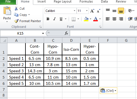
Cont-Corn Hypo-Corn Iso-Corn Hyper-Corn Speed 1 6.5 cm 10.9 cm 8.5 cm 0.5 cm Speed 2 13 cm 7.8 cm 13 cm 1 cm Speed 3 14.3 cm 3 cm 15 cm 2 cm Speed 4 6.5 cm 11 cm 10 cm 1.5 cm Speed 5 10 cm 10.5 cm 14 cm 1.7 cm
| Cont-Corn | Hypo-Corn | Iso-Corn | Hyper-Corn | |
| Speed 1 | 6.5 cm | 10.9 cm | 8.5 cm | 0.5 cm |
| Speed 2 | 13 cm | 7.8 cm | 13 cm | 1 cm |
| Speed 3 | 14.3 cm | 3 cm | 15 cm | 2 cm |
| Speed 4 | 6.5 cm | 11 cm | 10 cm | 1.5 cm |
| Speed 5 | 10 cm | 10.5 cm | 14 cm | 1.7 cm |
Answer
531.9k+ views
Hint: Here in this question we have been asked to draw the clustered bar graph of the given information on excel. For drawing the graph on Excel, we will follow some steps. We will first enter the given data and then choose the range and type of chat that need to be plotted.
Complete step-by-step answer:
Now considering from the question we have been asked to draw the clustered bar graph of the given information on excel.
For drawing the graph on Excel, we will follow some steps.
The given information is as below:
Step 1: Enter the Data into a new Excel sheet.
In the given question, we need to enter the given information as shown above.
Step 2: Select Range to Create Chart or Graph.
By highlighting the cells that contain the data we want to use in our graph by clicking and dragging our mouse across the cells. Now our cell range will now be highlighted in grey and we can select a chart type.
In this example we need to choose the whole data and select a clustered bar graph type chart which will be the first one when we go to “Insert” and choose “bar”.
Step 4: Add Chart Elements.
We can customize the graph as per our requirements. Like in our case we had chosen different colours and styles and gave a title.
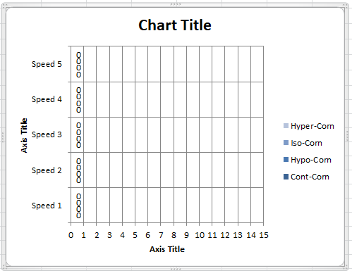
Hence we can conclude that the clustered bar graph of the given information on Excel can be plotted as shown above.
Note: For answering questions of this type we should be sure with the information that we have and carefully plot the graph. We should carefully choose the range of the axis that we need. We should carefully customize our graph accordingly.
Complete step-by-step answer:
Now considering from the question we have been asked to draw the clustered bar graph of the given information on excel.
For drawing the graph on Excel, we will follow some steps.
The given information is as below:
| Cont-Corn | Hypo-Corn | Iso-Corn | Hyper-Corn | |
| Speed 1 | 6.5 cm | 10.9 cm | 8.5 cm | 0.5 cm |
| Speed 2 | 13 cm | 7.8 cm | 13 cm | 1 cm |
| Speed 3 | 14.3 cm | 3 cm | 15 cm | 2 cm |
| Speed 4 | 6.5 cm | 11 cm | 10 cm | 1.5 cm |
| Speed 5 | 10 cm | 10.5 cm | 14 cm | 1.7 cm |
Step 1: Enter the Data into a new Excel sheet.
In the given question, we need to enter the given information as shown above.
Step 2: Select Range to Create Chart or Graph.
By highlighting the cells that contain the data we want to use in our graph by clicking and dragging our mouse across the cells. Now our cell range will now be highlighted in grey and we can select a chart type.
In this example we need to choose the whole data and select a clustered bar graph type chart which will be the first one when we go to “Insert” and choose “bar”.
Step 4: Add Chart Elements.
We can customize the graph as per our requirements. Like in our case we had chosen different colours and styles and gave a title.
Hence we can conclude that the clustered bar graph of the given information on Excel can be plotted as shown above.
Note: For answering questions of this type we should be sure with the information that we have and carefully plot the graph. We should carefully choose the range of the axis that we need. We should carefully customize our graph accordingly.
Recently Updated Pages
Master Class 11 Business Studies: Engaging Questions & Answers for Success
Master Class 11 Economics: Engaging Questions & Answers for Success
Master Class 11 Computer Science: Engaging Questions & Answers for Success
Master Class 11 English: Engaging Questions & Answers for Success
Master Class 11 Maths: Engaging Questions & Answers for Success
Master Class 11 Biology: Engaging Questions & Answers for Success
Trending doubts
One Metric ton is equal to kg A 10000 B 1000 C 100 class 11 physics CBSE
Discuss the various forms of bacteria class 11 biology CBSE
Draw a diagram of a plant cell and label at least eight class 11 biology CBSE
State the laws of reflection of light
Explain zero factorial class 11 maths CBSE
10 examples of friction in our daily life