


Draw a bar graph-
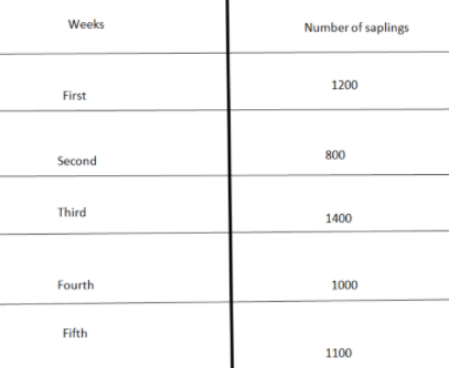
The number of saplings planted by a former in five consecutive weeks are given below.
Answer
579.6k+ views
Hint:
Here we have to draw a bar graph for the given table. For that, first we will take a proper division along the y-axis and on the horizontal axis, we will represent the bar of length given in the table. On the vertical axis we will write the number of saplings and on the vertical axis we will write weeks. Then we will draw a bar for every week representing the required number of saplings planted by a farmer in each week.
Complete step by step solution:
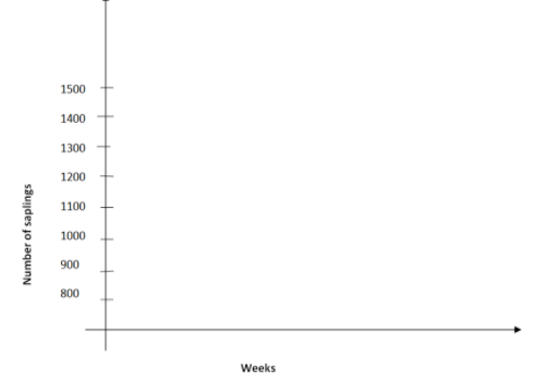
First we will draw x-axis and y-axis where we will represent the number of saplings planted along the y-axis and weeks along x-axis. Now, we will mark the number of saplings along the y-axis starting with $800$ and with a difference of $100$ till $1500$ .
Let’s draw the x-axis and y-axis with x-axis representing weeks and y-axis representing the number of saplings.
Now, we will draw bars on the x-axis named 1st week, 2nd week, 3rd week, 4th week and 5th week. The bars will be of size equal to the number of saplings planted by a farmer in each week, that is, the bar of 1st week will be of size equal to $800$ saplings, similarly we will draw other bars. Let’s draw the bars on the x-axis.
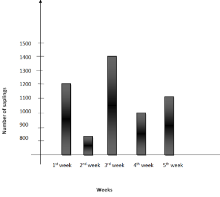
This is the required bar graph where x-axis is representing the weeks and y-axis is representing the number of saplings planted by a farmer.
Overall, this graph is showing the number of saplings planted by a farmer in different weeks.
Note:
Since this question is all about the bar graph. Let’s understand it deeply. A bar graph is a way of representing the data in pictorial form and it is either in the form of vertical rectangular bars or horizontal rectangular bars. Bars are of equal width and their lengths depend on the data.
Bars are generally used to compare data between different groups such as we can compare population of different countries using bar graphs, we can also compare literacy rate and poverty rate of different states or countries and there are many more examples.
Here we have to draw a bar graph for the given table. For that, first we will take a proper division along the y-axis and on the horizontal axis, we will represent the bar of length given in the table. On the vertical axis we will write the number of saplings and on the vertical axis we will write weeks. Then we will draw a bar for every week representing the required number of saplings planted by a farmer in each week.
Complete step by step solution:
First we will draw x-axis and y-axis where we will represent the number of saplings planted along the y-axis and weeks along x-axis. Now, we will mark the number of saplings along the y-axis starting with $800$ and with a difference of $100$ till $1500$ .
Let’s draw the x-axis and y-axis with x-axis representing weeks and y-axis representing the number of saplings.
Now, we will draw bars on the x-axis named 1st week, 2nd week, 3rd week, 4th week and 5th week. The bars will be of size equal to the number of saplings planted by a farmer in each week, that is, the bar of 1st week will be of size equal to $800$ saplings, similarly we will draw other bars. Let’s draw the bars on the x-axis.
This is the required bar graph where x-axis is representing the weeks and y-axis is representing the number of saplings planted by a farmer.
Overall, this graph is showing the number of saplings planted by a farmer in different weeks.
Note:
Since this question is all about the bar graph. Let’s understand it deeply. A bar graph is a way of representing the data in pictorial form and it is either in the form of vertical rectangular bars or horizontal rectangular bars. Bars are of equal width and their lengths depend on the data.
Bars are generally used to compare data between different groups such as we can compare population of different countries using bar graphs, we can also compare literacy rate and poverty rate of different states or countries and there are many more examples.
Recently Updated Pages
Master Class 10 Computer Science: Engaging Questions & Answers for Success
Master Class 10 General Knowledge: Engaging Questions & Answers for Success
Master Class 10 English: Engaging Questions & Answers for Success
Master Class 10 Social Science: Engaging Questions & Answers for Success
Master Class 10 Maths: Engaging Questions & Answers for Success
Master Class 10 Science: Engaging Questions & Answers for Success
Trending doubts
What is the median of the first 10 natural numbers class 10 maths CBSE
Which women's tennis player has 24 Grand Slam singles titles?
Who is the Brand Ambassador of Incredible India?
Why is there a time difference of about 5 hours between class 10 social science CBSE
Write a letter to the principal requesting him to grant class 10 english CBSE
A moving boat is observed from the top of a 150 m high class 10 maths CBSE