


What is a subdivided bar diagram?
Draw a subdivided bar diagram from the following data?
Stream Number of students 2009 2010 2011 Arts 50 70 75 Science 200 250 300 Commerce 100 120 130
| Stream | Number of students | ||
| 2009 | 2010 | 2011 | |
| Arts | 50 | 70 | 75 |
| Science | 200 | 250 | 300 |
| Commerce | 100 | 120 | 130 |
Answer
614.4k+ views
Hint: First of all, we have to write the definition of a subdivided diagram then we have to draw the subdivided diagram for the above data. To draw the subdivided diagram, we are going to add the number of students in 2009 which are from all three streams. Similarly, we are going to add the students in 2010 and 2011. Now, while drawing the bar diagram, we put the number of students of different streams on the vertical axis and year on the horizontal axis. Using this information, we will draw the subdivided bar diagram.
Complete step-by-step solution:
A subdivided bar diagram is a way of representing data in which the total magnitude is divided into different segments. In this diagram, first of all, we draw the simple bars for each class taking the total magnitude in that class then we divide that bar into segments of its various components.
In the above problem, we have given the following table through which we have to draw a subdivided diagram:
Now, to draw a subdivided bar diagram, first of all, we are going to add all the students in each year from 2009 to 2011. And we are tabulating this total number in the above table as follows:
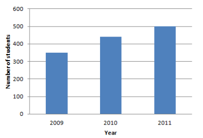
To draw a bar diagram, we place years on the horizontal axis and the number of students on the vertical axis. Then we mark 2009, 2010, and 2011 on the horizontal axis. After that, we draw a bar corresponding to the total number of students in that particular year.
After that, we divide each bar into segments and that segment corresponds to the number of students in arts, science, and commerce streams.
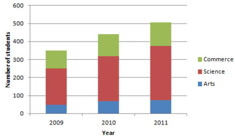
From the above diagram, you can see that we have divided 350 students in 2009 into 50 students in arts, 200 students in science, and 100 students in commerce. The blue color bar is for arts stream, red color for science, and green for commerce.
Hence, we have drawn the subdivided bar diagram.
Note: You might think that instead of adding the students of all streams in a year, we can directly draw the bars of different streams in a year like in 2009, first, we draw a bar for art students then above that we draw a bar for science students and above that, we draw a bar for commerce students. You can do it but it's better if you total the students and then make the segments as it will reduce your calculation mistakes also. Like, instead of drawing a bar for 100 students in commerce you might have drawn a bar for say 150 students in commerce then if you would have first drawn the bar for total students then make the segments you will quickly recognize that you have drawn the wrong bar which you cannot check if you have not drawn the total students bar.
Complete step-by-step solution:
A subdivided bar diagram is a way of representing data in which the total magnitude is divided into different segments. In this diagram, first of all, we draw the simple bars for each class taking the total magnitude in that class then we divide that bar into segments of its various components.
In the above problem, we have given the following table through which we have to draw a subdivided diagram:
| Stream | Number of students | ||
| 2009 | 2010 | 2011 | |
| Arts | 50 | 70 | 75 |
| Science | 200 | 250 | 300 |
| Commerce | 100 | 120 | 130 |
Now, to draw a subdivided bar diagram, first of all, we are going to add all the students in each year from 2009 to 2011. And we are tabulating this total number in the above table as follows:
| Stream | Number of students | ||
| 2009 | 2010 | 2011 | |
| Arts | 50 | 70 | 75 |
| Science | 200 | 250 | 300 |
| Commerce | 100 | 120 | 130 |
| Total students | 350 | 440 | 500 |
To draw a bar diagram, we place years on the horizontal axis and the number of students on the vertical axis. Then we mark 2009, 2010, and 2011 on the horizontal axis. After that, we draw a bar corresponding to the total number of students in that particular year.
After that, we divide each bar into segments and that segment corresponds to the number of students in arts, science, and commerce streams.
From the above diagram, you can see that we have divided 350 students in 2009 into 50 students in arts, 200 students in science, and 100 students in commerce. The blue color bar is for arts stream, red color for science, and green for commerce.
Hence, we have drawn the subdivided bar diagram.
Note: You might think that instead of adding the students of all streams in a year, we can directly draw the bars of different streams in a year like in 2009, first, we draw a bar for art students then above that we draw a bar for science students and above that, we draw a bar for commerce students. You can do it but it's better if you total the students and then make the segments as it will reduce your calculation mistakes also. Like, instead of drawing a bar for 100 students in commerce you might have drawn a bar for say 150 students in commerce then if you would have first drawn the bar for total students then make the segments you will quickly recognize that you have drawn the wrong bar which you cannot check if you have not drawn the total students bar.
Recently Updated Pages
Master Class 11 English: Engaging Questions & Answers for Success
Master Class 11 Social Science: Engaging Questions & Answers for Success
Master Class 11 Maths: Engaging Questions & Answers for Success
Master Class 11 Chemistry: Engaging Questions & Answers for Success
Master Class 11 Biology: Engaging Questions & Answers for Success
Master Class 11 Physics: Engaging Questions & Answers for Success
Trending doubts
Explain the Treaty of Vienna of 1815 class 10 social science CBSE
What is the full form of CNG A Complete Natural Gas class 10 social science CBSE
In cricket, what is a "Yorker" designed to do?
What is the full form of POSCO class 10 social science CBSE
Define Potential, Developed, Stock and Reserved resources
What were the majoritarian measures taken in Sri Lanka class 10 social science CBSE