


A random survey of the number of children of various age group playing in a park was found as follows:
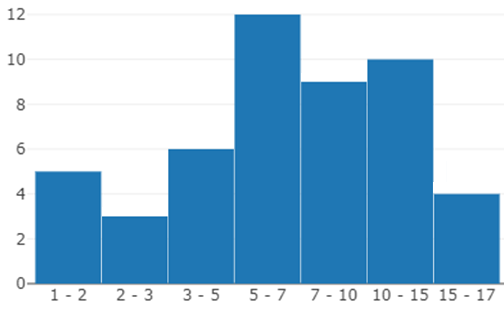
Age (in years) Number of children 1 – 2 5 2 – 3 3 3 – 5 6 5 – 7 12 7 – 10 9 10 – 15 10 15 – 17 4
Draw a histogram to represent the data above.
| Age (in years) | Number of children |
| 1 – 2 | 5 |
| 2 – 3 | 3 |
| 3 – 5 | 6 |
| 5 – 7 | 12 |
| 7 – 10 | 9 |
| 10 – 15 | 10 |
| 15 – 17 | 4 |
Answer
570k+ views
Hint: We start solving the problem by analyzing the data given in the problem. We then decide what to be taken in the x-axis and y-axis to draw a histogram. We check the frequency to take the scale on x and y-axes to plot. After checking all these factors, we draw the histogram.
Complete step by step solution:
A histogram is a graphical method for displaying the shape of a distribution. We know the class interval and frequency. Class intervals will be represented on the x-axis and frequency will be represented on the y-axis. A frequency polygon is plotted in the same manner as histograms except it is a line graph so points are calculated to plot the graph.
According to the problem, we need to draw the histogram for the given data which is listed in the table below,
Before drawing the histogram, we find the frequency of the height of the students to take as scale on the x-axis.
We take the age on the x-axis and no. of children on the y-axis.
Now, we draw the histogram for the given data present in the table.
So, the histogram is as follows:
Note: We should not confuse the histogram with a bar graph as we take the distance between bars bar graph which doesn’t in the histogram. Histograms give a better idea about data to analyze than a bar and other graphs. Most of the histograms follow a normal distribution. We can also expect problems to draw bar graphs, pie charts for a given data.
Complete step by step solution:
A histogram is a graphical method for displaying the shape of a distribution. We know the class interval and frequency. Class intervals will be represented on the x-axis and frequency will be represented on the y-axis. A frequency polygon is plotted in the same manner as histograms except it is a line graph so points are calculated to plot the graph.
According to the problem, we need to draw the histogram for the given data which is listed in the table below,
| Age (in years) | Number of children |
| 1 – 2 | 5 |
| 2 – 3 | 3 |
| 3 – 5 | 6 |
| 5 – 7 | 12 |
| 7 – 10 | 9 |
| 10 – 15 | 10 |
| 15 – 17 | 4 |
Before drawing the histogram, we find the frequency of the height of the students to take as scale on the x-axis.
We take the age on the x-axis and no. of children on the y-axis.
Now, we draw the histogram for the given data present in the table.
So, the histogram is as follows:
Note: We should not confuse the histogram with a bar graph as we take the distance between bars bar graph which doesn’t in the histogram. Histograms give a better idea about data to analyze than a bar and other graphs. Most of the histograms follow a normal distribution. We can also expect problems to draw bar graphs, pie charts for a given data.
Recently Updated Pages
Master Class 12 Business Studies: Engaging Questions & Answers for Success
Master Class 12 Biology: Engaging Questions & Answers for Success
Master Class 12 Chemistry: Engaging Questions & Answers for Success
Class 12 Question and Answer - Your Ultimate Solutions Guide
Master Class 11 Social Science: Engaging Questions & Answers for Success
Master Class 11 English: Engaging Questions & Answers for Success
Trending doubts
What is BLO What is the full form of BLO class 8 social science CBSE
Citizens of India can vote at the age of A 18 years class 8 social science CBSE
Right to vote is a AFundamental Right BFundamental class 8 social science CBSE
Name the states through which the Tropic of Cancer class 8 social science CBSE
Give me the opposite gender of Duck class 8 english CBSE
What are the 12 elements of nature class 8 chemistry CBSE