


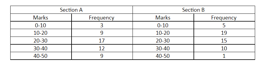
The following table gives the distribution of students of two sections according to the marks obtained by them:
Represent the marks of the students of both the sections on the same graph of two frequency polygons. From the two polygons compare the performance of the two sections.
Answer
513.9k+ views
Hint: A frequency polygon graph is the visual representation of the distribution among the quantities or the numbers. Simply we can say frequency. Number of times repeated. It indicates the number of occurrences for each of the distinct classes in the data set. Here we will first find the coordinates to plot. Convert the given range of the class in the class marks taking the sum of the upper limit and the lower limit divide by two. And plot the graph using the coordinates.
Complete step by step answer:
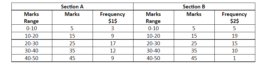
Class Marks / Midpoint of the range \[ = \dfrac{{upper{\text{ limit + lower limit}}}}{2}\]
For the class $1 = \dfrac{{0 + 10}}{2} = 5$
Similarly find for all the given range of the class and construct the table as shown below.
Now, Plot the point using the Marks and the respective frequency for the section and the section B respectively.
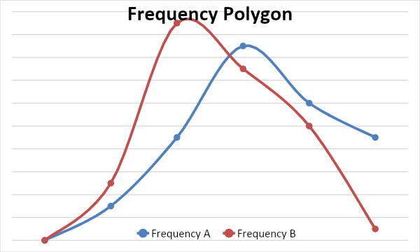
From the above graph we can observe that in section B, the frequency is high when the marks are low and as the marks are increasing the frequency is decreasing whereas, in the section A frequency is increasing as the marks are increasing. So, the performance of section A is better compared to section B.
Note: Also, refer to the other types of the graphs and know the difference between them and the pictorial representation or the diagram which represents the data or the value in the most organized manner.
Complete step by step answer:
Class Marks / Midpoint of the range \[ = \dfrac{{upper{\text{ limit + lower limit}}}}{2}\]
For the class $1 = \dfrac{{0 + 10}}{2} = 5$
Similarly find for all the given range of the class and construct the table as shown below.
Now, Plot the point using the Marks and the respective frequency for the section and the section B respectively.
From the above graph we can observe that in section B, the frequency is high when the marks are low and as the marks are increasing the frequency is decreasing whereas, in the section A frequency is increasing as the marks are increasing. So, the performance of section A is better compared to section B.
Note: Also, refer to the other types of the graphs and know the difference between them and the pictorial representation or the diagram which represents the data or the value in the most organized manner.
Recently Updated Pages
Basicity of sulphurous acid and sulphuric acid are
Master Class 11 Business Studies: Engaging Questions & Answers for Success
Master Class 11 Computer Science: Engaging Questions & Answers for Success
Master Class 11 Economics: Engaging Questions & Answers for Success
Master Class 11 Social Science: Engaging Questions & Answers for Success
Master Class 11 English: Engaging Questions & Answers for Success
Trending doubts
One Metric ton is equal to kg A 10000 B 1000 C 100 class 11 physics CBSE
The largest wind power cluster is located in the state class 11 social science CBSE
Explain zero factorial class 11 maths CBSE
State and prove Bernoullis theorem class 11 physics CBSE
What steps did the French revolutionaries take to create class 11 social science CBSE
Which among the following are examples of coming together class 11 social science CBSE