


What percent of the data is represented by each part of a box and whisker plot?
Answer
537k+ views
Hint: Sometimes, we need more details in distribution of data-sets that may not be fulfilled by the measure of central tendency like the mean, median and the mode. This demand can be fulfilled by a box and whiskers plot. A Box plot is a graph that provides us with much firm indication about how the values in the data should be spread.
Complete step by step solution:
A box and whisker plot is represented as:
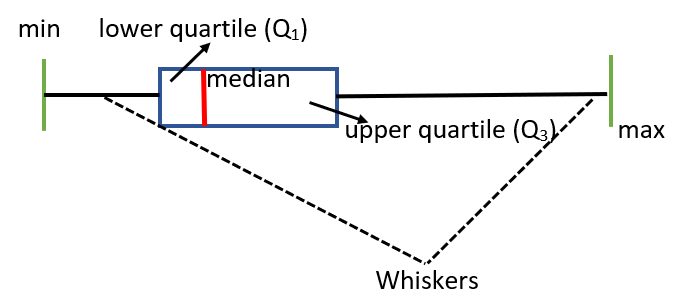
There are six elements in the Box and Whiskers plot. These are, the minimum score, the maximum score, the median, the lower quartile, the upper quartile and the whiskers.
Now, the percentage of data represented by each part of a box and whisker plot is given as follows:
The part till minimum score gives us 0% data.
The part till the first whisker gives us 25% data.
The Median (covering the interquartile region) gives us 50% of data.
The part till the second whisker gives us 75% of data. And, at last
The part till the maximum gives us 100% of data.
Hence, we can conclude that the part till the left side whisker represents the lowest 25% of data, the median covering the interquartile region gives us 50% of data and the part up to right hand side whisker represents the highest 25% of data.
Note: The Box plot offers us a visual summary of the data, therefore allowing the researchers to identify the mean values, the dispersion of the set and the signs of skewness. A Box plot offers to display the outliers within the data set. It also helps us get more knowledge about the symmetry of the data, that is, when the median is in the middle, and the whiskers on both sides are equal, the distribution will be symmetric.
Complete step by step solution:
A box and whisker plot is represented as:
There are six elements in the Box and Whiskers plot. These are, the minimum score, the maximum score, the median, the lower quartile, the upper quartile and the whiskers.
Now, the percentage of data represented by each part of a box and whisker plot is given as follows:
The part till minimum score gives us 0% data.
The part till the first whisker gives us 25% data.
The Median (covering the interquartile region) gives us 50% of data.
The part till the second whisker gives us 75% of data. And, at last
The part till the maximum gives us 100% of data.
Hence, we can conclude that the part till the left side whisker represents the lowest 25% of data, the median covering the interquartile region gives us 50% of data and the part up to right hand side whisker represents the highest 25% of data.
Note: The Box plot offers us a visual summary of the data, therefore allowing the researchers to identify the mean values, the dispersion of the set and the signs of skewness. A Box plot offers to display the outliers within the data set. It also helps us get more knowledge about the symmetry of the data, that is, when the median is in the middle, and the whiskers on both sides are equal, the distribution will be symmetric.
Recently Updated Pages
Basicity of sulphurous acid and sulphuric acid are
Master Class 11 Business Studies: Engaging Questions & Answers for Success
Master Class 11 Computer Science: Engaging Questions & Answers for Success
Master Class 11 Economics: Engaging Questions & Answers for Success
Master Class 11 Social Science: Engaging Questions & Answers for Success
Master Class 11 English: Engaging Questions & Answers for Success
Trending doubts
One Metric ton is equal to kg A 10000 B 1000 C 100 class 11 physics CBSE
The largest wind power cluster is located in the state class 11 social science CBSE
Explain zero factorial class 11 maths CBSE
State and prove Bernoullis theorem class 11 physics CBSE
What steps did the French revolutionaries take to create class 11 social science CBSE
Which among the following are examples of coming together class 11 social science CBSE