


Draw the bar graph of the following data
The population of India in successive census years:
Year 1941 1951 1961 1971 1981 1991 2001 Population (in millions) 320 360 440 550 680 850 1000
| Year | 1941 | 1951 | 1961 | 1971 | 1981 | 1991 | 2001 |
| Population (in millions) | 320 | 360 | 440 | 550 | 680 | 850 | 1000 |
Answer
613.5k+ views
Hint: For drawing the graph we take the years on X-axis and population on Y-axis. By assuming some scale to both the axes we plot the graph in rectangles each year, which means we take ten years as one unit which will be the breadth of the rectangle and the population as the length of the rectangle.
Complete step-by-step solution:
Let us assume that the years on X-axis and the population on Y-axis.
Now, let us create a table extending the given data to one column of having the coordinates of points to be represented on the graph as follows
Now, let us take the scale
On X-axis 1 unit is equal to 10 years
On Y-axis 1 unit is equal to 100 million
By using this scale let us plot the bar graph of the given data.
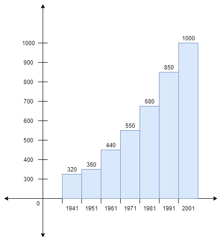
Therefore the bar graph of the given data is drawn.
Note: Students may miss some points that are listed below.
(i) We need to draw a bar graph in rectangles, not as points.
(ii) After drawing the rectangles we have to give some color or design or some shading to the rectangles to avoid confusion.
(iii) Mention corresponding Y-axis values on the rectangles to avoid confusion.
(iv)The years need to be taken in the range which means we take the same population over the decade because it is a bar graph.
The above points need to be taken care of, to get a perfect bar graph.
Complete step-by-step solution:
Let us assume that the years on X-axis and the population on Y-axis.
Now, let us create a table extending the given data to one column of having the coordinates of points to be represented on the graph as follows
| Year | Population(in millions) | Co-ordinates |
| 1941 | 320 | (1941, 320) |
| 1951 | 360 | (1951, 360) |
| 1961 | 440 | (1961, 440) |
| 1971 | 550 | (1971, 550) |
| 1981 | 680 | (1981, 680) |
| 1991 | 850 | (1991, 850) |
| 2001 | 1000 | (2001, 1000) |
Now, let us take the scale
On X-axis 1 unit is equal to 10 years
On Y-axis 1 unit is equal to 100 million
By using this scale let us plot the bar graph of the given data.
Therefore the bar graph of the given data is drawn.
Note: Students may miss some points that are listed below.
(i) We need to draw a bar graph in rectangles, not as points.
(ii) After drawing the rectangles we have to give some color or design or some shading to the rectangles to avoid confusion.
(iii) Mention corresponding Y-axis values on the rectangles to avoid confusion.
(iv)The years need to be taken in the range which means we take the same population over the decade because it is a bar graph.
The above points need to be taken care of, to get a perfect bar graph.
Recently Updated Pages
Master Class 11 Social Science: Engaging Questions & Answers for Success
Master Class 11 English: Engaging Questions & Answers for Success
Master Class 11 Maths: Engaging Questions & Answers for Success
Master Class 11 Chemistry: Engaging Questions & Answers for Success
Master Class 11 Biology: Engaging Questions & Answers for Success
Class 11 Question and Answer - Your Ultimate Solutions Guide
Trending doubts
Explain the Treaty of Vienna of 1815 class 10 social science CBSE
Why is it 530 pm in india when it is 1200 afternoon class 10 social science CBSE
What is the full form of POSCO class 10 social science CBSE
Define Potential, Developed, Stock and Reserved resources
Which Country Has the Largest Border with India?
Choose the feminine form of the given noun Fox AFoxess class 10 english CBSE