


consider the following statements:
$1$) Pie diagrams are suitable for categorical data.
${\text{2)}}$ The arc length of a sector of a pie diagram is proportional to the value of the component represented by the sector.
Which of the statements given above is/are correct?
${\text{A)}}$ $1$ Only
${\text{B)}}$$2$ Only
${\text{C)}}$ Both $1$ and $2$
${\text{D)}}$ Neither $1$ nor $2$
Answer
575.4k+ views
Hint: Pie chart is a circular representation of the given data which is used to categorize data. The arc length of the pie chart is proportionate to its value. Finally we discuss the example to clarify to conclude the required answer.
Complete step-by-step solution:
In this question we have to discuss the pie diagram and length of a sector which is used to draw a pie chart and it uses.
First we define the pie graph as follows:
Pie graph is a very commonly used type of graph to represent things in circular form which is actually divided into different pieces or slices to represent the numerical values of the data.
It is commonly used to categorize data. In the pie graph, the pieces length is known as arc length. The data given will be converted into degrees and represented in the table.
Now we discuss about the arc length of a pie diagram as follows:
So, the arc length of a sector of a pie diagram is proportional to the numerical value represented in the given data
Example: The given data is:
From the given pie diagram, we can see that the arc length of the pie graph is proportional to the values given as the data.
Therefore the given statements both are correct.
The correct answer is ${\text{C)}}$ both $1$ and $2$
Note: It is common that all the graphical representations are suitable for categorising data. Among them, the pie chart is more suitable because of this circular structure. With that feature pie chart is more suitable for comparing and categorising.
Complete step-by-step solution:
In this question we have to discuss the pie diagram and length of a sector which is used to draw a pie chart and it uses.
First we define the pie graph as follows:
Pie graph is a very commonly used type of graph to represent things in circular form which is actually divided into different pieces or slices to represent the numerical values of the data.
It is commonly used to categorize data. In the pie graph, the pieces length is known as arc length. The data given will be converted into degrees and represented in the table.
Now we discuss about the arc length of a pie diagram as follows:
So, the arc length of a sector of a pie diagram is proportional to the numerical value represented in the given data
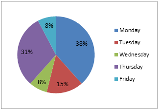
Example: The given data is:
| Monday | Tuesday | Wednesday | Thursday | Friday |
| $38\% $ | $15\% $ | $8\% $ | $31\% $ | $8\% $ |
From the given pie diagram, we can see that the arc length of the pie graph is proportional to the values given as the data.
Therefore the given statements both are correct.
The correct answer is ${\text{C)}}$ both $1$ and $2$
Note: It is common that all the graphical representations are suitable for categorising data. Among them, the pie chart is more suitable because of this circular structure. With that feature pie chart is more suitable for comparing and categorising.
Recently Updated Pages
Basicity of sulphurous acid and sulphuric acid are
Master Class 11 Business Studies: Engaging Questions & Answers for Success
Master Class 11 Computer Science: Engaging Questions & Answers for Success
Master Class 11 Economics: Engaging Questions & Answers for Success
Master Class 11 Social Science: Engaging Questions & Answers for Success
Master Class 11 English: Engaging Questions & Answers for Success
Trending doubts
One Metric ton is equal to kg A 10000 B 1000 C 100 class 11 physics CBSE
The largest wind power cluster is located in the state class 11 social science CBSE
Explain zero factorial class 11 maths CBSE
State and prove Bernoullis theorem class 11 physics CBSE
What steps did the French revolutionaries take to create class 11 social science CBSE
Which among the following are examples of coming together class 11 social science CBSE