

We have been Seeing the Wrong Map!
If we leave the globe aside, all maps of the world are drawn flat. Unless we believe the flat-earthers, a flat map of a round planet is not the correct way to depict it. Most classrooms usually have a wall-size rectangular flat map of the world to help students with their geography lessons.
We see a flat projection of Earth while on the other hand, we study that the earth is round. This creates a discrepancy between how our planet actually is and how it is depicted on paper. The flat maps are drawn simply to provide a detailed and coherent projection of the earth but they are not an accurate depiction. Let's tell you why all world maps are wrong.
Mercator Projection of the World
Why is Map a Bad Example?
For starters, while some areas on flat maps look far bigger than they really are, others appear much smaller. The distance as seen between various land masses also looks different than it is, leading to misrepresentation. Cartographers feel that every world map is in some way distorted. There are strong reasons that make them wonder why maps are wrong.
When we are drawing up a map of the world, we have to choose between wanting the regions to be shaped as they are on a globe, or sized as they are on a globe. While having a perfect size seems like the plausible choice for most purposes, having the right shape is a more aesthetic choice.
Despite the claims and protestations of flat-earthers, there is no dispute regarding the round shape of our planet as per science. Although technically the earth is an oblate spheroid, which is a sphere with a flattened top as well as bottom and a bulge along the equator.
The most daunting problem faced by cartographers since it was proven that the earth is round and maps were first drawn is: to represent a three-dimensional object in two dimensions!
Let’s try a practical experience to understand this dilemma for cartographers. Take a spare globe, or an old tennis ball, and cut it open. Now, try rearranging it into a perfect rectangle. You can also think about stuffing a round ball in a rectangular space. The distortions are hard to imagine. These are impractical challenges but they give a good idea of how a spheroid and a flat rectangle are incompatible.
Who Created World Map?
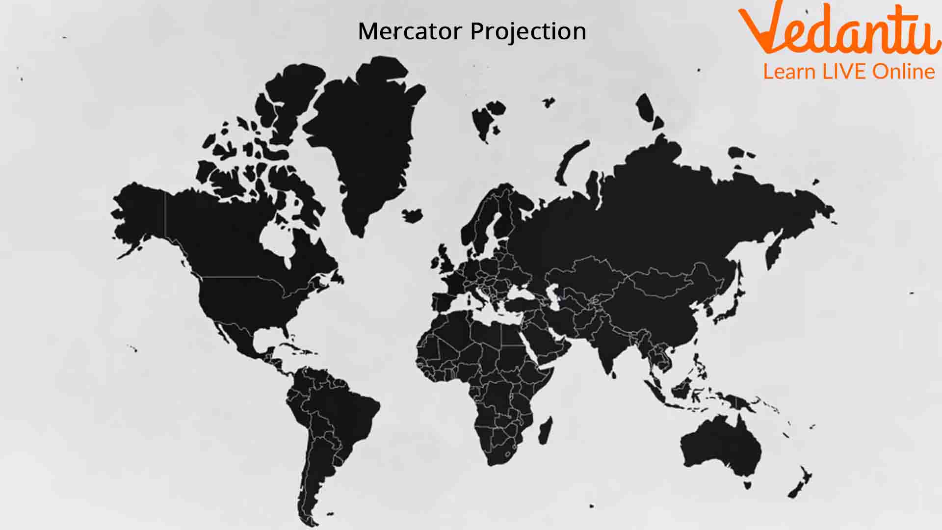
Flemish geographer and cartographer Gerardus Mercator created the Mercator projection in 1569, almost half a millennium ago. To date, it remains the most widely used flat depiction of Earth. This map was used by navigators for centuries because they could plot courses in a straight line with its help. However, it wasn’t high on precision.
Why is Globe More Accurate than a Map?
Some projections like the Mercator's projection are more distorted than others. This projection is conformal and depicts the great circles as straight lines. A great circle is any circle drawn on a globe with a centre that includes the centre of the globe.
Meridians converge on the globe as they approach a pole. The lengths of the parallels of latitude decrease until the pole. But, when the Earth is mapped into a rectangle, the poles are stretched from points into lines, the length of the equator. Every parallel is stretched to the length of the equator, so as one moves towards the poles, there is horizontal stretching on the map.
Parallels are equally spaced on the globe, but Mercator's projection exponentially increases the separation of parallels as one moves poleward. This is done to get the special property of great circles and straight lines. Therefore, there is increasing vertical stretching as one moves poleward on the map.
The result? Some regions look far bigger on the map than they are in reality, while others look much smaller.
A clear example of this distortion can be seen clearly in the relative sizes of Greenland, Europe, Africa, and India. While Greenland and Europe are shown bigger than they should be, the latter pair are represented relatively smaller.
The Mercator projection shows Greenland and Africa to be similar in size when in reality Africa is nearly 14 times larger. Similarly, Alaska is depicted as around three times bigger than Mexico, when in fact Mexico is around 1.3 times bigger than Alaska!
So, now that we know that the Mercator projection is flawed when it comes to representing various land masses in size, we wonder if there are any other world maps that we can use in its place.
What is Closer to Reality?
One alternative to Mercator's projection is the Gall-Peters projection, which is good on size-representation but ranks low in aesthetics. However, this projection also suffers from accuracy issues. While all areas are the correct size relative to each other, most of the land masses have been distorted in order to get the size correct. Land masses appear stretched vertically at the Equator and horizontally at the poles. This connotes that although countries on the map are roughly the correct size, they are not the right shape. This distortion is most prominent at the pole, just like in the Mercator projection.
There have been several other flat maps drawn over the centuries, but they all have the same problem: it is impossible to portray the 3D Earth on a 2D map without compromising on either the size or shape of the land masses. The National Geographic Society prefers the Winkel Tripel projection designed in 1921 as the flat map to use. However, even that has distortion issues. One of the most prominent examples of that is the Pacific Ocean, which looks bigger on this map than it is in reality.
Why does National geographic use this map then? It’s because, when compared to other small-scale maps, there is less distortion. It is what we call a "compromise projection" because, while the distortions regarding the area, direction or distance are still there, they have been minimised as much as possible on this flat map. Almost every part of the map is distorted albeit not excessively.
Conclusion
Astrophysicists developed what is believed to be the most accurate flat map of the earth ever, in 1921. It consists of two "pancake maps" that can be viewed back to back or side by side. This fundamentally different way of presenting the earth is different from almost every other flat map. We will have to wait and watch if this map is widely adopted in classrooms and textbooks.


